一、基础

plt.savefig(‘test’, dpi = 600) :将绘制的图画保存成png格式,命名为 test
plt.ylabel(‘Grade’) : y轴的名称
plt.axis([-1, 10, 0, 6]) : x轴起始于-1,终止于10 ,y轴起始于0,终止于6
plt.subplot(3,2,4) : 分成3行2列,共6个绘图区域,在第4个区域绘图。排序为行优先。也可 plt.subplot(324),将逗号省略。
1.1 Figure
在任何绘图之前,我们需要一个Figure对象,可以理解成我们需要一张画板才能开始绘图。
import matplotlib.pyplot as plt
fig = plt.figure()
1.2 Axes
在拥有Figure对象之后,在作画前我们还需要轴,没有轴的话就没有绘图基准,所以需要添加Axes。也可以理解成为真正可以作画的纸。
fig = plt.figure()
ax = fig.add_subplot(111)
ax.set(xlim=[0.5, 4.5], ylim=[-2, 8], title='An Example Axes',
ylabel='Y-Axis', xlabel='X-Axis')
plt.show()
上的代码,在一幅图上添加了一个Axes,然后设置了这个Axes的X轴以及Y轴的取值范围(这些设置并不是强制的,后面会再谈到关于这些设置),效果如下图:
这里写图片描述
对于上面的fig.add_subplot(111)就是添加Axes的,参数的解释的在画板的第1行第1列的第一个位置生成一个Axes对象来准备作画。也可以通过fig.add_subplot(2, 2, 1)的方式生成Axes,前面两个参数确定了面板的划分,例如 2, 2会将整个面板划分成 2 * 2 的方格,第三个参数取值范围是 [1, 2*2] 表示第几个Axes。如下面的例子:
fig = plt.figure()
ax1 = fig.add_subplot(221)
ax2 = fig.add_subplot(222)
ax3 = fig.add_subplot(224)
1.3 Multiple Axes
可以发现我们上面添加 Axes 似乎有点弱鸡,所以提供了下面的方式一次性生成所有 Axes:
fig, axes = plt.subplots(nrows=2, ncols=2)
axes[0,0].set(title='Upper Left')
axes[0,1].set(title='Upper Right')
axes[1,0].set(title='Lower Left')
axes[1,1].set(title='Lower Right')
axes 成了我们常用二维数组的形式访问,这在循环绘图时,额外好用。
Plot的图表函数
plt.plot(x,y , fmt) :绘制坐标图
plt.boxplot(data, notch, position): 绘制箱形图
plt.bar(left, height, width, bottom) : 绘制条形图
plt.barh(width, bottom, left, height) : 绘制横向条形图
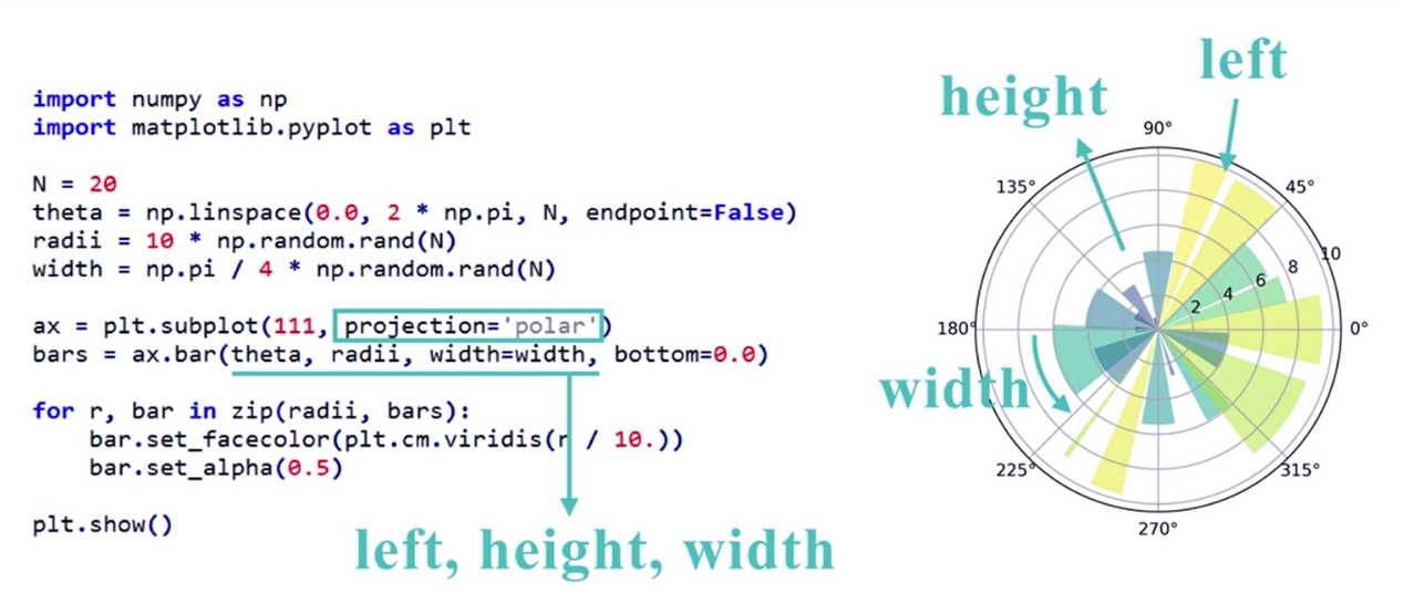
plt.polar(theta, r) : 绘制极坐标图
plt.pie(data, explode) : 绘制饼图
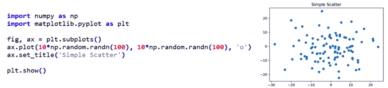
plt.scatter(x, y) :绘制散点图
plt.hist(x, bings, normed) : 绘制直方图
绘制饼图
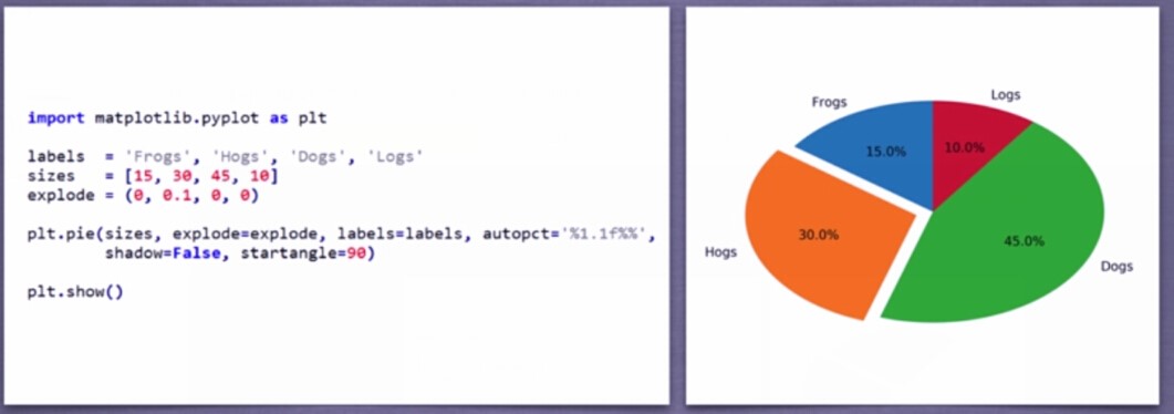
explode表示突出,如橘色这一块突出;autopct 表示显示数据的格式; shadow表示二维饼图;startangle表示起始的角度;
此为椭圆形饼图,要为圆形,可添加: plt.axis(‘equal’)
绘制直方图
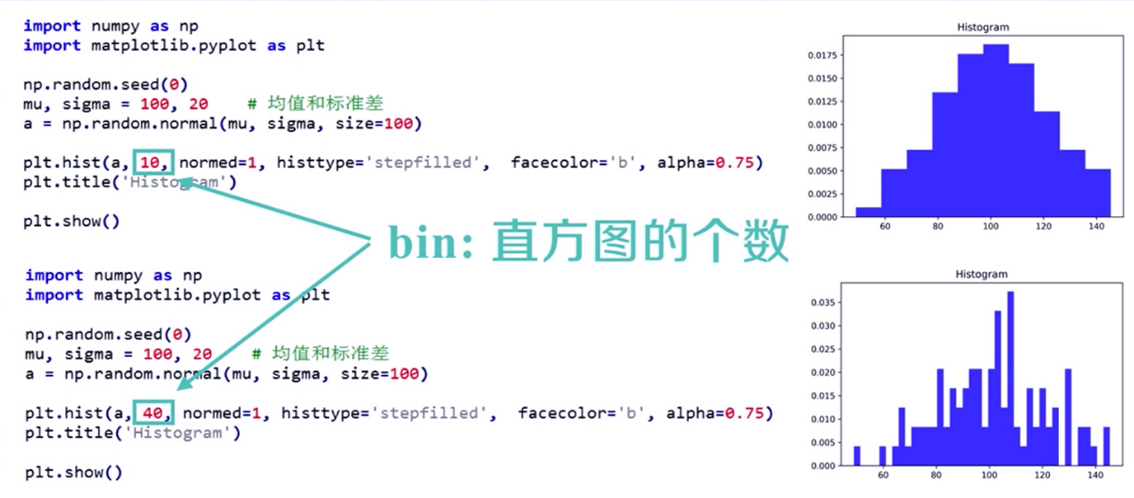
bings将直方图的取值范围进行均等划分bings个区间;
normed =1 表示将出现频次进行了归一化。 normed=0,则为频次;
alpha表示直方图的透明度[0, 1] ;
histtype = ‘stepfilled’ 表示去除条柱的黑色边框
面向对象的极坐标图绘制
面向对象散点图绘制
将subplots()变成一个对象,fig和ax表示subplots生成的图表以及相关区域。subplots为空时,默认为subplots(111)
其它代码:https://www.cnblogs.com/flowyourheart/p/Python-ke-shi-hua-kuMatplotlib-shi-yong-zong-jie.html
二、其它
1、画框
import matplotlib.patches as patches
import matplotlib.pyplot as plt
import cv2
img=cv2.imread("images/1.jpg")
plt.figure(8)
plt.imshow(imgSrc)
currentAxis=plt.gca()
rect=patches.Rectangle((200, 600),550,650,linewidth=1,edgecolor='r',facecolor='none')
currentAxis.add_patch(rect)
---------------------
作者:yjl9122
来源:CSDN
原文:https://blog.csdn.net/yjl9122/article/details/70762476
版权声明:本文为博主原创文章,转载请附上博文链接!
2、加子图
import numpy as np
import matplotlib.pyplot as plt
x = np.arange(0, 100)
fig = plt.figure()
ax1 = fig.add_subplot(221)
ax1.plot(x, x)
ax2 = fig.add_subplot(222)
ax2.plot(x, -x)
ax3 = fig.add_subplot(223)
ax3.plot(x, x ** 2)
ax4 = fig.add_subplot(224)
ax4.plot(x, np.log(x))
plt.show()
---------------------
作者:有一种宿命叫无能为力
来源:CSDN
原文:https://blog.csdn.net/you_are_my_dream/article/details/53439518
版权声明:本文为博主原创文章,转载请附上博文链接!
布局、图例说明、边界等
3.1区间上下限
当绘画完成后,会发现X、Y轴的区间是会自动调整的,并不是跟我们传入的X、Y轴数据中的最值相同。为了调整区间我们使用下面的方式:
ax.set_xlim([xmin, xmax]) #设置X轴的区间
ax.set_ylim([ymin, ymax]) #Y轴区间
ax.axis([xmin, xmax, ymin, ymax]) #X、Y轴区间
ax.set_ylim(bottom=-10) #Y轴下限
ax.set_xlim(right=25) #X轴上限
具体效果见下例:
x = np.linspace(0, 2*np.pi)
y = np.sin(x)
fig, (ax1, ax2) = plt.subplots(2)
ax1.plot(x, y)
ax2.plot(x, y)
ax2.set_xlim([-1, 6])
ax2.set_ylim([-1, 3])
plt.show()
可以看出修改了区间之后影响了图片显示的效果。
3.2 图例说明
我们如果我们在一个Axes上做多次绘画,那么可能出现分不清哪条线或点所代表的意思。这个时间添加图例说明,就可以解决这个问题了,见下例:
fig, ax = plt.subplots()
ax.plot([1, 2, 3, 4], [10, 20, 25, 30], label='Philadelphia')
ax.plot([1, 2, 3, 4], [30, 23, 13, 4], label='Boston')
ax.scatter([1, 2, 3, 4], [20, 10, 30, 15], label='Point')
ax.set(ylabel='Temperature (deg C)', xlabel='Time', title='A tale of two cities')
ax.legend()
plt.show()
在绘图时传入 label 参数,并最后调用ax.legend()显示体力说明,对于 legend 还是传入参数,控制图例说明显示的位置:
Location String Location Code
‘best’ 0
‘upper right’ 1
‘upper left’ 2
‘lower left’ 3
‘lower right’ 4
‘right’ 5
‘center left’ 6
‘center right’ 7
‘lower center’ 8
‘upper center’ 9
‘center’ 10
3.3 区间分段
默认情况下,绘图结束之后,Axes 会自动的控制区间的分段。见下例:
data = [('apples', 2), ('oranges', 3), ('peaches', 1)]
fruit, value = zip(*data)
fig, (ax1, ax2) = plt.subplots(2)
x = np.arange(len(fruit))
ax1.bar(x, value, align='center', color='gray')
ax2.bar(x, value, align='center', color='gray')
ax2.set(xticks=x, xticklabels=fruit)
#ax.tick_params(axis='y', direction='inout', length=10) #修改 ticks 的方向以及长度
plt.show()
上面不仅修改了X轴的区间段,并且修改了显示的信息为文本。
3.4 布局
当我们绘画多个子图时,就会有一些美观的问题存在,例如子图之间的间隔,子图与画板的外边间距以及子图的内边距,下面说明这个问题:
fig, axes = plt.subplots(2, 2, figsize=(9, 9))
fig.subplots_adjust(wspace=0.5, hspace=0.3,
left=0.125, right=0.9,
top=0.9, bottom=0.1)
#fig.tight_layout() #自动调整布局,使标题之间不重叠
plt.show()
通过fig.subplots_adjust()我们修改了子图水平之间的间隔wspace=0.5,垂直方向上的间距hspace=0.3,左边距left=0.125 等等,这里数值都是百分比的。以 [0, 1] 为区间,选择left、right、bottom、top 注意 top 和 right 是 0.9 表示上、右边距为百分之10。不确定如果调整的时候,fig.tight_layout()是一个很好的选择。之前说到了内边距,内边距是子图的,也就是 Axes 对象,所以这样使用 ax.margins(x=0.1, y=0.1),当值传入一个值时,表示同时修改水平和垂直方向的内边距。
这里写图片描述
观察上面的四个子图,可以发现他们的X、Y的区间是一致的,而且这样显示并不美观,所以可以调整使他们使用一样的X、Y轴:
fig, (ax1, ax2) = plt.subplots(1, 2, sharex=True, sharey=True)
ax1.plot([1, 2, 3, 4], [1, 2, 3, 4])
ax2.plot([3, 4, 5, 6], [6, 5, 4, 3])
plt.show()
3.5 轴相关
改变边界的位置,去掉四周的边框:
fig, ax = plt.subplots()
ax.plot([-2, 2, 3, 4], [-10, 20, 25, 5])
ax.spines['top'].set_visible(False) #顶边界不可见
ax.xaxis.set_ticks_position('bottom') # ticks 的位置为下方,分上下的。
ax.spines['right'].set_visible(False) #右边界不可见
ax.yaxis.set_ticks_position('left')
# "outward"
# 移动左、下边界离 Axes 10 个距离
#ax.spines['bottom'].set_position(('outward', 10))
#ax.spines['left'].set_position(('outward', 10))
# "data"
# 移动左、下边界到 (0, 0) 处相交
ax.spines['bottom'].set_position(('data', 0))
ax.spines['left'].set_position(('data', 0))
# "axes"
# 移动边界,按 Axes 的百分比位置
#ax.spines['bottom'].set_position(('axes', 0.75))
#ax.spines['left'].set_position(('axes', 0.3))
plt.show()