简单的css鼠标进入动画
本篇讲述的动画效果均基于 2d转化–>transform 与 过渡–>transition相结合,简单且实用。
应用时注意div基础样式需自行定义。
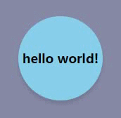
文字和盒子共同旋转、放大
效果图:
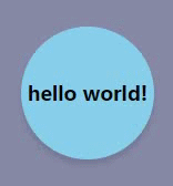
注:为了使过渡效果更佳,我们应用了贝塞尔曲线
代码如下:
<style>
/* 2D转化效果1 */
.animate1 {
    /* 过渡时间为0.5s,使用贝塞尔曲线 */
    transition: 0.5s cubic-bezier(.28,.19,.32,.99);
}
.animate1:hover {
    /* 旋转加放大 */
    transform: rotate(360deg) scale(1.2);
}
</style>

<div class="animate1">hello world!</div>
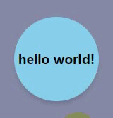
文字变大,背景盒子变小,有文字凸起效果
效果图:
代码如下:
<style>
/* 2D转化效果2 */
.animate2,.animate2 div {
    /* 过渡时间为0.5s,使用贝塞尔曲线 */
    transition: 0.5s cubic-bezier(.28,.19,.32,.99);
}
.animate2:hover {
    /* 旋转加放大 */
    transform:scale(0.8);
}
.animate2 div:hover {
    transform:scale(2);
}
</style>

<div class="animate2">
    <div>hello world!</div>
</div>
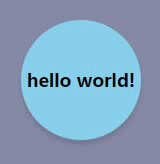
上下遮罩效果
效果图:
代码如下:
<style>
/* 2D转化效果3 */
.animate3 {
    overflow: hidden;
}
.animate3:hover .top {
    top: 0;
}
.animate3:hover .bottom {
    bottom: 0;
}
.top , .bottom{
    transition: 0.2s ;
    width: 100%;
    position: absolute;
    height: 30px;
}
.top {
    top: -30px;
    background: linear-gradient(to bottom, rgba(0, 0, 0, 0.4), rgba(255, 255, 255, 0));
}
.bottom {
    bottom: -30px;
    background: linear-gradient(to top, rgba(0, 0, 0, 0.4), rgba(255, 255, 255, 0));
}
</style>

<div class="animate3">hello world!
    <div class="top"></div>
    <div class="bottom"></div>
</div>
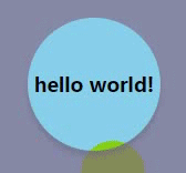
上下拉帘效果
效果图:
代码如下:
<style>
/* 2D转化效果4 */
.animate4 {
    overflow: hidden;
}
.from_t {
    position: absolute;
    top: 0px;
    height: 0;
    width: 100%;
    background: rgba(0, 0, 0, 0.2);
    transition: 0.3s linear;
}
.animate4:hover .from_t{
    height: 100%;
}
</style>

<div class="animate4">hello world!
    <div class="from_t"></div>
</div>
向上抖动效果
代码如下:
<style>
/* 2D转化效果5 */
.animate5 {
    transition: 0.4s;
}
.animate5:hover {
    transform: translateY(-10px);
}
</style>

<div class="animate5">hello world!</div>