版权声明:尊重原创! https://blog.csdn.net/weixin_42675488/article/details/83546309
- ||||||||||||||||||||||||||||||||||||||【 张鑫旭的指点迷津 】 — 【 前端开发手册 】
-
—— `路漫漫其修远兮,吾将上下求索` - ||||||||||||||||||||||||||||||||||||||【 鹅厂Coco文献大全 】 — 【 github学习知识库(全)】
9、倒尖三角的写法:
.g-container-case .swiper-button-prev:after {
    content: " ";
    position: absolute;
    top: 12px;
    right: 16px;
    display: block;
    height: 15px;
    width: 15px;
    border-width: 2px 2px 0 0; // 边线的大小
    border-color: #fff;
    border-style: solid;
     /*! autoprefixer: off */
    transform: matrix(0.71, 0.71, -0.71, 0.71, 0, 0); // 旋转的角度
     /* autoprefixer: on */
}

/* 正三角形 */
span {
  width: 0;  // 正三角写法(下图第一个)
  height: 0;
  border-top: 8px dashed #ddd;
  border-right: 8px solid transparent;
  border-left: 8px solid transparent;
}

/* 简写 */
.tabbar-box .tabbar-list li span {
    display: inline-block;
    width:  0;
    height: 0;
    border: 12px solid transparent;
    border-left-color: #ff0;
}
/* 正方形 */
p {
  width: 100%;  // 不设宽高的正方形写法
  padding-bottom: 100%;
}
8、inline-block内联元素空隙问题:
1)、当使用内联元素把块级元素转换为内联时,会发现两个内联元素之间有一定的间隙,既不是margin或padding,最后发现是由于换行符、制表符、空格等字符引起;
由于模块使用[换行符]或[空格符]后,webkit浏览器中会引起最后一个模块有多余空白,可以使用font-size:0可清除该空格:
方法: 在父元素中设置font-size: 0; 然后再在子元素上重置正确的 font-size;
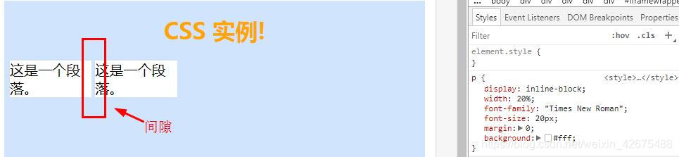
2)、opera浏览器需要添加 vertical-align:top 才能完全解决底部多余的空白,是在:after中添加;
.demo:after{
     display:inline-block;
     overflow:hidden;
     width:100%;
     height:0;
     content:'';
     vertical-align:top;
}
多个内联元素之间的高度坍塌问题,在子元素上用vertical-align: top解决;(inline-block生效)
7、vertical-align: 属性设置元素垂直对齐的方式;(效果与 8 一致)
同时,称之为“inline-block依赖型元素”,只会在inline-block上起作用;
在HTML5文档声明下,块状元素内部的内联元素的行为表现,就好像块状元素内部还有一个(更有可能两个-前后)看不见摸不着没有宽度没有实体的空白节点,这个假想又似乎存在的空白节点,
称之为“幽灵空白节点”。
vertical-align和line-height 好基友
.div { line-height: 0; }
.div .justify-img {
  display: inline-block;
  width: 128px;
  vertical-align: top;  // 在处理行内元素与行内元素之间的高度问题上也有很大作用;
}

- top //把元素的顶端与行中最高元素的顶端对齐
- middle //把此元素放置在父元素的中部
- bottom //把元素的顶端与行中最低的元素的顶端对齐
参考文献:张鑫旭-对CSS vertical-align的一些理解与认识
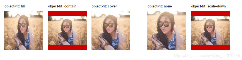
6、object-fit 的理解:
属性指定替换元素的内容应该如何适应到其使用的高度和宽度确定的框;缺点是不兼容IE
object-fit - fill  //初始值
		   - contain    //被替换的内容将被缩放,以在填充元素的内容框时保持其宽高比
		   - cover    // 被替换的内容大小保持其宽高比,同时填充(铺满)元素的整个内容框
参考文献:MDN web docs
1、button点击时会有蓝色边框线 :
button,
input {
    outline: none;
}
2、隐藏滚动轴 :
/*  pc端滚动条隐藏  */
::-webkit-scrollbar {
    display: none;
}

/* 微信 scroll-view 隐藏滚动条 */
::-webkit-scrollbar {
  width: 0;
  height: 0;
  color: transparent;
}
3、webpack打包样式 - 浏览器前缀问题
扫描二维码关注公众号,回复:
5956136 查看本文章

    /*! autoprefixer: off */
    -webkit-box-orient: vertical;
    /* autoprefixer: on */
4、文字省略点点点(...):
.text-flow {
    overflow: hidden;
    text-overflow: ellipsis;  // 多数浏览器已经支持
    display: -webkit-box;
    /*! autoprefixer: off */
    -webkit-box-orient: vertical;
    /* autoprefixer: on */
}
.clamp-md {
   -webkit-line-clamp: 2;  // 控制行数
}
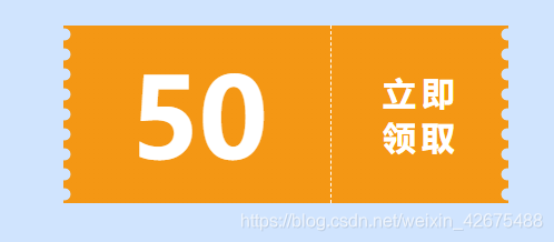
5、优惠券
<div class="coupon">50</div>
.coupon {
    position: relative;
    width: 400px;
    height: 160px;
    margin: 50px auto;
    background-image:
        radial-gradient(circle at 1px 8px, transparent 6px, #f49714 6px, #f49714 0px),
        radial-gradient(circle at 199px 8px, transparent 6px, #f49714 6px, #f49714 0px);
    background-size: 200px 18px;
    background-position: 0 0, 200px 0;
    background-repeat-x: no-repeat;
    font-size: 100px;
    color: #fff;
    font-weight: bold;
    line-height: 160px;
    padding-left: 60px;
    box-sizing: border-box;
    cursor: pointer;
}
.coupon:before {
    position: absolute;
    content: "";
    left: 240px;
    top: 0;
    bottom : 0;
    width: 0;
    border-left: 1px dashed #fff;
}
.coupon:after {
    position: absolute;
    content: "立即领取";
    font-size: 30px;
    width: 70px;
    top: 50%;
    right: 2%;
    transform: translate(-50%, -50%);
    line-height: 40px;
    letter-spacing: 5px;
}