版权声明:刘家军 https://blog.csdn.net/qq_42911663/article/details/89423013
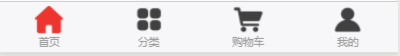
效果图
因为官网 自定义底部导航栏的api需求的基础库版本比较高 以及组建的所以底部导航栏用的模块化封装的
wxml部分
<template name="Tabbar">
    <cover-view class="tab-bar">
        <cover-view class="tab-bar-border"></cover-view>
        <cover-view wx:for="{{list}}" wx:key="index" class="tab-bar-item" data-path="{{item.pagePath}}" data-index="{{index}}" bindtap="switchTab">
            <cover-image src="{{selected === index ? item.selectedIconPath : item.iconPath}}">
            </cover-image>

            <cover-view style="color: {{selected === index ? selectedColor : color}}">{{item.text}}</cover-view>
        </cover-view>
    </cover-view>
</template>
js部分
// 获取应用实例
const App = getApp()

let _compData = {
	'_tabbar.color': "#7A7E83",
	'_tabbar.selectedColor': "#FC625D",
	'_tabbar.selected': 0,
	'_tabbar.list': [],
	'_tabbar.pageName': null
}
let _tabbarInstance = {
	initTabbar(e) {
		if (e.initPage) {
			this.setData({ '_tabbar.pageName': e.initPage, '_tabbar.selected': e.selected,})
			if (!this.hasInitTabbar) {
				this.hasInitTabbar = true
			let list = [{
				"iconPath": "/image/icon-home1.png",
				"selectedIconPath": "/image/icon-home2.png",
				"pagePath": "/pages/index/index",
				"text": "首页"
			},
			{
				"iconPath": "/image/icon-classify1.png",
				"selectedIconPath": "/image/icon-classify2.png",
				"pagePath": "/pages/shopDetail/shopDetail",
				"text": "分类"
			},
			{
				"iconPath": "/image/icon-shopCart1.png",
				"selectedIconPath": "/image/icon-shopCart2.png",
				"pagePath": "/pages/shopCart/shopCart",
				"text": "购物车"
			},
			{
				"iconPath": "/image/icon-my1.png",
				"selectedIconPath": "/image/icon-my2.png",
				"pagePath": "/pages/userCenter/userCenter",
				"text": "我的"
			}
			]
			this.setData({
				'_tabbar.list': list
			})
			}
		}
	},
	switchTab(e) {
		const data = e.currentTarget.dataset
		const url = data.path
		wx.switchTab({
			url
		})
	}
}

function Tabbar(PageInstance) {
	Object.assign(PageInstance, _tabbarInstance)
	PageInstance.setData(_compData)
	return this
}
module.exports = {
	Tabbar
}
wxss部分
.tab-bar { position: fixed;bottom: 0;left: 0;right: 0;height: 110rpx;background: white;display: flex;padding-bottom: env(safe-area-inset-bottom) }
.tab-bar-border { background-color: rgba(0, 0, 0, 0.33);position: absolute;left: 0;top: 0;width: 100%;height: 1px;transform: scaleY(0.5) }
.tab-bar-item {flex: 1;text-align: center;display: flex;justify-content: center;align-items: center;flex-direction: column;position:relative }
.tab-bar-item cover-image { width: 30px;height: 30px; }
.tab-bar-item cover-view { font-size: 10px; }
.shop-cart-bage { position:absolute;left:50%;top:0;transform:translate(-50%);margin-left:40rpx;min-width:40rpx;height:40rpx;line-height:40rpx;border-radius:20rpx;background-color:rgba(252, 98, 93, 1);color:#fff;padding:0 10rpx;box-shadow:0 0 5px rgba(0, 0, 0, 0.5)}
例子 index.wxml页面调用
<!-- 自定义底部导航栏 -->
<import src="../../component/CustomTabbar/CustomTabbar.wxml" />
<template is="Tabbar" data="{{ ..._tabbar }}" />
缺点 因为组件是在page里面 第一次加载的时候tabbar闪动 影响用户体验,
由于这个缺点封装完之后 就没再用
对于解决tabbar闪动的方案我是把tabar作为一个页面 然后把每一个导航栏的内容封装成组件 插入tabar页面中