决策树
决策树的生成算法有ID3,C4.5和CART(Classification And Regression Tree)等
- 由增熵(Entrophy)原理来决定哪个做父节点,哪个节点需要分裂
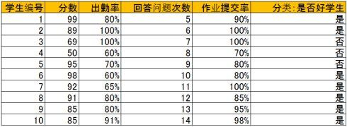
比如上表中的4个属性:单一地通过以下语句分类:

1. 分数小于70为【不是好学生】:分错1个

2. 出勤率大于70为【好学生】:分错3个

3. 问题回答次数大于9为【好学生】:分错2个

4. 作业提交率大于80%为【好学生】:分错2个

最后发现 分数小于70为【不是好学生】这条分错最少,
也就是熵最大,所以应该选择这条为父节点进行树的生成,
最后选择分类错最少即熵最大的那个条件。
而当分裂父节点时道理也一样,分裂有很多选择,
针对每一个选择,与分裂前的分类错误率比较,
留下那个提高最大的选择,即熵增益最大的选择。
(即递归的进行节点划分)
以上的缺点:通过对ID3的学习可以知道ID3存在一个问题,那就是越细小的分割分类错误率越小,所以ID3会越分越细,分割太细了,训练数据的分类可以达到0错误率,但是因为新的数据和训练数据不同,所以面对新的数据分错率反倒上升了
c4.5
C4.5中,增加的熵要除以分割太细的代价,
这个比值叫做信息增益率,显然分割太细分母增加,
信息增益率会降低。除此之外,其他的原理和ID3相同。
CART:分类回归树
CART是一个二叉树,也是回归树,同时也是分类树,CART只能将一个父节点分为2个子节点
CART用GINI指数来决定如何分裂:GINI指数:总体内包含的类别越杂乱,GINI指数就越大(跟熵的概念很相似)。
很多数据并不容易完全划分,或者完全划分需要很多次分裂,必然造成很长的运行时间,所以CART可以对每个叶节点里的数据分析其均值方差,当方差小于一定值可以终止分裂,以换取计算成本的降低


TOP:
a. 比如出勤率大于70%这个条件将训练数据分成两组:大于70%里面有两类:【好学生】和【不是好学生】,而小于等于70%里也有两类:【好学生】和【不是好学生】。

b. 如果用分数小于70分来分:则小于70分只有【不是好学生】一类,而大于等于70分有【好学生】和【不是好学生】两类。

比较a和b,发现b的凌乱程度比a要小,即GINI指数b比a小,所以选择b的方案。以此为例,将所有条件列出来,选择GINI指数最小的方案,这个和熵的概念很类似。


以上的决策树训练的时候,一般会采取Cross-Validation法:比如一共有10组数据:
(https://www.cnblogs.com/sddai/p/5696834.html)

第一次. 1到9做训练数据, 10做测试数据

第二次. 2到10做训练数据,1做测试数据

第三次. 1,3到10做训练数据,2做测试数据,以此类推
做10次,然后得平均错误率。这样称为 10 folds Cross-Validation。
比如 3 folds Cross-Validation 指的是数据分3份,2份做训练,1份做测试。
/TOP
监督学习:每个样本都有一组属性和一个分类结果,也就是分类结果已知
通过学习上表的数据,可以A,B,C,D,E的具体值,而A,B,C,D,E则称为阈值。当然也可以有和上图完全不同的树形,比如下图这种的:

所以决策树的生成有以下两个步骤:
- 节点的分裂:一般当一个节点所代表的属性无法给出判断时,则选择将这一节点分成2个 子 节点(如不是二叉树的情况会分成n个子节点)
- 阈值的确定:选择适当的阈值使得分类错误率最小 (Training Error)。
集成学习
集成学习就是构建并结合多个个体学习器(称为基学习器))来完成学习任务
集成学习器是通过少数服从多数的原则来进行分类结果的最终选择,这就要求我们的基学习器具有第一个表的特性:性能好,并且不一样(即好而不同)。随着基学习器数目的增加,集成的错误率剧烈下降直至为 0。

随机森林
https://www.cnblogs.com/maybe2030/p/4585705.html#_label1(随机森林)
例子
例子
打个形象的比喻:森林中召开会议,讨论某个动物到底是老鼠还是松鼠,每棵树都要独立地发表自己对这个问题的看法,也就是每棵树都要投票。该动物到底是老鼠还是松鼠,要依据投票情况来确定,获得票数最多的类别就是森林的分类结果。森林中的每棵树都是独立的,99.9%不相关的树做出的预测结果涵盖所有的情况,这些预测结果将会彼此抵消。少数优秀的树的预测结果将会超脱于芸芸“噪音”,做出一个好的预测。将若干个弱分类器的分类结果进行投票选择,从而组成一个强分类器,这就是随机森林bagging的思想
随机森林的生成
随机森林的生成
每棵树的按照如下规则生成:
1)如果训练集大小为N,对于每棵树而言,随机且有放回地从训练集中的抽取N个训练样本(这种采样方式称为bootstrap sample方法),作为该树的训练集;
从这里我们可以知道:每棵树的训练集都是不同的,而且里面包含重复的训练样本(理解这点很重要)。
为什么要有放回地抽样?(add @2016.05.28)
我理解的是这样的:如果不是有放回的抽样,那么每棵树的训练样本都是不同的,都是没有交集的,这样每棵树都是"有偏的",都是绝对"片面的"(当然这样说可能不对),也就是说每棵树训练出来都是有很大的差异的;而随机森林最后分类取决于多棵树(弱分类器)的投票表决,这种表决应该是"求同",因此使用完全不同的训练集来训练每棵树这样对最终分类结果是没有帮助的,这样无异于是"盲人摸象"。
2)如果每个样本的特征维度为M,指定一个常数m<<M,随机地从M个特征中选取m个特征子集,每次树进行分裂时,从这m个特征中选择最优的;
3)每棵树都尽最大程度的生长,并且没有剪枝过程。
一开始我们提到的随机森林中的“随机”就是指的这里的两个随机性。两个随机性的引入对随机森林的分类性能至关重要。由于它们的引入,使得随机森林不容易陷入过拟合,并且具有很好得抗噪能力(比如:对缺省值不敏感)。
随机森林分类效果(错误率)与两个因素有关:
森林中任意两棵树的相关性:相关性越大,错误率越大;
1.森林中每棵树的分类能力:每棵树的分类能力越强,整个森林的错误率越低。
2.减小特征选择个数m,树的相关性和分类能力也会相应的降低;增大m,两者也会随之增大。所以关键问题是如何选择最优的m(或者是范围),这也是随机森林唯一的一个参数。
3)最后用误分个数占样本总数的比率作为随机森林的oob误分率。oob误分率是随机森林泛化误差的一个无偏估计
6 随机森林工作原理解释的一个简单例子
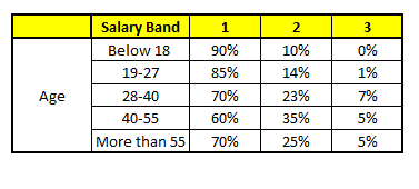
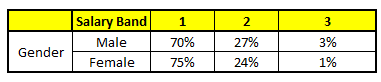
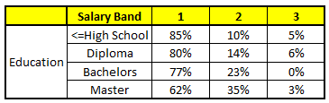
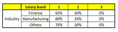
描述:根据已有的训练集已经生成了对应的随机森林,随机森林如何利用某一个人的年龄(Age)、性别(Gender)、教育情况(Highest Educational Qualification)、工作领域(Industry)以及住宅地(Residence)共5个字段来预测他的收入层次。
收入层次 :
Band 1 : Below $40,000
Band 2: $40,000 – 150,000
Band 3: More than $150,000
随机森林中每一棵树都可以看做是一棵CART(分类回归树),这里假设森林中有5棵CART树,总特征个数N=5,我们取m=1(这里假设每个CART树对应一个不同的特征)。
CART 1 : Variable Age
CART 2 : Variable Gender
CART 3 : Variable Education
CART 4 : Variable Residence

CART 5 : Variable Industry
我们要预测的某个人的信息如下:
1. Age : 35 years ; 2. Gender : Male ; 3. Highest Educational Qualification : Diploma holder; 4. Industry : Manufacturing; 5. Residence : Metro.
根据这五棵CART树的分类结果,我们可以针对这个人的信息建立收入层次的分布情况:
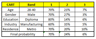
最后,我们得出结论,这个人的收入层次70%是一等,大约24%为二等,6%为三等,所以最终认定该人属于一等收入层次(小于$40,000)。
Python sklearn 参数调节

titanic代码:
#!/usr/bin/env python
# coding: utf-8

# In[1]:


import pandas as pd
import numpy as np
import matplotlib as plt
import seaborn as sns
get_ipython().run_line_magic('matplotlib', 'inline')

data = pd.read_csv("train.csv")
data.head(6)


# In[2]:


data.columns


# In[3]:


len(data) #数据集长度


# In[4]:


data.isnull().sum()


# In[5]:


sns.countplot(x="Survived",data=data)  # 对不同值得"Survived" 进行计数并绘图,这是seaborn?


# In[6]:


data.drop(['PassengerId','Name'],axis=1,inplace=True) #删除 data['PassengerId','Name'] 两列数据,axis=1 表示删除列,axis=0 表示删除行,inplace=True 原位删除
data.columns


# In[7]:


g = sns.heatmap(data[["Survived","SibSp","Parch","Age","Fare","Pclass"]].corr(),cmap="RdYlGn",annot=True)


# In[8]:


Age0 = data[(data["Survived"] == 0)&(data["Age"].notnull())]["Age"]  # 死亡乘客的Age数据
Age1 = data[(data["Survived"] == 1)&(data["Age"].notnull())]["Age"]  # 生存乘客的Age数据
g = sns.kdeplot(Age0,shade = True,color = "r",label = "NotSurvived")  # 死亡乘客年龄分布概率分布图,shade = True  设置阴影
g = sns.kdeplot(Age1,shade=True,color="b",label="Survived")  # 看来是有必要去总结一下seaborn了


# In[9]:


g=sns.catplot(x='Sex',y='Age',data=data,kind='box')
g=sns.catplot(x='Pclass',y='Age',data=data,kind='box')


# In[10]:


index = list(data[data['Age'].isnull()].index) #Age 缺失样例的 index
Age_mean = np.mean(data[data['Age'].notnull()]['Age']) #求平均值
copy_data = data.copy()
for i in index:
    filling_age = np.mean(copy_data[(copy_data['Pclass'] == copy_data.iloc[i]['Pclass'])
                                    & (copy_data['SibSp'] == copy_data.iloc[i]['SibSp'])
                                    & (copy_data['Parch'] == copy_data.iloc[i]['Parch'])
                                    ]['Age'])
    if not np.isnan(filling_age): # filling_age 非空为真
        data['Age'].iloc[i] = filling_age #填充 null 值
    else: # filling_age 空为真
        data['Age'].iloc[i] = Age_mean
g = sns.kdeplot(Age0, legend=True, shade=True, color='r', label='NotSurvived')
g = sns.kdeplot(Age1, legend=True, shade=True, color='b', label='Survived')


# In[11]:


data[data['Cabin'].notnull()]['Cabin'].head(10)


# In[12]:


# fillna() 填充 null 值
data['Cabin'].fillna('U',inplace=True) #填充NaN的值
# 使用 lambda 表达式定义匿名函数对 i 执行 list(i)[0]。map() 指对指定序列 data ['Cabin'] 进行映射,对每个元素执行 lambda
data['Cabin']=data['Cabin'].map(lambda i: list(i)[0])
# kind='bar' 绘制条形图,ci=False 不绘制概率曲线,order 设置横坐标次序
g = sns.factorplot(x='Cabin',y='Survived',data=data,ci=False,kind='bar',order=['A','B','C','D','E','F','T','U'])


# In[13]:


g = sns.countplot(x='Cabin',hue='Pclass',data=data,order=['A','B','C','D','E','F','T','U']) # hue='Pclass' 表示根据 'Pclass' 进行分类
data['Fare']


# In[14]:


data['Fare']=data['Fare'].map(lambda i:np.log(i) if i>0 else 0) # 匿名函数为对非零数据进行 Log Transformation,否则保持零值
print('Skew Coefficient:%.2f' %(data['Fare'].skew())) # skew() 计算偏态系数
g=sns.kdeplot(data[data['Survived']==0]['Fare'],shade='True',label='NotSurvived',color='r') # 死亡乘客 'Fare' 分布
g=sns.kdeplot(data[data['Survived']==1]['Fare'],shade='True',label='Survived',color='b') # 生存乘客 'Fare' 分布
data['Fare']


# In[15]:


data['Fare']
data['Fare']=data['Fare'].map(lambda i:np.log(i) if i>0 else 0) # 匿名函数为对非零数据进行 Log Transformation,否则保持零值
g=sns.distplot(data['Fare'])
print('Skew Coefficient:%.2f' %(data['Fare'].skew())) # skew() 计算偏态系数
data['Fare']


# In[16]:


Ticket=[]
import re
r=re.compile(r'\w*')#正则表达式,查找所有单词字符[a-z/A-Z/0-9]
for i in data['Ticket']:
    print("i=",i)
    sp=i.split(' ')#拆分空格前后字符串,返回列表
    print("sp=",sp)
    if len(sp)==1:
       Ticket.append('U')#对于只有一串数字的 Ticket,Ticket 增加字符 'U'
    else:
       t=r.findall(sp[0])#查找所有单词字符,忽略符号,返回列表
       Ticket.append(''.join(t))#将 t 中所有字符串合并
    print("Ticket=",Ticket)
data['Ticket']=Ticket
data=pd.get_dummies(data,columns=['Ticket'],prefix='T')#get_dummies:如果DataFrame的某一列中含有k个不同的值,则可以派生出一个k列矩阵或DataFrame(其值全为1和0)


# In[17]:


data.columns


# In[18]:


data['Sex'].replace('male',0,inplace=True)#inplace=True 原位替换
data['Sex'].replace('female',1,inplace=True)


# In[19]:


from collections import Counter

def outlier_detect(n, df, features):#定义函数 outlier_detect 探测离群点,输入变量 n, df, features,返回 outlier
    outlier_index = []
    for feature in features:
        Q1 = np.percentile(df[feature], 25)#计算上四分位数(1/4)
        Q3 = np.percentile(df[feature], 75)#计算下四分位数(3/4)
        IQR = Q3 - Q1
        outlier_span = 1.5 * IQR
        col = ((data[data[feature] > Q3 + outlier_span]) |
               (data[data[feature] < Q1 - outlier_span])).index
        outlier_index.extend(col)
        print('%s: %f (Q3+1.5*IQR) , %f (Q1-1.5*QIR) )' %
              (feature, Q3 + outlier_span, Q1 - outlier_span))
    outlier_index = Counter(outlier_index)#计数
    outlier = list(i for i, j in outlier_index.items() if j >= n)
    print('number of outliers: %d' % len(outlier))
    print(df[['Age', 'Parch', 'SibSp', 'Fare']].loc[outlier])
    return outlier

outlier = outlier_detect(3, data, ['Age', 'Parch', 'SibSp', 'Fare'])#调用函数 outlier_detect


# In[20]:


data['Cabin']


# In[21]:


data['Cabin'].replace('A',0,inplace=True)#inplace=True 原位替换
data['Cabin'].replace('B',1,inplace=True)
data['Cabin'].replace('C',2,inplace=True)#inplace=True 原位替换
data['Cabin'].replace('D',3,inplace=True)
data['Cabin'].replace('E',4,inplace=True)#inplace=True 原位替换
data['Cabin'].replace('F',5,inplace=True)
data['Cabin'].replace('T',6,inplace=True)#inplace=True 原位替换
data['Cabin'].replace('U',7,inplace=True)
data['Cabin'].replace('G',6,inplace=True)


# In[22]:


data['Cabin']


# In[23]:


data.columns


# In[24]:


data['Embarked'].fillna(0,inplace = True)


# In[25]:


data['Embarked']


# In[26]:


from sklearn.ensemble import AdaBoostClassifier
from sklearn.ensemble import RandomForestClassifier
from sklearn.model_selection import cross_val_score


# In[27]:


data['Embarked'].replace('S',0,inplace=True)
data['Embarked'].replace('C',1,inplace=True)#inplace=True 原位替换
data['Embarked'].replace('Q',2,inplace=True)


# In[28]:


y = data['Survived']
X = data.drop(['Survived'], axis=1).values

classifiers = [AdaBoostClassifier(
    random_state=2), RandomForestClassifier(random_state=2)]
for clf in classifiers:
    score = cross_val_score(clf, X, y, cv=10, scoring='accuracy')#cv=10:10 折交叉验证法,scoring='accuracy':返回测试精度
    print([np.mean(score)])#显示测试精度平均值


# In[29]:


from sklearn.model_selection import learning_curve
import matplotlib.pyplot as plt

# 定义函数 plot_learning_curve 绘制学习曲线。train_sizes 初始化为 array([ 0.1  ,  0.325,  0.55 ,  0.775,  1\.   ]),cv 初始化为 10,以后调用函数时不再输入这两个变量

def plot_learning_curve(estimator, title, X, y, cv=10,
                        train_sizes=np.linspace(.1, 1.0, 5)):
    plt.figure()
    plt.title(title) # 设置图的 title
    plt.xlabel('Training examples') # 横坐标
    plt.ylabel('Score') # 纵坐标
    train_sizes, train_scores, test_scores = learning_curve(estimator, X, y, cv=cv,
                                                            train_sizes=train_sizes)
    train_scores_mean = np.mean(train_scores, axis=1) # 计算平均值
    train_scores_std = np.std(train_scores, axis=1) # 计算标准差
    test_scores_mean = np.mean(test_scores, axis=1)
    test_scores_std = np.std(test_scores, axis=1)
    plt.grid() # 设置背景的网格

    plt.fill_between(train_sizes, train_scores_mean - train_scores_std,
                     train_scores_mean + train_scores_std,
                     alpha=0.1, color='g') # 设置颜色
    plt.fill_between(train_sizes, test_scores_mean - test_scores_std,
                     test_scores_mean + test_scores_std,
                     alpha=0.1, color='r')
    plt.plot(train_sizes, train_scores_mean, 'o-', color='g',
             label='traning score') # 绘制训练精度曲线
    plt.plot(train_sizes, test_scores_mean, 'o-', color='r',
             label='testing score') # 绘制测试精度曲线
    plt.legend(loc='best')
    return plt

g = plot_learning_curve(RandomForestClassifier(), 'RFC', X, y) # 调用函数 plot_learning_curve 绘制随机森林学习器学习曲线


# In[30]:


from sklearn.ensemble import RandomForestClassifier
from sklearn.model_selection import cross_val_score

y = data['Survived']
X = data.drop(['Survived'], axis=1).values


# In[31]:


len(X[0])


# In[36]:


def para_tune(para,X,y):
    clf = RandomForestClassifier(n_estimators = para)
    score = np.mean(cross_val_score(clf,X,y, scoring='accuracy'))
    return score

def accurate_curve(para_range,X,y, title):
    score = []
    for para in para_range:
        score.append(para_tune(para,X,y))

    plt.figure()
    plt.title(title)
    plt.xlabel("Paramters")
    plt.ylabel("Score")
    plt.grid()
    plt.plot(para_range,score,'o-')
    return plt

g = accurate_curve([2,10,50,100,150],X,y,'n_estimator')


# In[38]:


def para_tune(para,X,y):
    clf = RandomForestClassifier(n_estimators=300, max_depth=para)
    score = np.mean(cross_val_score(clf,X,y,scoring = 'accuracy'))
    return score

def accurate_curve(para_range,X,y,title):
    score = []
    for para in para_range:
        score.append(para_tune(para,X,y))
    plt.figure()
    plt.title(title)
    plt.xlabel('Paramters')
    plt.ylabel('Score')
    plt.grid()
    plt.plot(para_range,score,'o-')
    return plt

g = accurate_curve([2,5,10,20,30],X,y,'max_depth tuning')


# In[39]:


from sklearn.model_selection import GridSearchCV
from sklearn.model_selection import learning_curve

def plot_learning_curve(estimator, title, X, y, cv=10,
                        train_sizes=np.linspace(.1, 1.0, 5)):
    plt.figure()
    plt.title(title) # 设置图的 title
    plt.xlabel('Training examples') # 横坐标
    plt.ylabel('Score') # 纵坐标
    train_sizes, train_scores, test_scores = learning_curve(estimator, X, y, cv=cv,
                                                            train_sizes=train_sizes)
    train_scores_mean = np.mean(train_scores, axis=1) # 计算平均值
    train_scores_std = np.std(train_scores, axis=1) # 计算标准差
    test_scores_mean = np.mean(test_scores, axis=1)
    test_scores_std = np.std(test_scores, axis=1)
    plt.grid() # 设置背景的网格

    plt.fill_between(train_sizes, train_scores_mean - train_scores_std,
                     train_scores_mean + train_scores_std,
                     alpha=0.1, color='g') # 设置颜色
    plt.fill_between(train_sizes, test_scores_mean - test_scores_std,
                     test_scores_mean + test_scores_std,
                     alpha=0.1, color='r')
    plt.plot(train_sizes, train_scores_mean, 'o-', color='g',
             label='traning score') # 绘制训练精度曲线
    plt.plot(train_sizes, test_scores_mean, 'o-', color='r',
             label='testing score') # 绘制测试精度曲线
    plt.legend(loc='best')
    return plt

clf = RandomForestClassifier()
para_grid = {'max_depth': [10], 'n_estimators': [100], 'max_features': [1, 5, 10], 'criterion': ['gini', 'entropy'],
             'min_samples_split': [2, 5, 10], 'min_samples_leaf': [1, 5, 10]}#对以上参数进行网格搜索
gs = GridSearchCV(clf, param_grid=para_grid, cv=3, scoring='accuracy')
gs.fit(X, y)
gs_best = gs.best_estimator_ #选择出最优的学习器
gs.best_score_ #最优学习器的精度

g = plot_learning_curve(gs_best, 'RFC', X, y)#调用实验2中定义的 plot_learning_curve 绘制学习曲线


# In[ ]: