一、先总结一下各种实现的方法
全部浮动法
如果一个CSS初学者写图片圆角效果,那么推荐使用全部浮动法,简单且容易上手。其原理就是左圆角左浮动,主体也左浮动,右圆角右浮动,外包div 平铺背景图片。很直观的就实现出图片圆角效果。缺点是之后会需要清除浮动,且因背景图片全部平铺,所以左右俩个圆角必须左右覆盖背景上不能让圆角留白处透 明出下方的图片。
HTML代码如下:
<div class="floatMethod">
  <div class="left"></div>
  <div class="middle">全部浮动法</div>
  <div class="right"></div>
</div>
CSS代码如下:
.floatMethod{width:350px; height:32px; background:url('roundBox_middle.gif') left top repeat-x;}
.floatMethod .middle{float:left; line-height:32px; padding:0 0 0 10px;}
.floatMethod .left{float:left; width:6px; height:32px; background:url('roundBox_left.gif') left top no-repeat;}
.floatMethod .right{float:right; width:8px; height:32px; background:url('roundBox_right.gif') left top no-repeat;}
优点:简单、方便、易上手。
缺点:需要清除浮动、圆角图片留白处不能透明。
原理简析:三个div 一起浮动,左右俩个div 放置圆角,外包div 使用背景平铺。
左右浮动法
个人认为左右浮动发是全部浮动法的升级版,修复了圆角图片留白处不能透明的缺陷。原理与全部浮动法有些类似,但现在左圆角左浮动,右圆角右浮动,主体直接放后面。主体利用margin 挤压使得俩个圆角留白处可以透明处下面的背景。
HTML代码如下:
<div class="newFloatMethod">
  <div class="left"></div>
  <div class="right"></div>
  <div class="middle">左右浮动法</div>
</div>
CSS代码如下:
.newFloatMethod{width:350px; height:32px;}
.newFloatMethod .middle{line-height:32px; margin:0 8px 0 6px; padding:0 0 0 10px; background:url('images/roundBox_middle.gif') left top repeat-x;}
.newFloatMethod .left{float:left; width:6px; height:32px; background:url('images/roundBox_left.gif') left top no-repeat;}
.newFloatMethod .right{float:right; width:8px; height:32px; background:url('images/roundBox_right.gif') left top no-repeat;}
优点:简单、易上手。
缺点:需要清除浮动。
原理简析:左圆角左浮动,右圆角右浮动,主体直接放后面。
滑动门法
滑动门法是一种比较巧妙的方法,使用一个内嵌标签,外部标签为左圆角,内嵌的标签包含了背景与右圆角。要求切图要按照特定的方式切出,切图的图片同 浮动法不同。缺点就是对CSS掌握要求比较高,切图也有特定的要求,且要注意宽度,尽量的让图片足够的长,防止宽度不够图片掉出情况发生。
HTML代码如下:
<div class="slidingDoorMethod">
  <div class="inner">滑动门法</div>
</div>
CSS代码如下:
.slidingDoorMethod{
  width:350px;
  height:32px;
  background:url('images/roundBox_left.gif') left top no-repeat;}
.slidingDoorMethod .inner{
  line-height:32px;
  margin:0 0 0 6px;
  padding:0 0 0 10px;
  background:url('images/roundBox_slidingDoor_right.gif') right top no-repeat;
}
优点:代码精简、自由度大。
缺点:CSS要求较高、滑动门切图要求多。
原理简析:使用一个内嵌标签,外部标签为左圆角,内嵌的标签包含了背景与右圆角。
负Margin法
负Margin 法是我比较喜欢的一种方法,简单合理,开发效率高。主要利用负Margin 技术让俩个div 重叠,“挤”出俩个圆角,实现出图片圆角效果。
HTML代码如下:
<div class="negativeMarginMethod">
  <div class="topLeft"></div>
  <div class="topRight"></div>
  <div class="title">负Margin法</div>
</div>
CSS代码如下:
.negativeMarginMethod{width:350px; height:32px;}
.negativeMarginMethod .topLeft{height:5px; _overflow:hidden; background:url('images/roundBox_negativeMargin.gif') left top no-repeat;}
.negativeMarginMethod .topRight{height:5px; _overflow:hidden; margin:-5px 0 0 5px; background:url('images/roundBox_negativeMargin.gif') right top no-repeat;}
.negativeMarginMethod .title{line-height:28px; padding:0 0 0 15px; background:url('images/roundBox_middle.gif') left top repeat-x;}
优点:简单直接,开发效率高。
缺点:需理解负Margin 用法,特定的切图方式。
原理简析:主要利用负Margin 技术让俩个div 重叠,“挤”出俩个圆角,实现出图片圆角效果。
负左Margin法
这个负左Margin法是我自己瞎琢磨出来的,代码有点风骚,这里纯粹当做一个新的思路放上来,对IE6似乎有点小缺陷,但只要知道固定宽度也能够兼容。主要原理就是三个div 一起浮动,主体放前面,俩个圆角利用负左margin 让他覆盖到相应的位置。
HTML代码如下:
<div class="negativeMarginLeftMethod">
  <div class="inner">
    <div class="title">负左Margin法</div>
  </div>
  <div class="left"></div>
  <div class="right"></div>
</div>
CSS代码如下:
.negativeMarginLeftMethod{width:350px; height:32px;}
.negativeMarginLeftMethod .left{float:left; width:6px; height:32px; margin:0 0 0 -100%; _margin:0 0 0 -350px;  background:url('images/roundBox_left.gif') left top no-repeat;}
.negativeMarginLeftMethod .right{float:left; width:8px; height:32px; margin:0 0 0 -8px; background:url('images/roundBox_right.gif') left top no-repeat;}
.negativeMarginLeftMethod .inner{float:left; width:100%; line-height:32px; }
.negativeMarginLeftMethod .title{margin:0 8px 0 6px; padding:0 0 0 10px; background:url('images/roundBox_middle.gif') left top repeat-x;}
优点:代码足够风骚。
缺点:代码略臃肿、CSS要求较高、IE6需要知道具体宽度。
原理简析:主要利用负Margin 技术让俩个div 重叠,“挤”出俩个圆角,实现出图片圆角效果。
上面五种图片圆角实现方式,除了最后一种略微不适合实际中运用外,前面四种都可以很好的兼容各个浏览器且兼顾了一定的开发效率。个人比较推崇滑动门 法和负Margin 法这俩种方法。当然没有最好的方法只有最适合的自己方法,根据自己的需要来选择一种适合自己的方法才是最棒的方法。
所用的的图片
 roundBox_left.gif
  roundBox_middle.gif
  roundBox_right.gif
 roundBox_slidingDoor_right.gif
 roundBox_negativeMargin.gif
二、各种案例
前面讲述的是顶部两个圆角的实现,如果想实现四个圆角,就必须多加两个div或其他HTML来实现,并多两个或三个图片
案例1--本例只用一个图片实现,使用的是滑动门法
<!DOCTYPE html>
<html lang="en">
<meta charset="utf-8" />
<meta name="viewport" content="width=device-width,initial-scale=1">
<head></head>
<style>
.container{margin:10px auto;}
.bd {  width:50%;  margin:0 auto;  position:relative;}
.bd .rc,.bd .rc span {  height:7px;  overflow:hidden;  display:block; background:url("corner2.png") no-repeat 0px 0px;  position:relative;}
.bd .rc span{  display:block; height:7px; width:7px;}
.bd .tp span,.bd .bp span {  float:right;}
.bd .tp { margin-bottom:-7px;  background-position:-8px 0;}
.bd .bp {  margin-top:-7px;  background-position:-8px -8px;}
.bd .bp span {  background-position:0 -8px;}
.bd .main_warp { border:1px solid #C2DEF3; background:#F1F6FA; padding:10px;}
</style>
<body>
<div class="container">
    <div class="bd">
      <span class="rc tp"><span></span></span>
      <div class="main_warp">
        用图片做比较简单<br/>
        用图片做比较简单<br/>
        用图片做比较简单<br/>
        用图片做比较简单<br/>
        用图片做比较简单<br/>
      </div>
      <span class="rc bp"><span></span></span>
    </div>
</div><!--Containner end-->
</body>
</html>
效果如图:
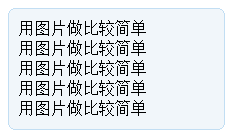
缺点:只用一张图片虽然比较好,但不够灵活,无法实现比较复杂的圆角效果,如有阴影的圆角,或其他比较好看的效果
案例2--本例用五个图片实现,使用的是滑动门法
<!DOCTYPE html>
<html lang="en">
<meta charset="utf-8" />
<meta name="viewport" content="width=device-width,initial-scale=1">
<head></head>
<style>
.container{margin:10px auto;width: 70%;}
#Content {width: 100%; background: url(left-top.png) top left no-repeat;}
.bTop {background: url(right-top.png) top right no-repeat;padding: 1.25em 1.25em 0.625em;}
.bBottom {background: url(left-bottom.png) bottom left no-repeat;}
.bBottom p {display: block;padding: 0.625em 1.25em 1.25em;margin: 0 0 0 0;background: url(right-bottom.png) bottom right no-repeat;}
.allcontent {background: url(right.png) top right repeat-y;padding: 0.625em 1.25em;}
</style>
<body>
<div class="container">
    <div id="Content">
        <div class="bTop"> </div>
        <div class="allcontent">
            <h2>Sylvan Skills Assessment</h2>
            <p>When it comes to tutoring services, Sylvan is the go-to educational resource for your local community because we believe that learning should be personal and dynamic. Utilizing technology (including iPads®) and digital lessons, we take learning to the next level of engagement and interactivity. Start your child on the path to success by partnering with Sylvan. Here's how it works:
            <br/>
            </p>
            <br style="clear:both;" />
        </div>
    </div>
    <div class="bBottom"><p> </p></div>
</div><!--mainContent end-->
</body>
</html>
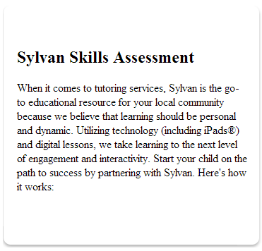
优点:可以实现各种复杂效果,只要改变相应的图片即可
缺点:资源使用比较多——图片多
转载于:https://www.cnblogs.com/JoannaQ/archive/2013/01/25/2876377.html