纯css 实现 三角形效果
1,首先,我创建了一个 class 名为 ‘box’ 的div,我们暂且亲切的称它为‘方块’
<html>
 		<!--方块的样式-->
 		<style>
        .box{
            width:20px;
            height:20px;
            background-color:blue;
         }
         </style>
         <div class='box'></div>
<html>
我们看一下效果, 其实就是一个普通的,背景颜色为蓝色的div。

2,我们给‘方块’添加四条边框样式,边框设置的宽一点, 四条边框的颜色给不一样的值, 方便我们查看
.box
        {
            width:50px;
            height:50px;
            background-color:blue;

            border-top:50px solid red;
            border-right:50px solid yellow;
            border-bottom:50px solid green;
            border-left:50px solid pink;
            }
看看效果
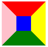
3,我们把‘方块’的宽高设置为0px,去掉蓝色的背景色, 当然就只剩下四周的边框了,脑补一下, 然后我们上代码,看一下效果。
.box
        {
            width:0px;
            height:0px;

            border-top:50px solid red;
            border-right:50px solid yellow;
            border-bottom:50px solid green;
            border-left:50px solid pink;
            }
看效果图, 我么们似乎已经看到了4个颜色不同的三角形了,接下来要做的步骤,就很清晰了。

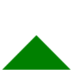
4,假设我们想要一个向上的三角形,只要把‘方块’上、右、左 方向边框的颜色设置为透明, 就只剩下下边框,也就是向上的小三角了, 来上代码!
 .box
        {
            width:0px;
            height:0px;

            border-top:50px solid rgba(0,0,0,0);
            border-right:50px solid  rgba(0,0,0,0);
            border-bottom:50px solid green;
            border-left:50px solid  rgba(0,0,0,0);
            }
看效果!绿色的向上的小三角就出现了, (o)/