版权声明:署名,允许他人基于本文进行创作,且必须基于与原先许可协议相同的许可协议分发本文 (Creative Commons)
下面介绍Flutter中的水平布局:
Flutter中的row控件就是水平控件,它可以让Row里边的子元素进行水平排列。
Row控件可以分为灵活排列和非灵活排列两种,这两种模式都需要熟练掌握,等经验丰富后可根据需求进行使用。
1、不灵水平布局
从字面上就可以理解到,不灵活就是根据Row子元素的大小,进行布局。如果子元素不足,它会留有空隙,如果子元素超出,它会警告。
比如现在我们要制作三个按钮,并让三个按钮同时在一排。我们写下了如下代码,但你会发现效果并不理想。
import 'package:flutter/material.dart';
//主函数(入口函数)
void main() {
     runApp(MyApp());
}
//声明MyApp类继承-StatelessWidget:具有不可变状态(state)的Widget(窗口小部件).
class MyApp extends StatelessWidget{
  @override
  Widget build(BuildContext context) {
    //返回一个material风格的组件
    return MaterialApp(
       title: 'Welcome to Flutter',
       //Scaffold:实现了基本的 Material 布局,可以理解为一个布局的容器
       home: Scaffold(                //home : 应用默认所显示的界面 Widget
          appBar: AppBar(
            title: Text('Welcome to Flutter'),
          ),
          body:Row(
            children: <Widget>[
              new RaisedButton(
                onPressed: (){},  //按钮点击事件
                color: Colors.orangeAccent,
                child: new Text('Orange Button'),
              ),
              new RaisedButton(
                onPressed: (){},
                color: Colors.redAccent,
                child: new Text('Red Button'),
              ),
              new RaisedButton(
                onPressed: (){},
                color: Colors.blueAccent,
                child: new Text('Blue Button'),
              ),
            ],
          )
        ),
       theme: new ThemeData(primaryColor: Colors.red),  // 设置主题颜色
    );
  }
}
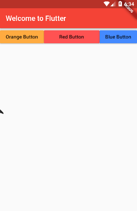
运行结果:
这时候你会发现的页面已经有了三个按钮,但这三个按钮并没有充满一行,而是出现了空隙。这就是不灵活横向排列造成的。它根据子元素的大小来进行排列。如果我们想实现充满一行的效果,就要使用灵活水平布局了。
2、灵活水平布局
解决上面有空隙的问题,可以使用 Expanded来进行解决,也就是我们说的灵活布局。我们在按钮的外边加入Expanded就可以了,代码如下:
import 'package:flutter/material.dart';
//主函数(入口函数)
void main() {
     runApp(MyApp());
}
//声明MyApp类继承-StatelessWidget:具有不可变状态(state)的Widget(窗口小部件).
class MyApp extends StatelessWidget{
  @override
  Widget build(BuildContext context) {
    //返回一个material风格的组件
    return MaterialApp(
       title: 'Welcome to Flutter',
       //Scaffold:实现了基本的 Material 布局,可以理解为一个布局的容器
       home: Scaffold(                //home : 应用默认所显示的界面 Widget
          appBar: AppBar(
            title: Text('Welcome to Flutter'),
          ),
          body:Row(
            children: <Widget>[
              Expanded(
                child:new RaisedButton(
                  onPressed: (){},  //按钮点击事件
                  color: Colors.orangeAccent,
                  child: new Text('Orange Button'),
              ),),
              Expanded(
                child:  new RaisedButton(
                  onPressed: (){},
                  color: Colors.redAccent,
                  child: new Text('Red Button'),
              ),),
               Expanded(
                child: new RaisedButton(
                  onPressed: (){},
                  color: Colors.blueAccent,
                  child: new Text('Blue Button'),
              ),),
            ],
          )
        ),
       theme: new ThemeData(primaryColor: Colors.red),  // 设置主题颜色
    );
  }
}
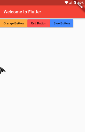
这时候就可以布满一行了,效果如下图:

3、灵活和不灵活的混用
如果这时候想让中间的按钮大,而两边的按钮保持真实大小,就可以不灵活和灵活模式进行混用,实现效果。代码和效果如下:
import 'package:flutter/material.dart';
//主函数(入口函数)
void main() {
     runApp(MyApp());
}
//声明MyApp类继承-StatelessWidget:具有不可变状态(state)的Widget(窗口小部件).
class MyApp extends StatelessWidget{
  @override
  Widget build(BuildContext context) {
    //返回一个material风格的组件
    return MaterialApp(
       title: 'Welcome to Flutter',
       //Scaffold:实现了基本的 Material 布局,可以理解为一个布局的容器
       home: Scaffold(                //home : 应用默认所显示的界面 Widget
          appBar: AppBar(
            title: Text('Welcome to Flutter'),
          ),
          body:Row(
            children: <Widget>[
              new RaisedButton(
                  onPressed: (){},  //按钮点击事件
                  color: Colors.orangeAccent,
                  child: new Text('Orange Button'),
              ),
              Expanded(
                child:  new RaisedButton(
                  onPressed: (){},
                  color: Colors.redAccent,
                  child: new Text('Red Button'),
              ),),
              new RaisedButton(
                  onPressed: (){},
                  color: Colors.blueAccent,
                  child: new Text('Blue Button'),
              ),
            ],
          )
        ),
       theme: new ThemeData(primaryColor: Colors.red),  // 设置主题颜色
    );
  }
}
运行效果如下: