1、源码
public Container(
            Key key = null,//唯一标识符
            Alignment alignment = null,//子元素的排列方式
            EdgeInsets padding = null,//内边距
            Color color = null,//颜色,
            Decoration decoration = null,//绘制在child后面的装饰,设置了decoration的话,就不能设置color属性,否则会报错,此时应该在decoration中进行颜色的设置。
            Decoration forgroundDecoration = null,//绘制在child前面的装饰。
            float? width = null,//container的宽度
            float? height = null,//container的高度
            BoxConstraints constraints = null,//添加到child上额外的约束条件
            EdgeInsets margin = null,//外边距
            Matrix3 transfrom = null,//变换矩阵
            Widget child = null//子元素
        )
2、例子
new Container(
           constraints:BoxConstraints.expand(
            height:Theme.of(context).textTheme.display1.fontSize*1.1f+200f
        ),
           decoration:new BoxDecoration(
               border: Border.all(width: 2.0f, color: Colors.red),
               color: Colors.grey,
               borderRadius: BorderRadius.all(Radius.circular(20.0f)),
               image:new DecorationImage(
                   image:new NetworkImage(@"https://hbimg.huabanimg.com/437658f08a68e1d24ea512b48b4a8cb7d808f3de25148-uBjU7Q_fw658"),
                   centerSlice: Unity.UIWidgets.ui.Rect.fromLTRB(270.0f, 180.0f, 1360.0f, 730.0f)
               )


           ),
           alignment:Alignment.center,
           padding:EdgeInsets.all(8),
               margin:EdgeInsets.all(10f),
            //    color:Colors.green,
               child:new Text(
                    "Hello World",
                    style:Theme.of(context)
                                .textTheme
                                .display1
                                .copyWith(color:Colors.black)

                 ),
                 transfrom:Matrix3.makeRotate(0.3f)
        );

3,简单使用
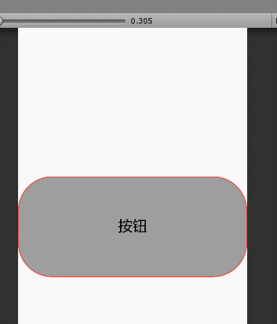
按钮的状态(正常态、点击态)的颜色变化;
new GestureDetector(
           child:new Container(
                constraints:BoxConstraints.expand(
                    height:Theme.of(context).textTheme.display1.fontSize*1.1f+200f
                ),
                decoration:new BoxDecoration(
                    border: Border.all(width: 2.0f, color: Colors.red),
                    color: btnColor,
                    borderRadius: BorderRadius.all(Radius.circular(80.0f))
                ),
                alignment:Alignment.center,
                padding:EdgeInsets.all(20),
                    margin:EdgeInsets.only(top:350),
                    //    color:Colors.green,
                    child:new Text(
                            "按钮",
                            style:Theme.of(context)
                                        .textTheme
                                        .display1
                                        .copyWith(color:Colors.black)

                        )

        ),
        onTapDown:(x)=>
        {
            setState(()=>{
                btnColor=Colors.blue;
            });
        },
        onTapUp:(x)=>{
            setState(()=>{
                btnColor=Colors.grey;
            });
        }
           )
       ;