用Bootstrap写一个类似于GitHub的登录界面
Bootstrap中文链接:https://code.z01.com/v4/
Bootstrap英文链接:https://getbootstrap.com/
logo来源:阿里巴巴矢量图标库:https://www.iconfont.cn/search/index?searchType=icon&q=github
我个人对GitHub的登录界面是比较喜欢的,简洁美观,布局合理,没有那么花里胡哨,登录页面的基本元素也都具备,设计得也很清晰直观,对整个的操作上来说也是简洁方便的,下面我们就用Bootstrap来实现一个类似的效果吧!有一些细节上没有做到完全一样,这是由于Bootstrap本身有着自己已经重写过的一些样式,并且Bootstrap本身提供的样式、组件以及布局基本上可以满足绝大部分的需求,所以在使用Bootstrap写页面的时候,我就想尽可能的不再自己去写样式和布局,要做的就是一些微调。下面看一下具体的代码:
代码:
<!-- login.html -->
<!DOCTYPE html>
<html lang="zh-cn">

<head>
  <!-- Required meta tags -->
  <meta charset="utf-8">
  <meta name="viewport" content="width=device-width, initial-scale=1, shrink-to-fit=no">
  <!-- Bootstrap CSS -->
  <link rel="stylesheet" href="https://stackpath.bootstrapcdn.com/bootstrap/4.3.1/css/bootstrap.min.css" integrity="sha384-ggOyR0iXCbMQv3Xipma34MD+dH/1fQ784/j6cY/iJTQUOhcWr7x9JvoRxT2MZw1T" crossorigin="anonymous">
  <link rel="stylesheet" href="login.css">
  <title>Github登录</title>
</head>

<body class="bg-light">
  <div class="container-fluid">
    <div class="row">
      <div class="col text-center py-4 mt-2">
        <img class="img-fluid" src="github.png" alt="GitHub">
      </div>
    </div>
    <div class="row">
      <div class="col text-center">
        <h4 class="text-muted font-weight-light mt-1">Sign in to Github</h4>
      </div>
    </div>
    <div class="row row-custom">
      <div class="col">
        <div class="bg-white p-4 mt-3 border rounded">
          <form>
            <div class="form-group">
              <label for="usernameInput" class="text-dark">Username or email address</label>
              <input type="text" class="form-control form-control-sm" id="usernameInput" placeholder="Enter username or email">
            </div>
            <div class="form-group">
              <label for="userpwdInput" class="text-dark d-block">Password
                <a class="text-primary float-right">Forgot password?</a>
              </label>
              <input type="password" class="form-control form-control-sm" id="userpwdInput" placeholder="Password">
            </div>
            <button type="submit" class="btn rounded-sm btn-primary-custom btn-block btn-sm text-white mt-4">Sign in</button>
          </form>
        </div>
      </div>
    </div>
    <div class="row mt-3 row-custom">
      <div class="col text-center">
        <div class="border py-3 rounded">
          <span>New to GitHub?</span>
          <a href="#">Create an account.</a>
        </div>
      </div>
    </div>
  </div>
  <!-- Optional JavaScript -->
  <!-- jQuery first, then Popper.js, then Bootstrap JS -->
  <script src="https://code.jquery.com/jquery-3.3.1.slim.min.js" integrity="sha384-q8i/X+965DzO0rT7abK41JStQIAqVgRVzpbzo5smXKp4YfRvH+8abtTE1Pi6jizo" crossorigin="anonymous"></script>
  <script src="https://cdnjs.cloudflare.com/ajax/libs/popper.js/1.14.7/umd/popper.min.js" integrity="sha384-UO2eT0CpHqdSJQ6hJty5KVphtPhzWj9WO1clHTMGa3JDZwrnQq4sF86dIHNDz0W1" crossorigin="anonymous"></script>
  <script src="https://stackpath.bootstrapcdn.com/bootstrap/4.3.1/js/bootstrap.min.js" integrity="sha384-JjSmVgyd0p3pXB1rRibZUAYoIIy6OrQ6VrjIEaFf/nJGzIxFDsf4x0xIM+B07jRM" crossorigin="anonymous"></script>
</body>

</html>
/*login.css*/
/*自定义Sign in 按钮的颜色*/
.btn-primary-custom {
  background-color: #28a745;
  background-image: linear-gradient(-180deg, #34d058, #28a745 90%);
}

.btn-primary-custom:hover {
  background-color: #269f42;
  background-image: linear-gradient(180deg, #2fcb53, #269f42 90%);
  border-color: rgba(27, 31, 35, .5);
}

a {
  cursor: pointer;
}

.row-custom {
  width: 340px;
  margin: 0 auto;
}
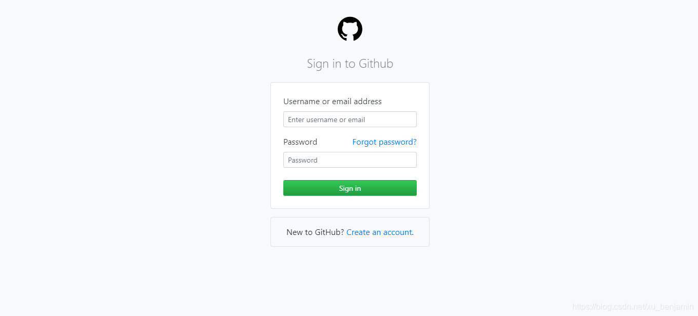
- github.png:

效果图
- 缩小后:
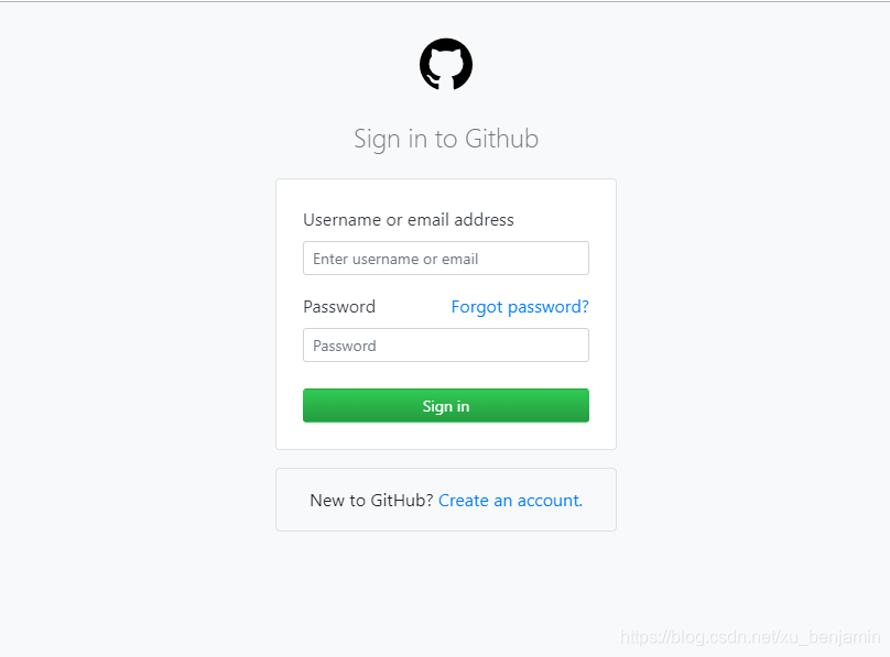
总体来说,整体的布局相对还是比较简单的,但是有一些细节上的东西还是值得说一下的。
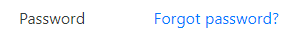
- 1、就是
Password和Forgot password?部分,因为label标签中的元素默认是左对齐的,这里是直接把Forgot password?放在a标签里然后直接放到label标签中,然后给a标签的class设置float-right,使其右对齐。但是这里会出现一个小问题,就是鼠标移至Forgot password?上时不会出现手型的标识,所以就直接在css文件中设置a { cursor: pointer; }。
<label for="userpwdInput" class="text-dark d-block">Password
   <a class="text-primary float-right">Forgot password?</a>
</label>
- 2、就是
Sign in按钮的背景渐变,这里我也尝试过多遍,但始终感觉和官网上的渐变有一些区别。这里就不再追求完全一样了,大致上是差不多的。
<button type="submit" class="btn rounded-sm btn-primary-custom btn-block btn-sm text-white mt-4">Sign in</button>
.btn-primary-custom {
  background-color: #28a745;
  background-image: linear-gradient(-180deg, #34d058, #28a745 90%);
}

.btn-primary-custom:hover {
  background-color: #269f42;
  background-image: linear-gradient(180deg, #2fcb53, #269f42 90%);
  border-color: rgba(27, 31, 35, .5);
}
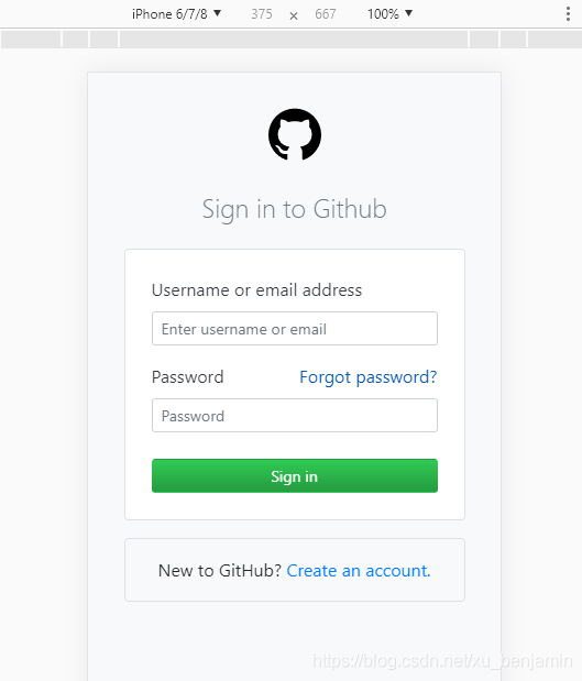
- 3、页面的兼容问题。通过放缩浏览器可以看到官网的登录界面的宽度是没有变化的,而且始终是居中的。关于页面兼容问题的处理办法其实是比较多的,Bootstrap本身也提供了针对不同尺寸设备的响应式支持,但是在这里通过设置断点来进行响应式的支持好像是比较麻烦的,并且好像是存在一些问题的,因为这个登录框这一部分在不同的页面的占比是不同的,所以这里我就从简处理了,直接把登录框(包括下方
New to GitHub? Create an account.)这一部分的宽度直接写死了:width: 340px;,然后设置margin: 0 auto;来使其居中。
<div class="row row-custom"></div>
.row-custom {
  width: 340px;
  margin: 0 auto;
}
总体来说,这个页面样式的设计实现基本上没有什么太大的难度,但是在兼容性和一些细节上的处理还是需要找一些比较好的办法来实现的。同样的一种效果其实通常会有很多种办法来实现,那么我们要做的就是找到一种更简洁的办法去实现同样的效果,尤其是在使用Bootstrap这种提供了完善且强大的布局和样式支持,在使用的时候就希望能够尽可能少的自己去写样式和调整布局。好的,就啰嗦这么多了
创作不易,喜欢的话加个关注点个赞,蟹蟹蟹蟹♪(・ω・)ノ