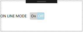
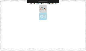
效果图:
工程:
<Window x:Class="ToggleButton.MainWindow"
        xmlns="http://schemas.microsoft.com/winfx/2006/xaml/presentation"
        xmlns:x="http://schemas.microsoft.com/winfx/2006/xaml"
        xmlns:d="http://schemas.microsoft.com/expression/blend/2008"
        xmlns:mc="http://schemas.openxmlformats.org/markup-compatibility/2006"
        xmlns:local="clr-namespace:ToggleButton"
        mc:Ignorable="d"
        Title="MainWindow" Height="150" Width="300">
    <Window.Resources>
        <Style x:Key="ButtonFocusVisual">
            <Setter Property="Control.Template">
                <Setter.Value>
                    <ControlTemplate>
                        <Rectangle Margin="2" SnapsToDevicePixels="true" Stroke="{DynamicResource {x:Static SystemColors.ControlTextBrushKey}}" StrokeThickness="1" StrokeDashArray="1 2"/>
                    </ControlTemplate>
                </Setter.Value>
            </Setter>
        </Style>
        <LinearGradientBrush x:Key="ButtonNormalBackground" EndPoint="0,1" StartPoint="0,0">
            <GradientStop Color="#F3F3F3" Offset="0"/>
            <GradientStop Color="#EBEBEB" Offset="0.5"/>
            <GradientStop Color="#DDDDDD" Offset="0.5"/>
            <GradientStop Color="#CDCDCD" Offset="1"/>
        </LinearGradientBrush>
        <SolidColorBrush x:Key="ButtonNormalBorder" Color="#FF707070"/>
        <Style x:Key="ToggleButtonStyle1" TargetType="{x:Type ToggleButton}">
            <Setter Property="FocusVisualStyle" Value="{StaticResource ButtonFocusVisual}"/>
            <Setter Property="Background" Value="{StaticResource ButtonNormalBackground}"/>
            <Setter Property="BorderBrush" Value="{StaticResource ButtonNormalBorder}"/>
            <Setter Property="BorderThickness" Value="1"/>
            <Setter Property="Foreground" Value="{DynamicResource {x:Static SystemColors.ControlTextBrushKey}}"/>
            <Setter Property="HorizontalContentAlignment" Value="Center"/>
            <Setter Property="VerticalContentAlignment" Value="Center"/>
            <Setter Property="Padding" Value="1"/>
            <Setter Property="Template">
                <Setter.Value>
                    <ControlTemplate TargetType="{x:Type ToggleButton}">
                        <StackPanel Orientation="Vertical">
                            <ContentPresenter HorizontalAlignment="{TemplateBinding HorizontalContentAlignment}" Margin="{TemplateBinding Padding}" RecognizesAccessKey="True" SnapsToDevicePixels="{TemplateBinding SnapsToDevicePixels}" VerticalAlignment="{TemplateBinding VerticalContentAlignment}"/>
                            <Border x:Name="on" Width="25" Height="25" Background="LightGray" CornerRadius="2,0,0,4">
                                <TextBlock x:Name="onText" Text="On" HorizontalAlignment="Center" VerticalAlignment="Center"/>
                            </Border>
                            <Border x:Name="off" Width="25" Height="25" Background="LightGray" CornerRadius="0,2,4,0">
                                <TextBlock x:Name="offText" Text="Off" HorizontalAlignment="Center" VerticalAlignment="Center"/>
                            </Border>
                        </StackPanel>
                        <ControlTemplate.Triggers>
                            <Trigger Property="IsEnabled" Value="false">
                                <Setter Property="Foreground" Value="#ADADAD"/>
                            </Trigger>
                            <Trigger Property="IsChecked" Value="true">
                                <Setter TargetName="on" Property="Background" Value="LightBlue"/>
                                <Setter TargetName="onText" Property="Foreground" Value="White"/>
                            </Trigger>
                            <Trigger Property="IsChecked" Value="False">
                                <Setter TargetName="off" Property="Background" Value="LightBlue"/>
                                <Setter TargetName="offText" Property="Foreground" Value="White"/>
                            </Trigger>
                        </ControlTemplate.Triggers>
                    </ControlTemplate>
                </Setter.Value>
            </Setter>
        </Style>
    </Window.Resources>
    <Grid>
        <ToggleButton Content="ON LINE MODE" Style="{StaticResource ToggleButtonStyle1}"/>
    </Grid>
</Window>
StackPanel Orientation="Vertical" 或 StackPanel Orientation="Horizontal"
参考文章:
https://stackoverflow.com/questions/38321275/toggle-button-in-wpf
