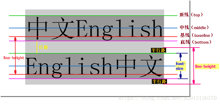
1.行高 line-height
- 浏览器默认文字大小:16px
- 行高是文本行基线间的垂直距离(基线与基线位置)
- 行高=文字高度+上下边距
行高实战
<!DOCTYPE html>
<html lang="en">
<head>
	<meta charset="UTF-8">
	<title>行高</title>
	<style type="text/css">
		a.one{
			text-decoration-line:none;
			display: inline-block;
			width:120px;
			height: 58px;
			background: url(bg1.png);
			color: white;
			text-align: center;
			line-height: 50px;
		}

		a.two{
			text-decoration-line:none;
			display: inline-block;
			width:120px;
			height: 58px;
			background: url(bg2.png);
			color: white;
			text-align: center;
			line-height: 50px;
		}
		a.three{
			text-decoration-line:none;
			display: inline-block;
			width:120px;
			height: 58px;
			background: url(bg3.jpg);
			color: white;
			text-align: center;
			line-height: 50px;
		}
		a.four{
			text-decoration-line:none;
			display: inline-block;
			width:120px;
			height: 58px;
			background: url(bg3.png);
			color: white;
			text-align: center;
			line-height: 50px;
		}
		a.one:hover{
			background: url(bg2.png);
		}
	</style>
</head>
<body>
	<a href="#" class="one">五彩导航</a>
	<a href="#" class="two">五彩导航</a>
	<a href="#" class="three">五彩导航</a>
	<a href="#" class="four">五彩导航</a>
</body>
</html>
行高单位
| 单位 | 文字大小 | 值 |
| px | 20px | 20px |
| em | 20px | 40px |
| % | 20px | 30px |
| 2 | 20px | 40px |
总结:单位除了像素以外,行高都是与文字大小乘积
| 行高单位 | 父元素文字大小 | 子元素文字大小 | 行高 |
| 40px | 20px | 30px | 40px |
| 2em | 20px | 30px | 40px |
| %150 | 20px | 30px | 30px |
| 2 | 20px | 30px | 60px |
总结:不带单位时,行高是和子元素文字大小相乘,em和%的行高是和父元素文字相乘,行高以像素为单位,就是定义行高值。 推荐行高使用像素为单位。
2. css盒子模型
1.边框 border
border-top-style:solid;实线 dotted;点线 dashed;虚线
border-top-color 颜色
border-top-width 宽度
以上属性可连写:border-top:red solid 12px; 线型必写
四个边框:border:red solid 12px;
边框合并:border-collaspe:collaspe
<!DOCTYPE html>
<html lang="en">
<head>
	<meta charset="UTF-8">
	<title></title>
	<style>
		table{
			width: 200px;
			height: 100px;
			border: 1px solid red;
            /*边框合并*/
			border-collapse: collapse;
		}
		td{
			border: 1px solid green;
		}
	</style>
</head>
<body>
	<table cellspacing="0">
		<tr>
			<td></td>
			<td></td>
		</tr>
		<tr>
			<td></td>
			<td></td>
		</tr>
		<tr>
			<td></td>
			<td></td>
		</tr>
		<tr>
			<td></td>
			<td></td>
		</tr>
		<tr>
			<td></td>
			<td></td>
		</tr>
	</table>
</body>
</html>
效果

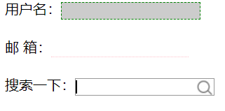
实战之表单控件
<!DOCTYPE html>
<html lang="en">
<head>
	<meta charset="UTF-8">
	<title>表单控件</title>
	<style>
		.username{
			border: 0 none; /*去掉边框,兼容性更好*/
			outline-style: none;/*去掉轮廓线*/
			/*重新定义*/
			background: #ccc;
			border: 1px dashed green;
		}
		.username:focus{
			background: red;
		}
		.email{
			border: 0 none; /*去掉边框,兼容性更好*/
			outline-style: none;/*去掉轮廓线*/
			/*重新定义*/
			border-bottom:1px dotted pink;
		}
		.search{
			border: 0 none; /*去掉边框,兼容性更好*/
			outline-style: none;/*去掉轮廓线*/
			/*重新定义*/
			border: 1px solid #999;
			background: url(1.jpg) no-repeat right;
		}
	</style>
</head>
<body>
	用户名:<input type="text" class="username"><br><br>
	邮 箱:<input type="text" class="email"><br><br>
	搜索一下:<input type="text" class="search">
</body>
</html>
效果图:
2. 内边距:padding
属性:padding-left、padding-right、padding-top、padding-bottom
简写:padding:20px;上右下左内边距都是20px
padding:20px 30px;上下20px ;左右30px
padding:20px 30px 40px;上内边距20px;左右内边距30px;下内边距40px
padding:20px 30px 40px 50px;上 20px;右30px;下40px;左50px;
内边距影响盒子大小:内边距会撑大盒子
影响盒子宽度的因素;
1. 内边距影响盒子的宽度;
2. 边框影响盒子的宽度;
盒子的宽度 = 定义的宽度+边框的宽度+左右内边距
注意:继承的盒子一般不会撑大
包含(嵌套)的盒子,如果子盒子没有定义宽度,给予盒子设置左右内边距,一般不会撑大盒子。
盒子之新浪导航案例
<!DOCTYPE html>
<html lang="en">
<head>
	<meta charset="UTF-8">
	<title>盒子模型</title>
	<style>
		.nav{
			height: 40px;
			background: #eee;
			border-top: 3px solid orange;
			border-bottom: 1px solid #aaa;
		}
		.nav_con{
			width: 1000px;
			background: #aaa;
			height: 40px;
			margin: 0 auto;
			/*line-height: 40px;*/
		}
		a{
			font: 12px/40px 微软雅黑;
			color: #333;
			display: inline-block;
			height: 40px;
			text-decoration: none;
			padding: 0 12px;
		}
		a:hover{
			background: #999;
			font: 14px;
		}
	</style>
</head>
<body>
	<div class="nav">
	<div nav_con>
		<a href="#">设置首页</a>
		<a href="#">手机新浪</a>
		<a href="#">移动客户</a>
	</div>
</div>
</body>
</html>
盒子模型存在疑惑有待提高?????
外边距
