利用CSS的float属性可以将元素并排,做出三列并排的布局。
如这样的效果
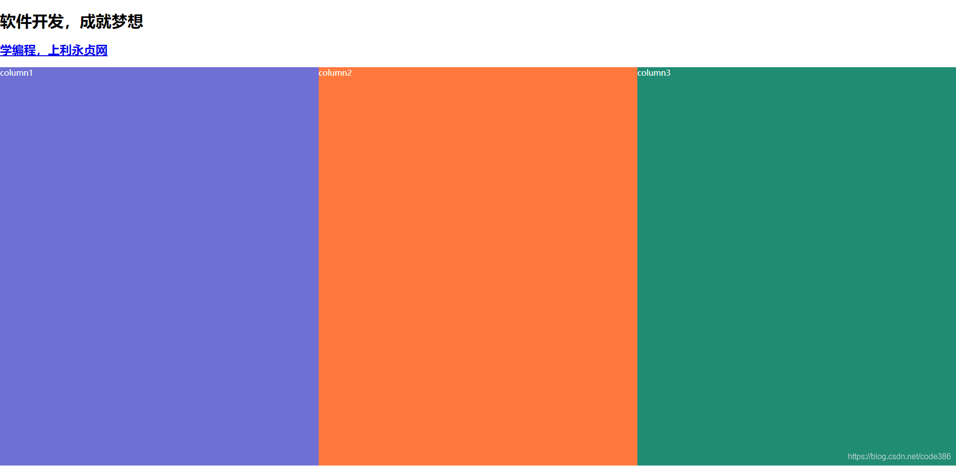
实现的原理:只要将3个元素设置float属性,属性值为left,同时指定不同比例的宽度,及高度。
下面是实现代码
<!DOCTYPE html>
<html>
	<head>
		<title>元素并排</title>
		<meta charset="UTF-8">
		<style type="text/css">
			body{margin:0px;padding:0px;}
			.column1{
				float:left;
				width:33.33333%;
				background-color:#706fd3;
				min-height:800px;
			}
			div{color:#fff;}
			.column2{
				float:left;
				width:33.33333%;
				background-color:#ff793f;
				min-height:800px;
			}
			.column3{
				float:left;
				width:33.33333%;
				background-color:#218c74;
				min-height:800px;
			}
	   </style>
	</head>
	<body>
		<h1>软件开发,成就梦想</h1>
        <h2><a href="https://www.liyongzhen.com/">学编程,上利永贞网</a></h2>
		<div>
			<div class="column1">column1</div>
			<div class="column2">column2</div>
			<div class="column3">column3</div>
		</div>
	</body>
</html>