1、border-radius 知识点:
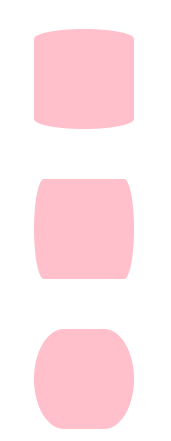
1.1、简单语法:
border-radius:length/persentage;
js语法:object.style.borderRadius="5px"
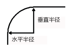
border-radius 属性是一个简写属性,用于设置四个 border-*-radius 属性。4个角(顺时针方向,左上,右上,右下,左下),每个角都有两个半径,水平半径和垂直半径,
如下图所示demo,就是每个圆角的水平、垂直半径都一样。数值越大,圆角弧度就越大
<html>
<head>
<meta charset="utf-8"/>
<title>内凹圆角</title>
<style type="text/css">
div{
	margin: 50px;
}
.test1{
	border-radius:20px;
	width: 100px;
	height: 100px;
	background: pink
}
.test2{
	border-top-left-radius:20px;
	border-top-right-radius:20px;
	border-bottom-right-radius:20px;
	border-bottom-left-radius:20px;
	width: 100px;
	height: 100px;
	background: pink
}
.test3{
	border-top-left-radius:10px;
	border-top-right-radius:30px;
	border-bottom-right-radius:40px;
	border-bottom-left-radius:50px;
	width: 100px;
	height: 100px;
	background: pink
}
</style>
</head>
<body>
<div class="test1"></div>
<div class="test2"></div>
<div class="test3"></div>
</body>
</html>
这2种写法是一样的,test1是test2的缩写,test3是不同的弧度演示
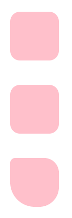
1.2、每个圆角都设置2组值,既水平半径和垂直半径不相同
语法:
border-radius:50px/10px;这样是一次性设置4个圆角都是一样的
依然沿用上面的html,
.test4{
	border-radius:50px/10px;
	width: 100px;
	height: 100px;
	background: pink
}
.test5{
	border-radius:10px/50px;
	width: 100px;
	height: 100px;
	background: pink
}
.test6{
	border-radius:30px/50px;
	width: 100px;
	height: 100px;
	background: pink
}
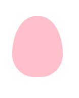
也可以针对每个圆角单独设置,比如画一个鸡蛋
.test7{
	width: 100px;
	height: 120px;
	background: pink;
	border-radius:60px 60px 60px 60px/100px 100px 60px 60px;
}
2、css内凹圆角
工作中经常用用到,显示圆角的按钮图片这种是比较简单也常见的效果。如果要实现内凹的圆角形状还是比较复杂的,例如这种
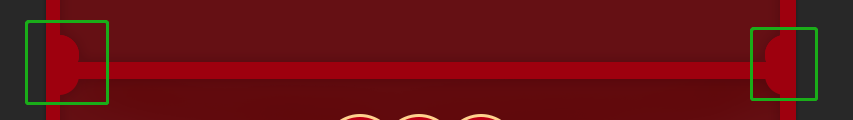
大概实现思路如下:
- 一个外层div,设置宽高,设置相对定位。
- 4个小的div,在外层div里面,通过border-radius进行不同方法的圆角设置
- 为这些小块加上不同方位的边框,通过对象定位,分别定位到外层div的
代码如下:
<html>
<head>
<meta charset="utf-8"/>
<title>内凹圆角</title>
<style type="text/css">
    .wrap {
        width: 200px;
        height: 200px;
        border: 1px solid red;
        position: relative;
        margin-top: 100px;
        margin-left: 100px;
    }

    .wrap_left_top, .wrap_right_top, .wrap_left_bottom, .wrap_right_bottom {
        position: absolute;
        width: 40px;
        height: 40px;
        border: 1px solid #fff;
        z-index: 1;
        background: pink;
    }

    .wrap_left_top {
        top: -1px;
        left: -1px;
        border-radius: 0 0 40px 0;
        border-bottom: 1px solid red;
        border-right: 1px solid red;
    }

    .wrap_right_top {
        top: -1px;
        right: -1px;
        border-radius: 0 0 0 40px;
        border-bottom: 1px solid red;
        border-left: 1px solid red;
    }

    .wrap_left_bottom {
        left: -1px;
        bottom: -1px;
        border-radius: 0 40px 0 0;
        border-top: 1px solid red;
        border-right: 1px solid red;
    }

    .wrap_right_bottom {
        right: -1px;
        bottom: -1px;
        border-radius: 40px 0 0 0;
        border-top: 1px solid red;
        border-left: 1px solid red;
    }
</style>
</head>
<body>
<div class="wrap">
    <div class="wrap_left_top"></div>
    <div class="wrap_right_top"></div>
    <div class="wrap_left_bottom"></div>
    <div class="wrap_right_bottom"></div>
</div>
</body>
</html>
最后,把4个小块的背景色去掉。就完成了

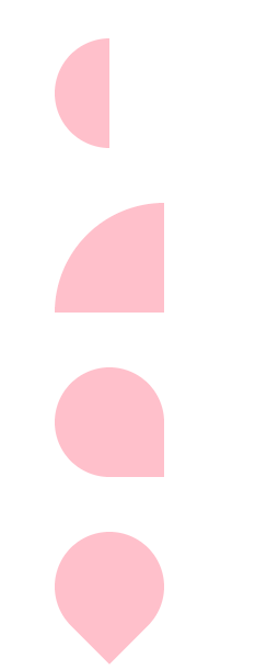
3、其他常用形状
/*圆圈*/
.other1{
	width: 100px;
	height: 100px;
	background: pink;
	border-radius: 50%;

}
/*半圆*/
.other2{
	width:50px;
	height: 100px;
	background: pink;
	border-radius: 50px 0 0 50px;

}
/*扇形*/
.other3{
	width: 100px;
	height: 100px;
	background: pink;
	border-radius: 100% 0 0 0;

}
/*花瓣 旋转一下也可以是水滴*/
.other4{
	width: 100px;
	height: 100px;
	background: pink;
	border-radius: 50% 50% 0 50%;
}
/*花瓣 旋转一下也可以是水滴*/
.other5{
	width: 100px;
	height: 100px;
	background: pink;
	border-radius: 50% 50% 0 50%;
	transform:rotate(45deg);
}