目录
一、概述
transition是CSS3新增加的属性,可以为同一元素的多个属性定义过渡动画。
二、详解
transition的定义和用法
transition是一个复合属性,用于设置元素的过渡动画,适用于所有元素,包括伪对象:after和:before,定义如下。
transition:transition-property||transition-duration||transition-timing-function||transition-delay// 缩写方式
transition:width .5s ease-in .1s, background-color .5s ease-in .1s;
// 拆分方式
transition-property: width, background-color
transition-duration: .5s, .5s;
transition-timing-function: ease-in, ease-in;
transition-delay: .1s, .1s;如果定义了多个过渡属性,而其它属性只有一个参数值,则表明所有需要过渡的属性都应用同一个参数值,据此可以对上面的例子进行缩写,如下所示。
transition-property: width, background-color
transition-duration: .5s;
transition-timing-function: ease-in;
transition-delay: .1s;
如果需要定义多个过渡属性且不想指定具体是哪些属性过渡,同时其它属性只有一个参数值,据此可以对上面的例子进行缩写,如下所示。
transition:all .5s ease-in .1s;transition的子属性
transition-property:        设置元素中参与过渡的属性, all表示所有属性
transition-duration:        设置元素过渡的持续时间
transition-timing-function: 设置元素过渡的动画类型, 常用的有linear(匀速)、ease(缓冲运动)
transition-delay:           设置元素延迟过渡的时间
// transition-timing-function属性值
linear: 线性过渡。等同于贝塞尔曲线(0.0, 0.0, 1.0, 1.0)
ease: 平滑过渡。等同于贝塞尔曲线(0.25, 0.1, 0.25, 1.0)
ease-in: 由慢到快。等同于贝塞尔曲线(0.42, 0, 1.0, 1.0)
ease-out: 由快到慢。等同于贝塞尔曲线(0, 0, 0.58, 1.0)
ease-in-out: 由慢到快再到慢。等同于贝塞尔曲线(0.42, 0, 0.58, 1.0)
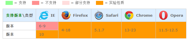
cubic-bezier(<number>, <number>, <number>, <number>): 特定的贝塞尔曲线类型,4个数值需在[0, 1]区间内transition的兼容性
三、代码实例
实例一:鼠标悬浮在圆形div上使之变大
<style>
    div {
        width: 200px;
        height: 200px;
        background-color: red;
        border-radius: 50%;
        transition: width 1s ease, height 1s ease, background-color 1s ease;
        -moz-transition: width 1s ease, height 1s ease, background-color 1s ease;
        -webkit-transition: width 1s ease, height 1s ease, background-color 1s ease;
        -o-transition: width 1s ease, height 1s ease, background-color 1s ease;
        -ms-transition: width 1s ease, height 1s ease, background-color 1s ease;
    }

    div:hover {
        width: 500px;
        height: 500px;
        background-color: aquamarine;
    }
</style>
<div></div>
实例二:鼠标移入图片时, 图片说明滑入的效果
<!--鼠标移入图片时, 图片说明滑入的效果-->
<style>
    .bg {
        width: 200px;
        height: 240px;
        background-color: red;
        overflow: hidden;
    }

    .desc {
        height: 120px;
        background-color: aquamarine;
        color: #fff;
        margin-top: 240px;
        transition: margin-top 1s ease 0.5s;
        -moz-transition: margin-top 1s ease 0.5s;
        -webkit-transition: margin-top 1s ease 0.5s;
        -o-transition: margin-top 1s ease 0.5s;
        -ms-transition: margin-top 1s ease 0.5s;
    }

    .bg:hover .desc {
        margin-top: 120px;
    }

    .clearfix:before {
        content: '';
    }
</style>
<div class="bg clearfix">
    <div class="desc clearfix">
        <h1>文字标题</h1>
        <p>鼠标移入图片时, 图片说明滑入的效果</p>
    </div>
</div>
实例三:背景颜色过渡
<style>
    h1 {
        font-size: 16px;
    }
    .test {
        overflow: hidden;
        width: 100%;
        margin: 0;
        padding: 0;
        list-style: none;
    }
    .test li {
        float: left;
        width: 100px;
        height: 100px;
        margin: 0 5px;
        border: 1px solid #ddd;
        background-color: #eee;
        text-align: center;
        -moz-transition: background-color .5s ease-in;
        -webkit-transition: background-color .5s ease-in;
        -o-transition: background-color .5s ease-in;
        -ms-transition: background-color .5s ease-in;
        transition: background-color .5s ease-in;
    }
    .test li:nth-child(1):hover {
        background-color: #bbb;
    }
    .test li:nth-child(2):hover {
        background-color: #999;
    }
    .test li:nth-child(3):hover {
        background-color: #630;
    }
    .test li:nth-child(4):hover {
        background-color: #090;
    }
    .test li:nth-child(5):hover {
        background-color: #f00;
    }
</style>
<h1>请将鼠标移动到下面的矩形上:</h1>
<ul class="test">
    <li>背景色过渡</li>
    <li>背景色过渡</li>
    <li>背景色过渡</li>
    <li>背景色过渡</li>
    <li>背景色过渡</li>
</ul>
