立体按压按钮
 鼠标点击->
<!DOCTYPE html>

<html>
<head>

<style>
a.button {
    position: relative;
    color: rgba(255,255,255,1);
    text-decoration: none;
    background-color: rgba(219,87,5,1);
    font-family: 'Yanone Kaffeesatz';
    font-weight: 700;
    font-size: 2em;
    display: block;
    padding: 4px;
    -webkit-border-radius: 8px;
    -moz-border-radius: 8px;
    border-radius: 8px;
    -webkit-box-shadow: 0px 9px 0px rgba(219,31,5,1), 0px 9px 25px rgba(0,0,0,.7);
    -moz-box-shadow: 0px 9px 0px rgba(219,31,5,1), 0px 9px 25px rgba(0,0,0,.7);
    box-shadow: 0px 9px 0px rgba(219,31,5,1), 0px 9px 25px rgba(0,0,0,.7);
    margin: 100px auto;
    width: 160px;
    text-align: center;

    -webkit-transition: all .1s ease;
    -moz-transition: all .1s ease;
    -ms-transition: all .1s ease;
    -o-transition: all .1s ease;
    transition: all .1s ease;
}

a.button:active {
    -webkit-box-shadow: 0px 3px 0px rgba(219,31,5,1), 0px 3px 6px rgba(0,0,0,.9);
    -moz-box-shadow: 0px 3px 0px rgba(219,31,5,1), 0px 3px 6px rgba(0,0,0,.9);
    box-shadow: 0px 3px 0px rgba(219,31,5,1), 0px 3px 6px rgba(0,0,0,.9);
    position: relative;
    top: 6px;
}

</style>

</head>
<body>
	<div>
		<a href="#" class="button">Push me!</a>
	</div>
</body>
</html>
科技边框1
<!DOCTYPE html>

<html>
<head>

<style>
body{
	background: #003366;
}
.sci{
	height: 180px;width: 400px;
	background: url(http://www.imaoda.com/s/img/tpl/content-frame1.png) no-repeat;
	background-size: contain;
	background-position: center;
	color: white;
	text-align: center;
}
</style>

</head>

<body>
	<div class='sci'><br> 科技边框 </div>
</body>
</html>
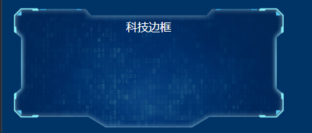
科技边框2

<!DOCTYPE html>

<html>
<head>


<style>
body{
	background: #003366;
}
.panel{
	height: 20rem; width: 40rem; color:rgba(255,255,255,.9);
	border: 20px solid transparent;
	border-image: url(http://www.imaoda.com/s/img/tpl/border.png) 5%;
	background:rgba(0,0,0,.3);
}
.panel:last-child{
	box-shadow:  0 0 5rem rgb(0,110,150)
}
</style>


</head>

<body>
        <br><br><br>
        <br><br><br>
        <br><br><br>
<div align="center">
    <div class='panel'>科技边框</div>
</div>
</body>
</html>
动态旋转边框

<!DOCTYPE html>

<html>
<head>

<style>
body{
	background: #003366;
}

.box{
  position: relative; width: 220px; height: 220px;
  display: flex; justify-content: center; align-items: center
}
.ring-inner{
  height: 220px; width: 220px; position: absolute;
  background: url(http://www.imaoda.com/s/img/tpl/ring-inner.png) no-repeat;
  background-size: 90%; background-position: center;
  animation: clockwise 3s linear infinite;
}
.ring-outer{
  height: 220px; width: 220px; position: absolute;
  background: url(http://www.imaoda.com/s/img/tpl/ring-outer.png) no-repeat;
  background-size: 100%;
  background-position: center;
  animation: anti-clockwise 3s linear infinite;
}
.avatar{
  height: 160px; width: 160px;
  background: url(http://www.imaoda.com/s/img/lessons/92.jpg);
  background-size: cover;
  border-radius: 50%
}
@keyframes clockwise{
  100%{
    transform: rotate(360deg)
  }
}
@keyframes anti-clockwise{
  0%{
    transform: rotate(360deg)
  }
}
</style>

</head>

<body>
	<div class='box'>
		<div class='ring-outer'></div>
		<div class='ring-inner'></div>
		<div class='avatar'></div>
	</div>
</body>
</html>
文本悬浮特效
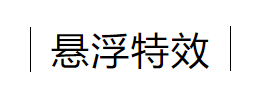 -->
-->
<!DOCTYPE html>

<html>
<head>

<style>
.indexbody a{
    padding: 0 20px;
    height: 45px;
    line-height: 45px;
    position: relative;
    display: inline-block;
    margin: 15px 25px;
    letter-spacing: 2px;
    font-weight: 400;
    font-size:38px;
    /*text-shadow: 0 0 1px rgba(255, 255, 255, 1);*/
    text-shadow:0px 9px 25px rgba(255,255,255, 1);
}

.indexbody a::before,
.indexbody a::after {
    position: absolute;
    width: 45px;
    height: 1px;
    background: #000000;
    content: '';
    -webkit-transition: all 0.3s;
    -moz-transition: all 0.3s;
    transition: all 0.3s;
    pointer-events: none;
}


.indexbody a::before {
    top: 0;
    left: 0;
    -webkit-transform: rotate(90deg);
    -moz-transform: rotate(90deg);
    transform: rotate(90deg);
    -webkit-transform-origin: 0 0;
    -moz-transform-origin: 0 0;
    transform-origin: 0 0;
}


.indexbody a::after {
    right: 0;
    bottom: 0;
    -webkit-transform: rotate(90deg);
    -moz-transform: rotate(90deg);
    transform: rotate(90deg);
    -webkit-transform-origin: 100% 0;
    -moz-transform-origin: 100% 0;
    transform-origin: 100% 0;
}


.indexbody a:hover::before,
.indexbody a:hover::after,
.indexbody a:focus::before,
.indexbody a:focus::after {
    background: #00000;   /*前后竖线移动后颜色*/
}

.indexbody a:hover::before,
.indexbody a:focus::before {
    left: 50%;
    -webkit-transform: rotate(0deg) translateX(-50%);
    -moz-transform: rotate(0deg) translateX(-50%);
    transform: rotate(0deg) translateX(-50%);
}

.indexbody a:hover::after,
.indexbody a:focus::after {
    right: 50%;
    -webkit-transform: rotate(0deg) translateX(50%);
    -moz-transform: rotate(0deg) translateX(50%);
    transform: rotate(0deg) translateX(50%);
}

.more-link {
    font-size: 1.5em;
    line-height: 100%;
}
</style>

</head>

<body>
    <div class="more indexbody">
        <br><br>
        <a>悬浮特效</a>
    </div>
</body>
</html>参考链接:https://blog.csdn.net/weixin_41871290/article/details/80855079
