<!--index.html-->
<!DOCTYPE html>
<html>
    <head>
        <meta charset="UTF-8">
        <meta name="viewport" content="width=device-width,initial-scale=1.0,user-scalable=no">
        <link rel="stylesheet" href="../src/index.css">
        <title>页面布局</title>
        <style>
            /* 头部导航条 */
            .tt-header{
                position: fixed;
                box-sizing: border-box;
                left: 0;
                right: 0;
                height: 2.3rem;
                top: 0;
                z-index: 200;
                border-bottom: 1px solid #ddd;
            }
            /* 内容区 */
            .tt-content{
                box-sizing: border-box;
                position: relative;
                overflow-y: auto;
                /* padding-top: 2.3rem;
                padding-bottom: 2.5rem; */
            }
            /* 根据header和navbar自动适应内容区高度,即有.tt-header时才会有 padding-top: 2.3rem; 有.tt-navbar时才会有 padding-top: 2.5rem;从而实现自适应*/
            .tt-header ~ .tt-content{
                padding-top: 2.3rem;
            }
            .tt-navbar ~ .tt-content{
                padding-bottom: 2.5rem;
            }
            /* 底部导航栏 */
            .tt-navbar{
                position: fixed;
                box-sizing: border-box;
                bottom: 0;
                width: 100%;
                left: 0;
                right: 0;
                height: 2.5rem;
                border-top: 1px solid #ddd;
                z-index: 200;
            }

            /* 页面蒙版 */
            .tt-mask{
                position: fixed;
                top: 0;
                bottom: 0;
                left: 0;
                right: 0;
                background: rgba(0,0,0,.5);
                z-index: 300;
            }
        </style>
    </head>
    <body>
        <div class="tt-header">
            标题栏
        </div>
        <div class="tt-navbar">
            导航栏
        </div>
        <div class="tt-content">
            内容区
        </div>
        <!-- 页面蒙版 -->
        <div class="tt-mask"></div>
    </body>
</html>
/*
*common.css:通用样式
*/
/* 屏幕宽度在340px至410px时,基准尺寸使用20px */
html{
font-size: 20px;
}
/* 屏幕宽度小于340px时,基准尺寸使用18px */
@media (max-width: 340px){
html{
font-size: 18px;
}
}
/* 屏幕宽度大于410px时,基准尺寸使用22px */
@media (min-width: 410px){
html{
font-size: 22px;
}
}
/* body默认样式 */
body{
background: #f8f8f8;
overflow-x: hidden;
-webkit-overflow-scrolling: touch;/**设置可以在ios上元素滚动带有弹性,滚动更顺滑,旨在webkit内核浏览器上有效**/
}
/**弹性布局类**/
.fixed{
position: fixed;
}
.position_lr_0{
right: 0;
left: 0;
}
.position_tb_0{
top: 0;
bottom: 0;
}
/**居中定位**/
.position_center{
position: fixed;
width: 300px;
height: 400px;
top: 0;
bottom: 0;
left: 0;
right: 0;
margin: auto;
}/*
*reset.css:重置样式文件
*/
/* 1.去掉所有元素的内外边距 */
html, body, div, span,
h1, h2, h3, h4, h5, h6, p, pre,
a, img, ul, li, form, label, input,
table, tbody, tfoot, thead, tr, th, td,
audio, video {
margin: 0;
padding: 0;
}
/* 2.统一全局字体 */
body {
font-family: -apple-system-font,BlinkMacSystemFont,"Helvetica Neue","PingFang SC","Hiragino Sans GB","Microsoft YaHei UI","Microsoft YaHei"
}
/* 3.列表元素去掉默认的列表样式 */
ol, ul {
list-style: none;
}
/* 4.Table元素的边框折叠 */
table {
border-collapse: collapse;
border-spacing: 0;
}
/* 5.去掉默认的下划线 */
a{
text-decoration: none;
}
/* 6去掉input自带的边缘效果和背景颜色 */
input{
outline: none;
background: none;
}/* index.css引入重置样式和通用样式以及字体图标 */
@import './reset.css';
@import './common.css';如头部导航的开发,实现左 中 右的布局:
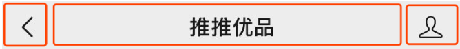
<div class="tt-header">
    <div class="left"><i class="fa fa-chevron-left"></i> 返回</div>
    <div class="title">我是标题</div>
    <div class="right"><i class="fa fa-ellipsis-h"></i></div>
</div>
<style>
/* 头部导航条 */
.tt-header{
+   display: flex;
    position: fixed;
    box-sizing: border-box;
    width: 100%;
    max-width: 640px;
    height: 2.3rem;
+   line-height: 2.3rem;
+   text-align: center;
    top: 0;
    z-index: 200;
    border-bottom: 1px solid #ddd;
+   background: #f8f8f8;
}
/* 左侧功能区 */
.tt-header > .left{
    flex-basis: 3rem;
    text-align: center;
    flex-shrink: 0;
}
/* 中间标题部分,超出省略 */
.tt-header > .title{
    flex-grow: 1;
    overflow: hidden;
    white-space: nowrap;
    text-overflow: ellipsis;
}
/* 右侧功能区 */
.tt-header > .right{
    flex-basis: 3rem;
    flex-shrink: 0;
}
</style>
底部导航的开发:
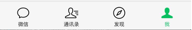
<div class="tt-navbar">
    <a class="navbar-item">
        <i class="fa fa-home icon"></i>
        <span class="name">首页</span>
    </a>
    <a class="navbar-item active">
        <i class="fa fa-list icon"></i>
        <span class="name">分类</span>
    </a>
    <a class="navbar-item">
        <i class="fa fa-search icon"></i>
        <span class="name">发现</span>
    </a>
    <a class="navbar-item">
        <i class="fa fa-user-o icon"></i>
        <span class="name">我的</span>
    </a>
</div>
<style>
/* 底部导航栏 */
.tt-navbar{
+   display: flex;
    position: fixed;
    box-sizing: border-box;
    bottom: 0;
    width: 100%;
    max-width: 640px;
    height: 2.5rem;
    border-top: 1px solid #ddd;
    z-index: 200;
+   background: #f8f8f8;
+   text-align: center;
}
/* 导航项目 */
.tt-navbar > .navbar-item{
    flex: 1;
    color: #808080;
}
/* 被选中的样式 */
.tt-navbar > .navbar-item.active{
    color: #09BB07;
}
/* 导航图标 */
.tt-navbar > .navbar-item > .icon{
    padding: .3rem 0 .1rem;
    font-size: 1.1rem;
}
/* 导航名称 */
.tt-navbar > .navbar-item > .name{
    display: block;
    font-size: .5rem;
}
</style>