纯CSS制作笑脸评分系统
教程地址:原文地址(YouTube)
B站教程:原文转载(bilibili)
两个视频的内容相同,第二个为转载
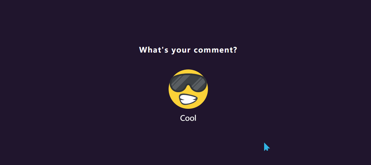
效果图
代码区
html
  <div class="rating">
    <input type="radio" name="star" id="star1" >
    <!-- for绑定对应ID -->
		<label for="star1">
			<img src="img/001.png" alt="">
			<h4>Sad</h4>
    </label>
    <!-- 默认选择的表情 -->
		<input type="radio" name="star" id="star2" checked='checked'>
		<label for="star2">
			<img src="img/002.png" alt="">
			<h4>Surprised</h4>
		</label>
		<h2 class=" text">What's your comment?</h2>
	</div>
CSS
* {
  margin: 0; /* 外边距 */
  padding: 0; /* 内边距 */
  box-sizing: border-box; /* 盒子大小规则 */
  font-family: sans-serif; /* 字体 */
}
body {
  display: flex; /* 弹性盒模型 */
  justify-content: center; /* 主轴对齐方式 */
  align-items: center; /* 交叉轴对齐方式 */
  min-height: 100vh; /* 最小高度 */
  background: #20152d; /* 背景 */
}
.rating {
  position: relative;
  display: flex;
  flex-direction: row-reverse; /* 弹性盒布局方向: 反向行 */
}
.rating input {
  display: none; /* 隐藏 */
}
.rating label {
  position: relative;
  width: 0; /* 宽度 */
  height: 128px;
  cursor: pointer; /* 鼠标样式 */
  transition: 0.5s;
  filter: grayscale(1); /* 灰阶过渡 */
  text-align: center; /* 字体水平居中 */
  opacity: 0; /* 透明度 */
}
.rating:hover label {
  width: 160px;
  opacity: 0.2;
}
.rating input:hover + label,
.rating input:checked + label{
  /* 悬停和选择时进行触发 */
  /* 通过修改灰阶和透明度进行显示 */
  filter: grayscale(0);
  opacity: 1;
  width: 160px;
}

img {
  height: 100%;
}
/* 图标下字体 */
.rating label h4 {
  color: #fff;
  font-size: 24px; /* 字体大小 */
  padding-top: 10px;
  font-weight: 500; /* 字体维度 */
  white-space: nowrap; /* 不换行 */
  opacity: 0;
  transform: translateY(-50px) scale(0); /* Y轴移动,放大 */
  transition: 0.5s;
}
.rating input:hover + label h4,
.rating input:checked + label h4{
  opacity: 1;
  transform: translateY(0px) scale(1);
}
/* 标题 */
.text {
  position: absolute;
  top: -80px;
  left: 50%;
  transform: translateX(-50%);
  color: #ffffff;
  width: 500px;
  font-weight: 700;
  letter-spacing: 2px; /* 字体间距 */
  text-align: center;
}
JS
教程地址:原文地址(YouTube)
B站教程:原文转载(bilibili)
