css3常用选择器
常用属性选择器
-
E[attr=‘val’]: 属性attr值为val的元素
-
E[attr~=‘val’]: 属性attr有多个值, 但其中一定有一个值是val
-
E[attr^=‘val’]: 属性值以val开头的元素
-
E[attr*=‘val’]: 属性值中包含val字符
-
E[attr$=‘val’]: 属性值以val结尾
<!DOCTYPE html>
<html lang="en">
<head>
    <meta charset="UTF-8">
    <meta name="viewport" content="width=device-width, initial-scale=1.0">
    <meta http-equiv="X-UA-Compatible" content="ie=edge">
    <title>css3常用属性选择器</title>
    <style>
        /* 找到type属性为text的input元素 */
        input[type='text'] {
            border: 1px solid tomato;
        }

        /* 找到class中带有handler属性的div元素 */
        div[class ~= 'handler'] {
            color: green;
        }

        /* 找到class属性以password开头的input元素 */
        input[class ^= 'password'] {
            border: 1px solid blue;
        }

        /* 找到class属性以p开头的input元素 */
        input[class ^= 'p'] {
            border: 1px solid gold;
        }

        /* 找到class属性以t结尾的div元素 */
        div[class $= 't'] {
            background-color: indianred;
        }

        /* 找到name中包含login的input元素 */
        input[name *= 'login'] {
            border: 1px solid saddlebrown;
        }
    </style>
</head>
<body>
    <form action="#">
        <input type="text">
        <input class="password input" type="password">
        <input type="number" name = 'loginId'>
    </form>

    <div class="box wrapper handler">hello</div>
    <div class="last">world</div>
</body>
</html>
常用同级选择器
E + F: 匹配所有紧随E元素之后的同级元素F, 这哥们F一定是要紧跟在E后面的, 中间空了一个元素都不成的
E ~ F: 匹配任何元素在E元素之后的同级F元素(兄弟选择器)
<!DOCTYPE html>
<html lang="en">
<head>
    <meta charset="UTF-8">
    <meta name="viewport" content="width=device-width, initial-scale=1.0">
    <meta http-equiv="X-UA-Compatible" content="ie=edge">
    <title>css3常用选择器</title>
    <style>
        /* 匹配类名队列中有一个类名为wrapper的属性, 然后找到他的直系子元素中的类名为.content-box
        的元素, 经过该元素找到他之后的所有为div的兄弟元素 并且设置背景色为salmon
         */
        div[class~='wrapper'] > .content-box ~ div {
            background-color: salmon;
        }

        /* 匹配类名字符串中有wra这三个字符的元素, 然后找到他的直系子元素中的类名为.content-box
        的元素, 经过该元素找到他之后的第一个div属性设置字体色为#fff
         */
        div[class*='wra'] > .content-box + div {
            color: #fff;
        }
    </style>
</head>
<body>
    <div class="wrapper">
        <div class="content-box">1</div>
        <div class="left-box">2</div>
        <div class="right-box">3</div>
    </div>
</body>
</html>
常用伪类选择器
-
E:not[attr]: 匹配元素中不是attr的元素, (attr可以是类名id名等)
-
E:first-child: 匹配父元素的第一个子元素, 且匹配到的该元素必须是E, E(element => 可以是li, div, p)
<!-- 比如 -->
<ul>
    <p>hello</p>
    <li>world</li>
</ul>
<!-- 像上面这种情况如果写li:first-child会匹配不到因为li的父元素的第一个子元素不是li -->
-
E:last-child: 匹配父元素的最后一个子元素 且匹配到的该元素必须是E, E(element => 可以是li, div, p)
-
E:nth-child(n): 匹配父元素的第n个子元素(正序)且匹配到的该元素必须是E, E(element => 可以是li, div, p)
-
E:nth-last-child(n): 匹配父元素的第n个子元素(倒序)且匹配到的该元素必须是E, E(element => 可以是li, div, p)
-
E:first-of-type: 匹配父元素的第一个E元素, 他会直接略过非E元素的子元素
<!-- 比如 -->
<ul>
    <p>hello</p>
    <li>world</li>
</ul>
<!-- 像上面这种情况如果写li:first-of-type, 当看到父元素的第一个子元素是p他会直接跳过知道找到第一个为li的子元素所以会匹配到<li>world</li> -->
-
E:last-of-type: 匹配父元素的最后一个E元素
-
E:nth-of-type: 匹配父元素的第n个E元素(正序)
-
E:nth-last-of-type: 匹配父元素的第n个E元素(倒序)
上面八个伪类选择器的实例如下
<!DOCTYPE html>
<html lang="en">
<head>
    <meta charset="UTF-8">
    <meta name="viewport" content="width=device-width, initial-scale=1.0">
    <meta http-equiv="X-UA-Compatible" content="ie=edge">
    <title>css3常用选择器</title>
    <style>
        /* 匹配li中类名不是active的所有li */
        li:not(.active) {
            color: blue;
        }

        /* 匹配li父元素的第一个子元素 -> 且这个第一个子元素必须是li */
        li:first-child {
            background-color: red;
        }

        /* 匹配li父元素的最后一个子元素 -> 且这个最后一个子元素必须是li */
        li:last-child {
            background-color: gold;
        }
        /* 匹配li父元素的第n个子元素 -> 且这个第n个子元素必须是li n从1开始*/
        li:nth-child(2) {
            background-color: green;
        }
        /* 匹配li父元素的第n个子元素(但是这个顺序是从后往前找倒数的) -> 且这个第n个子元素必须是li n从1开始*/
        li:nth-last-child(2) {
            background-color: hotpink;
        }
        /* 匹配li父元素的奇数个子元素 -> 且这个第n个子元素必须是li n从1开始*/
        li:nth-child(2n + 1) {
            color: lightseagreen;
        }

        /* 匹配到父元素的第一个元素类型为div的子元素 */
        div:first-of-type {
            background-color: brown;
        }

        /* 匹配到父元素的最后一个类型为.span类名的元素 */
        .span:last-of-type {
            color: #fff;
        }

        /* 匹配到.wrapper下div父元素的第一个div元素 */
        .wrapper > div:nth-of-type(1) {
            background-color: cornflowerblue;
        }
    </style>
</head>
<body>
    <ul>
        <li>2</li>
        <li>3</li>
        <li class="active">1</li>
        <li>4</li>
    </ul>

    <div class="wrapper">
        <p>hello</p>
        <div>world</div>
        <span class="span">yes</span>
        <div>no</div>
    </div>
</body>
</html>
- E:empty: 匹配元素内容是空的E元素, 元素内容不能有任何节点包括空格, 同时如果设置了伪元素但是本身元素内容为空, 也会视作匹配成功
<!DOCTYPE html>
<html lang="en">
<head>
    <meta charset="UTF-8">
    <meta name="viewport" content="width=device-width, initial-scale=1.0">
    <meta http-equiv="X-UA-Compatible" content="ie=edge">
    <title>css3常用选择器</title>
    <style>
        /* 匹配元素内容为空的div元素, 所以inner会被选中 */
        div:empty {
            border: 1px solid #ccc;
        }
    </style>
</head>
<body>
    <div>
        <div class='inner'></div>
    </div>
</body>
</html>
-
E:enable: 匹配表单中激活的元素
-
E:disabaled: 匹配表单中未激活的元素
-
E:checked: 匹配表单中选中的元素, 单选框或者复选框
-
E:target: 匹配当前被选中的锚点
-
:root: 根元素, 相当于html
上方五个选择器实例如下
<!DOCTYPE html>
<html lang="en">
<head>
    <meta charset="UTF-8">
    <meta name="viewport" content="width=device-width, initial-scale=1.0">
    <meta http-equiv="X-UA-Compatible" content="ie=edge">
    <title>css3常用选择器</title>
    <style>
        :root {
            width: 100%;
            height: 100%;
            background-color: firebrick;
        }

        /* 匹配禁用的input框 */
        input:disabled {
            background: cornflowerblue;
        }
        /* 匹配可输入的input框 */
        input:enabled {
            border: 1px solid tomato;
        }
        /* 匹配被选中的复选框 */
        input:checked {
           width: 500px;
        }
        /* 匹配于锚点响应的a链接 */
        a:target {
            display: block;
            width: 10px;
            height: 10px;
            background-color: dodgerblue;
        }
    </style>
</head>
<body>
    你好我是一名前端工程师
   <form action="">
        <input type="text" placeholder="请输入用户名" disabled>
        <input type="password">
        <label for="name">name</label><input type="checkbox" name="" checked id="name">
        <a id="1" href="#1">1</a>
   </form>
</body>
</html>
常用伪元素选择器
-
E::first-letter: 找到E元素的第一个字元素文本内容
-
E::first-line:找到E元素的第一行元素文本内容
-
::selection: 匹配用户选中文字
上方三个选择器实例如下
<!DOCTYPE html>
<html lang="en">
<head>
    <meta charset="UTF-8">
    <meta name="viewport" content="width=device-width, initial-scale=1.0">
    <meta http-equiv="X-UA-Compatible" content="ie=edge">
    <title>css3常用选择器</title>
    <style>
        /* 当文字被鼠标选中 */
        ::selection {
            color: gold;
        }
        /* 文本的第一个字 */
        ::first-letter {
            color: hotpink;
        }
        /* 文本的第一行 */
        ::first-line {
            color: indigo;
        }
    </style>
</head>
<body>
    你好我是一名前端工程师
</body>
</html>
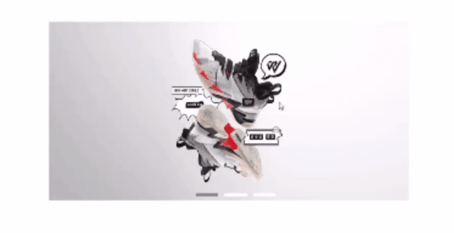
我们来根据上方的一些选择器做一个纯css的选项卡, 话不多说效果如图
先新建一个html页面
demo.html
<!DOCTYPE html>
<html lang="en">
<head>
    <meta charset="UTF-8">
    <meta name="viewport" content="width=device-width, initial-scale=1.0">
    <meta http-equiv="X-UA-Compatible" content="ie=edge">
    <title>纯css实现选项卡</title>
    <link rel="stylesheet" href="./demo.css">
</head>
<body>
    <!-- 选项卡wrapper -->
    <div class="tab-wrapper">
        <!-- 第一个tab -->
        <div class="first-tab tab">
            <input type="radio" checked name="listTab" id="first">
            <div class="show-content">
                <label for="first">
                    <a id="1" href="#1"></a>
                </label>
                <img src="https://c.static-nike.com/a/images/f_auto/dpr_1.0/w_1605,c_limit/e21582bd-8559-49df-8b33-983ef5d262a8/jordan.jpg" alt="">
            </div>
        </div>
        <!-- 第二个tab -->
        <div class="seccond-tab tab">
            <input type="radio" name="listTab" id="second">
            <div class="show-content">
                <label for="second">
                    <a id="2" href="#2"></a>
                </label>
                <img src="https://c.static-nike.com/a/images/f_auto/dpr_1.0/w_1605,c_limit/ca3676ef-d998-4363-a40e-0b6c8ae1b712/nike-.jpg" alt="">
            </div>
        </div>
        <!-- 第三个tab -->
        <div class="third-tab tab">
            <input type="radio" name="listTab" id="third">
            <div class="show-content">
                <label for="third">
                    <a id="3" href="#3"></a>
                </label>
                <img src="https://c.static-nike.com/a/images/f_auto/dpr_1.0/w_1717,c_limit/edd73182-1d29-478c-bd6e-2d38b00fb1e0/nike-.jpg" alt="">
            </div>
        </div>
    </div>
</body>
</html>
同时注册一个demo.css
/* 初始化wrapper */
.tab-wrapper {
    position: relative;
    width: 800px;
    height: 400px;
    margin: 100px auto;
}
/* 总共三个tab栏 */
.tab-wrapper .tab {
    position: absolute;
    left: 0;
    top: 0;
    width: 100%;
    height: 100%;
}

/* 给单选框全部都要消失 */
.tab-wrapper .tab input[type='radio'] {
    display: none;
}

/* 设置图片和图片容器的宽高 */
.tab-wrapper > .tab > .show-content, .tab-wrapper > .tab > .show-content > img {
    width: 100%;
    height: 100%;
}

/* label直接作为白色小方块的索引 */
.tab-wrapper .tab label {
    display: inline-block;
    width: 50px;
    height: 6px;
    font-size: 0;
    background-color: #fff;
    position: absolute;
    left: calc(50% - 10px);
    bottom: 10px;
    z-index: 999;
    cursor: pointer;
}

/* 图片默认都不展示 */
.tab-wrapper .tab .show-content img {
    opacity: 0;
    transition: opacity 0.5s linear;
}

/* 当点击label导致单选框被选中的时候图片的透明度变为1 */
.tab-wrapper .tab input[type = 'radio']:checked + .show-content > img {
    opacity: 1;

}

/* 同时也要更改选中的索引的颜色 */
.tab-wrapper .tab input[type = 'radio']:checked + .show-content label {
    background-color: rgba(0, 0, 0, 0.4);
}

.tab-wrapper .tab:first-of-type label {
    left: calc(42% - 10px);
}


.tab-wrapper .tab:nth-of-type(2) label {
    left: calc(50% - 10px);
}

.tab-wrapper .tab:last-of-type label {
    left: calc(58% - 10px);

}
无任何css我们的渐变选项卡就做好啦
