-
图的合并
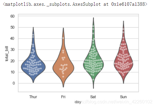
sns.violinplot(x='day',y='total_bill',data=tips,inner=None)
sns.swarmplot(x='day',y='total_bill',data=tips,color='w',alpha=.5)
运行结果:
-
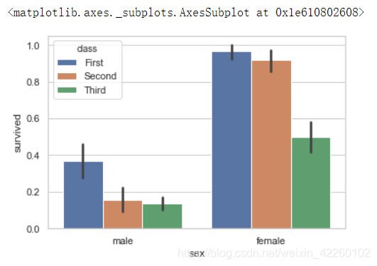
显示的集中趋势可以用条形图来表示
sns.barplot(x='sex',y='survived',hue='class',data=titanic)运行结果:
-
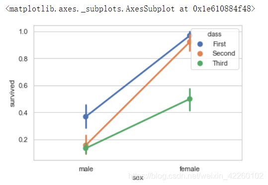
点图可以更好的表述变化差异
sns.pointplot(x='sex',y='survived',hue='class',data=titanic)运行结果:
-
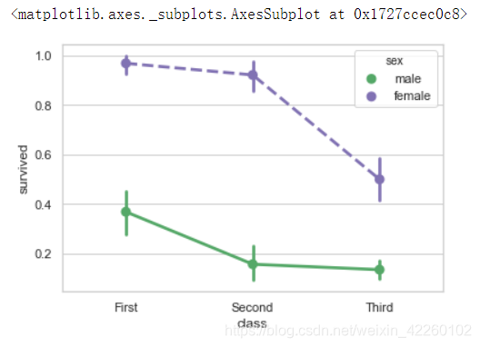
指定线型
sns.pointplot(x='class',y='survived',hue='sex',data=titanic,
              palette={'male':'g','female':'m'},
              marker={'`','o'},
              linestyles=['-','--'])
运行结果:
-
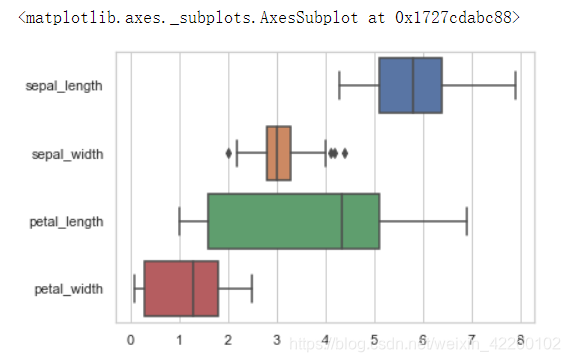
盒图横着画
sns.boxplot(data=iris,orient='h')运行结果:
-
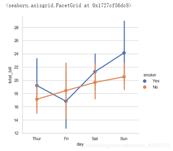
多面板分类图
sns.factorplot(x='day',y='total_bill',hue='smoker',data=tips)运行结果:
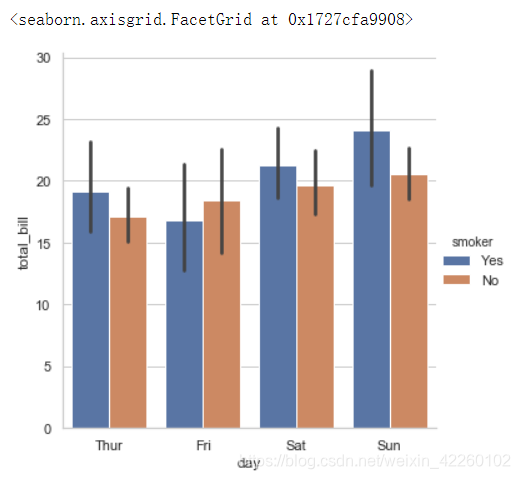
sns.factorplot(x='day',y='total_bill',hue='smoker',data=tips,kind='bar')运行结果:
sns.factorplot(x='day',y='total_bill',hue='smoker',data=tips,col='time',kind='swarm')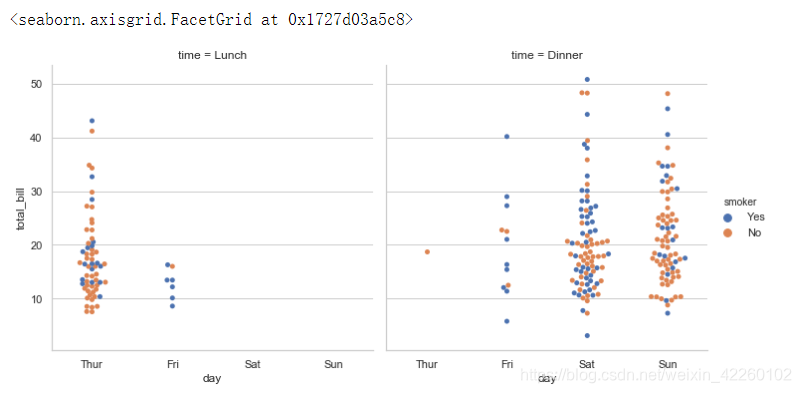
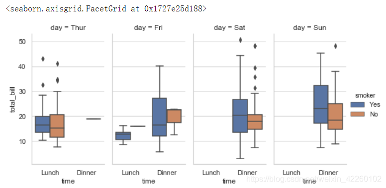
sns.factorplot(x='time',y='total_bill',hue='smoker',data=tips,
               col='day',kind='box',size=4,aspect=.5)
运行结果:
分类属性绘图

猜你喜欢
转载自blog.csdn.net/weixin_42260102/article/details/103450493
今日推荐
周排行