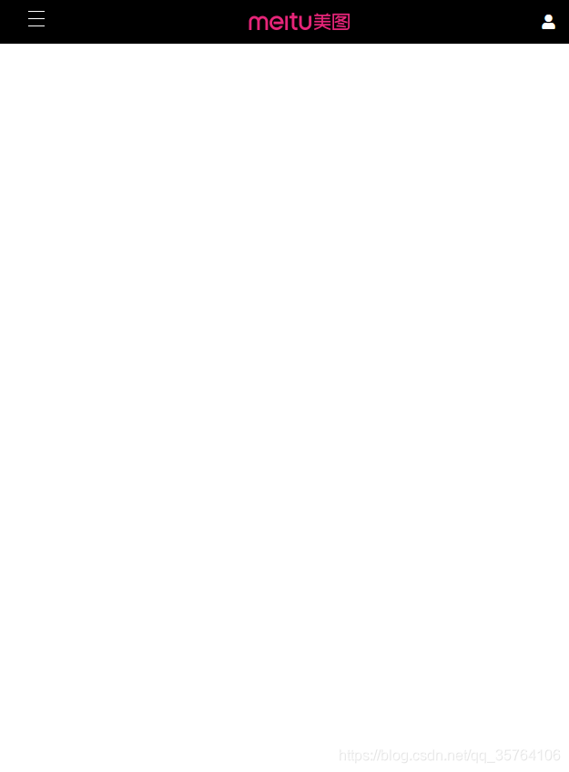
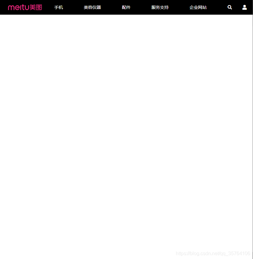
效果图
- 小于768px时
- 大于768px时
index.html
<!DOCTYPE html>
<html lang="zh">
<head>
<meta charset="UTF-8">
<meta name="viewport" content="width=device-width, initial-scale=1.0">
<link rel="stylesheet" href="./reset.css">
<link rel="stylesheet" href="./style.css">
<link rel="stylesheet" href="./fa/css/all.css">
<title>Document</title>
</head>
<body>
<div class="top-bar-wrapper">
<div class="top-bar">
<div class="left-menu">
<ul class="menu-btn">
<li></li>
<li></li>
<li></li>
</ul>
<ul class="menu-content">
<li><a href="#">手机</a></li>
<li><a href="#">美容仪器</a></li>
<li><a href="#">配件</a></li>
<li><a href="#">服务支持</a></li>
<li><a href="#">企业网站</a></li>
<li><a href="#"><i class="fas fa-search"></i></a>
<span>搜索Meitu.com</span>
</li>
</ul>
</div>
<h1 class="logo">
<a href="/">美图手机官网</a>
</h1>
<div class="user-info">
<a href="#"><i class="fas fa-user"></i></a>
</div>
</div>
</div>
</body>
</html>
style.less
.top-bar-wrapper{
    background-color: #000000;
    width: 100%;

    a{
        text-decoration: none;
        color: #ffffff;
    }
}

// 设置顶部导航条主体的样式
.top-bar{
    // 设置最大宽度,浏览器视口最大化时顶部导航条的内容也居中
    max-width: 1200px;
    width: 95%;
    height: 48px;
    margin: 0 auto;
    display: flex;
    justify-content: space-between;
    // align-items设置左侧菜单、中部logo和右侧用户信息垂直居中
    align-items: center;

    // 设置左侧菜单的样式
    .left-menu{
        width: 48px;
        height: 48px;

        // 设置菜单图标的样式
        .menu-btn{
            width: 100%;
            height: 100%;
            position: relative;

         li{
             height: 1px;
              width: 18px;
              background-color: #ffffff;
               position: absolute;
               left: 0;
               right: 0;
               margin: 0 auto;
               transition: .6s;
                // 改变Z轴旋转的原点
                transform-origin:0 0;
            }


           li:first-child{
               top: 12px;
           }

           li:nth-child(2){
                top:20px;
                // transition: 0s;
            }

           li:last-child{
               top:28px;
           }

           // 设置菜单图标鼠标移入的样式
            &:hover{
            // 第二条横杆消失
              li:nth-child(2){
                  display: none;
              }

            // 第一条横岗沿Z轴旋转40度
               li:first-child{
                 transform: rotateZ(60deg);
              }

            // 第三条横岗沿Z轴旋转-40度
              li:last-child{
                  transform: rotateZ(-60deg);
              }

             }
        }

        // 设置下拉菜单的样式
        .menu-content{
            display: none;
            position: absolute;
            background-color: #000000;
            top: 48px;
            // 把left、right、bottom设置为0,width和height是auto会自动填满背景
            left: 0;
            bottom: 0;
            right: 0;
            padding-top: 50px;

            li{
                width: 80%;
                height: 40px;
                line-height: 40px;
                margin: auto;
                border-bottom: 1px #272727 solid;

                &:last-child{
                    a {
                        display: inline-block
                    };
                }
            }

            a{
                font-size: 14px;
                display: block;

                &:hover{
                    color: #aaaaaa;
                }
            }

            span{
                margin-left: 6px;
                font-size: 14px;
                color: #ffffff;
            }
        }

         // 设置鼠标移入菜单图标后显示下拉菜单内容
         &:hover .menu-content{
            display: block;
        }
    }

    //设置中部logo的样式
    .logo{
        // text-indent把h1的文字隐藏
        text-indent: -9999px;

        a{
            width: 123px;
            height: 30px;
            display: block;
            background-image: url(./dff63979.sprites-index@2x.png);
            // 原雪碧图是800x800的2倍图,需要缩放
            background-size: 400px 400px;
            transition: .3s;
        }

        &:hover a{
            // 利用opacity设置鼠标移入后背景图片颜色变淡
            opacity: .7;
        }
    }

    // 设置右侧用户信息鼠标移入的样式
    .user-info:hover a{
        display: block;
        color: #aaaaaa;
    }

    // 设置媒体查询,视口宽度大于768px的样式
    @media only screen{
        @media (min-width:768px){
            // 改变菜单、logo、用户信息的样式,为其设置order
            .logo{
                order: 1;
            }

            .left-menu{
                order: 2;
                height: 48px;
                // 利用flex自动调整和logo、和用户信息的间距
                // 若设置为width:auto,会变得很短,auto是靠内容撑起
                flex: auto;


                 // 隐藏菜单的横杆图标
                 .menu-btn{
                    display: none;
                }

                &:hover .menu-content{
                    display: flex;
                }

                // 改变下拉菜单的样式,使其横置
                .menu-content{

                    display: flex;
                    // 关闭定位
                    position: static;
                    padding-top: 0;
                    justify-content: space-between;


                    li{
                        // 取消移动端页面原先设置的样式
                        // 此处不应设置为flex:auto,因为li的长度本来就是其内容撑开
                        width: auto;
                        border-bottom: none;
                    }

                    a{
                        line-height: 48px;
                    }

                    span{
                        display: none
                    }
                }
            }

            .user-info{
                order: 3;
            }
        }
    }

}
