结构
    <div class="item">
      <div class="photo"></div>
      <div class="text">
        <div class="title">
          <div>樱桃小丸子</div>
          <div>2020-01-01</div>
        </div>
        <div class="content">
          樱桃小丸子樱桃小丸子樱桃小丸子樱桃小丸子樱桃小丸子樱桃小丸子
          樱桃小丸子樱桃小丸子樱桃小丸子樱桃小丸子樱桃小丸子樱桃小丸子
          樱桃小丸子樱桃小丸子樱桃小丸子樱桃小丸子樱桃小丸子樱桃小丸子
          樱桃小丸子樱桃小丸子樱桃小丸子樱桃小丸子樱桃小丸子樱桃小丸子
        </div>
      </div>
    </div>
样式
    .item {
      width: 600px;
      display: flex;
      margin-bottom: 20px;
    }

    .photo {
      height: 60px;
      width: 60px;
      background-color: #666;
      border-radius: 15px;
      margin-right: 20px;
    }

    .text {
      flex: 1;
      padding: 20px;
      background-color: #d7d7d7;
      border-radius: 15px;
    }

    .title {
      display: flex;
      justify-content: space-between;
      margin-bottom: 10px;
    }

    .content {
      text-indent: 2em;
    }
效果
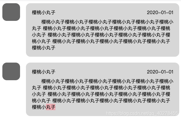
使用flex布局轻松完成~
