Switch 和 Checkbox 分别代表开关按钮和复选框。这在 Android 开发中也是常用的控件。
一、Switch
创建 material 设计风格开关。Switch 非常简单,只有两种状态,要么开要么关。它继承自 StatefulWidget 。
Switch 本身不保持任何状态。 相反,当 Switch 的状态更改时,Widget 将调用 [onChanged] 回调。 大多数使用 Switch 的 Widget 将监听 [onChanged] 回调,并使用新的 [value] 重建 Switch 以更新 Switch 的外观。
以下参数是必须的:
value ---- 确定此 Switch 是打开还是关闭。
onChanged ---- 当用户打开或关闭 Switch 时,将调用 [onChanged]。
  const Switch({
    Key key,
    @required this.value,
    @required this.onChanged,
    this.activeColor,
    this.activeTrackColor,
    this.inactiveThumbColor,
    this.inactiveTrackColor,
    this.activeThumbImage,
    this.inactiveThumbImage,
    this.materialTapTargetSize,
    this.dragStartBehavior = DragStartBehavior.start,
  })
activeColor ---- 激活颜色,也就是此开关打开时使用的颜色。
activeTrackColor ---- 开关打开时在轨道上使用的颜色。默认为 [ThemeData.toggleableActiveColor],不透明度设置为50%。
inactiveThumbColor ---- 关闭此开关时在 Thumb (圆巴巴)上使用的颜色。
inactiveTrackColor ---- 关闭此开关时在轨道上使用的颜色。默认为 material 设计规范中描述的颜色。
activeThumbImage ---- 开关打开时在此开关的 Thumb 上使用的图像。

inactiveThumbImage ---- 开关关闭时在此开关的 Thumb 上使用的图像。
materialTapTargetSize ---- 配置点击目标的最小尺寸。
dragStartBehavior ---- 偏移的配置传递给 [DragStartDetails]。设置确定用户开始拖动时拖动何时正式开始。
enum DragStartBehavior {
  /// 在检测到第一个按下事件的位置设置初始偏移量。
  down,

  /// 将初始位置设置在检测到拖动开始事件的位置。
  start,
}
下面来定义一个按钮详细了解它的用法。我们创建了是个开关,第一个只是简单的使用;第二个自定义了按钮打开和关闭时的颜色(包括轨道颜色);第三个自定义了打开时Thumb图像;第四个修改了dragStartBehavior。
class _MyHomePageState extends State<MyHomePage> {
  bool _switchSelected1 = true;
  bool _switchSelected2 = true;
  bool _switchSelected3 = true;
  bool _switchSelected4 = true;

  @override
  Widget build(BuildContext context) {
    return Scaffold(
        appBar: AppBar(
          title: Text("Home Page"),
        ),
        body: Column(
          mainAxisAlignment: MainAxisAlignment.center,
          children: <Widget>[
            Row(mainAxisAlignment: MainAxisAlignment.center, children: <Widget>[
              Switch(
                value: _switchSelected1,
                onChanged: (value) {
                  print("switch1 value = $value");
                  setState(() {
                    _switchSelected1 = value;
                  });
                },
              ),
            ]),
            Row(mainAxisAlignment: MainAxisAlignment.center, children: <Widget>[
              Switch(
                value: _switchSelected2,
                onChanged: (value) {
                  print("switch2 value = $value");
                  setState(() {
                    _switchSelected2 = value;
                  });
                },
                activeColor: Colors.red,
                activeTrackColor: Colors.green,
                inactiveThumbColor: Colors.grey,
                inactiveTrackColor: Colors.blue,
              ),
            ]),
            Row(mainAxisAlignment: MainAxisAlignment.center, children: <Widget>[
              Switch(
                value: _switchSelected3,
                onChanged: (value) {
                  print("switch3 value = $value");
                  setState(() {
                    _switchSelected3 = value;
                  });
                },
                activeThumbImage: AssetImage("images/image.jpg"),
              ),
            ]),
            Row(mainAxisAlignment: MainAxisAlignment.center, children: <Widget>[
              Switch(
                value: _switchSelected4,
                onChanged: (value) {
                  print("switch4 value = $value");
                  setState(() {
                    _switchSelected4 = value;
                  });
                },
                dragStartBehavior: DragStartBehavior.down,
              ),
            ]),
          ],
        ));
  }
}

下面是操作后的log。
I/flutter ( 3390): switch1 value = false
I/flutter ( 3390): switch1 value = true
I/flutter ( 3390): switch1 value = false
I/flutter ( 3390): switch2 value = false
I/flutter ( 3390): switch2 value = true
I/flutter ( 3390): switch2 value = false
I/flutter ( 3390): switch2 value = true
I/flutter ( 3390): switch3 value = false
I/flutter ( 3390): switch3 value = true
I/flutter ( 3390): switch3 value = false
I/flutter ( 3390): switch3 value = true
I/flutter ( 3390): switch4 value = false
I/flutter ( 3390): switch4 value = true
I/flutter ( 3390): switch4 value = false
I/flutter ( 3390): switch4 value = true
二、Checkbox
复选框,多个选项可以勾选的时候非常有用,多选题实现多个答案选中就需要用到复选框。
和 Switch Widget 类似,两个 Field 是必须的。
value ---- 它确定是否选中该复选框。 如果 [tristate] 为 true,则 [value] 只能为 null。
onChanged ---- 当复选框的值更改时调用。可以将其设置为 null 以禁用该复选框。
  const Checkbox({
    Key key,
    @required this.value,
    this.tristate = false,
    @required this.onChanged,
    this.activeColor,
    this.checkColor,
    this.materialTapTargetSize,
  })
tristate ---- 如果为true,则复选框的 [value] 可以为 true,false 或 null。如果复选框的值为空,则显示一个破折号。
activeColor ---- 选中此复选框时使用的颜色。
checkColor ---- 选中此复选框时用于选中图标的颜色。
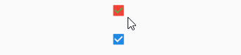
下面定义了两个Checkbox,第一个设置了 activeColor 和 checkColor;第二个设置 tristate 为 true 时的效果。
            Row(mainAxisAlignment: MainAxisAlignment.center, children: <Widget>[
              Checkbox(
                value: _checkboxSelected1,
                onChanged: (value) {
                  print("checkbox1 value = $value");
                  setState(() {
                    _checkboxSelected1 = value;
                  });
                },
                activeColor: Colors.red,
                checkColor: Colors.green,
              ),
            ]),
            Row(mainAxisAlignment: MainAxisAlignment.center, children: <Widget>[
              Checkbox(
                value: _checkboxSelected2,
                onChanged: (value) {
                  print("checkbox2 value = $value");
                  setState(() {
                    _checkboxSelected2 = value;
                  });
                },
                tristate: true,
              ),
            ]),
这是对应的操作log。
03-09 02:47:58.820 3390-3404/com.example.flutter_app I/flutter: checkbox1 value = false
03-09 02:48:00.682 3390-3404/com.example.flutter_app I/flutter: checkbox1 value = true
03-09 02:48:02.675 3390-3404/com.example.flutter_app I/flutter: checkbox1 value = false
03-09 02:48:05.842 3390-3404/com.example.flutter_app I/flutter: checkbox2 value = null
03-09 02:48:08.442 3390-3404/com.example.flutter_app I/flutter: checkbox2 value = false
03-09 02:48:09.980 3390-3404/com.example.flutter_app I/flutter: checkbox2 value = true
03-09 02:48:11.026 3390-3404/com.example.flutter_app I/flutter: checkbox2 value = null
03-09 02:48:11.982 3390-3404/com.example.flutter_app I/flutter: checkbox2 value = false
最后是完整 Demo 的代码。
import 'package:flutter/gestures.dart';
import 'package:flutter/material.dart';

void main() => runApp(MyApp());

class MyApp extends StatelessWidget {
  // This widget is the root of your application.
  @override
  Widget build(BuildContext context) {
    return MaterialApp(
      title: 'Flutter Demo',
      theme: ThemeData(
        primarySwatch: Colors.blue,
      ),
      home: MyHomePage(),
    );
  }
}

class MyHomePage extends StatefulWidget {
  @override
  _MyHomePageState createState() => _MyHomePageState();
}

class _MyHomePageState extends State<MyHomePage> {
  bool _switchSelected1 = true;
  bool _switchSelected2 = true;
  bool _switchSelected3 = true;
  bool _switchSelected4 = true;

  bool _checkboxSelected1 = true;
  bool _checkboxSelected2 = true;

  @override
  Widget build(BuildContext context) {
    return Scaffold(
        appBar: AppBar(
          title: Text("Home Page"),
        ),
        body: Column(
          mainAxisAlignment: MainAxisAlignment.center,
          children: <Widget>[
            Row(mainAxisAlignment: MainAxisAlignment.center, children: <Widget>[
              Switch(
                value: _switchSelected1,
                onChanged: (value) {
                  print("switch1 value = $value");
                  setState(() {
                    _switchSelected1 = value;
                  });
                },
              ),
            ]),
            Row(mainAxisAlignment: MainAxisAlignment.center, children: <Widget>[
              Switch(
                value: _switchSelected2,
                onChanged: (value) {
                  print("switch2 value = $value");
                  setState(() {
                    _switchSelected2 = value;
                  });
                },
                activeColor: Colors.red,
                activeTrackColor: Colors.green,
                inactiveThumbColor: Colors.grey,
                inactiveTrackColor: Colors.blue,
              ),
            ]),
            Row(mainAxisAlignment: MainAxisAlignment.center, children: <Widget>[
              Switch(
                value: _switchSelected3,
                onChanged: (value) {
                  print("switch3 value = $value");
                  setState(() {
                    _switchSelected3 = value;
                  });
                },
                activeThumbImage: AssetImage("images/image.jpg"),
              ),
            ]),
            Row(mainAxisAlignment: MainAxisAlignment.center, children: <Widget>[
              Switch(
                value: _switchSelected4,
                onChanged: (value) {
                  print("switch4 value = $value");
                  setState(() {
                    _switchSelected4 = value;
                  });
                },
                dragStartBehavior: DragStartBehavior.down,
              ),
            ]),
            Row(mainAxisAlignment: MainAxisAlignment.center, children: <Widget>[
              Checkbox(
                value: _checkboxSelected1,
                onChanged: (value) {
                  print("checkbox1 value = $value");
                  setState(() {
                    _checkboxSelected1 = value;
                  });
                },
                activeColor: Colors.red,
                checkColor: Colors.green,
              ),
            ]),
            Row(mainAxisAlignment: MainAxisAlignment.center, children: <Widget>[
              Checkbox(
                value: _checkboxSelected2,
                onChanged: (value) {
                  print("checkbox2 value = $value");
                  setState(() {
                    _checkboxSelected2 = value;
                  });
                },
                tristate: true,
              ),
            ]),
          ],
        ));
  }
}
