  <table class="table table-bordered table-sm">
            <thead>
            <tr>
                <th>操作</th>
            </tr>
            </thead>
            <tbody id="tbody">
            {% for student in object_list %}
                <tr>
                     <td>
                        <a class="btn btn-sm btn-success" href="{% url 'd3:StudentUpdateChuhe' student.id %}">初核</a>
                    </td>

                </tr>
            {% empty %}
                <tr>
                    <td colspan="99">没有检索到数据</td>
                </tr>
            {% endfor %}
            </tbody>
        </table>
因为是responsive模式,table里面的内容自动折行,不太好看
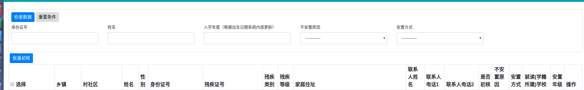
修改:
关键1: table加上 text-nowrap
<table class="table table-bordered table-striped table-sm text-nowrap">
加上后,随不这行了,但是屏幕布局变了,右侧拉伸很多。

关键2:把整个table放入 如下的 div中
<div style="overflow:scroll;">
   <table class="table table-bordered table-striped table-sm text-nowrap">
      省略

   </table>
</div>