从本讲开始,我们开始正式地将组件。如果你参与过窗体设计,你肯定会了解什么是组件。Element的所有组件都经过精心的设计,以至于其非常美丽。
Element 03~Element 10主要讲述Basic组件,分别是
Layout 布局
Container 布局容器
Color 色彩
Typography 字体
Border 边框
Icon 图标
Button 按钮
Link 文字链接
今天我们将Layout 布局。
布局,就是把一块内容通过特定的方式来分布。比如我的博客就是25%+50%+25%来布局的。使用Element,可以轻松地对于网页进行单排甚至多排的平行布局,同时可以使网页多布局化,以适用于企业网站。
首先我们来将什么是 基础布局。基础布局,就是使用单一分栏创建基础的栅格布局。通过el-row和el-col组件,并通过el-col组件的span属性我们就可以自由地组合布局。
这里说明一下,Element的所有组件都是由el-开头。这也是和Foundation可以共存的原因。
首先给大家查看普通布局的效果:
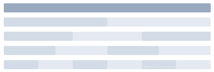
每一种颜色都可以代表其内容。
代码实现:
<el-row>
  <el-col :span="24"><div class="grid-content bg-purple-dark"></div></el-col>
</el-row>
<el-row>
  <el-col :span="12"><div class="grid-content bg-purple"></div></el-col>
  <el-col :span="12"><div class="grid-content bg-purple-light"></div></el-col>
</el-row>
<el-row>
  <el-col :span="8"><div class="grid-content bg-purple"></div></el-col>
  <el-col :span="8"><div class="grid-content bg-purple-light"></div></el-col>
  <el-col :span="8"><div class="grid-content bg-purple"></div></el-col>
</el-row>
<el-row>
  <el-col :span="6"><div class="grid-content bg-purple"></div></el-col>
  <el-col :span="6"><div class="grid-content bg-purple-light"></div></el-col>
  <el-col :span="6"><div class="grid-content bg-purple"></div></el-col>
  <el-col :span="6"><div class="grid-content bg-purple-light"></div></el-col>
</el-row>
<el-row>
  <el-col :span="4"><div class="grid-content bg-purple"></div></el-col>
  <el-col :span="4"><div class="grid-content bg-purple-light"></div></el-col>
  <el-col :span="4"><div class="grid-content bg-purple"></div></el-col>
  <el-col :span="4"><div class="grid-content bg-purple-light"></div></el-col>
  <el-col :span="4"><div class="grid-content bg-purple"></div></el-col>
  <el-col :span="4"><div class="grid-content bg-purple-light"></div></el-col>
</el-row>

<style>
  .el-row {
    margin-bottom: 20px;
    &:last-child {
      margin-bottom: 0;
    }
  }
  .el-col {
    border-radius: 4px;
  }
  .bg-purple-dark {
    background: #99a9bf;
  }
  .bg-purple {
    background: #d3dce6;
  }
  .bg-purple-light {
    background: #e5e9f2;
  }
  .grid-content {
    border-radius: 4px;
    min-height: 36px;
  }
  .row-bg {
    padding: 10px 0;
    background-color: #f9fafc;
  }
</style>提示:这里的颜色使用CSS效果实现。
如何在分栏里面实现间隔呢?不要急,马上就来。
是不是你要的效果?el-row 组件 提供gutter属性来指定每一栏之间的间隔,默认间隔为 0。
<el-row :gutter="20">
  <el-col :span="6"><div class="grid-content bg-purple"></div></el-col>
  <el-col :span="6"><div class="grid-content bg-purple"></div></el-col>
  <el-col :span="6"><div class="grid-content bg-purple"></div></el-col>
  <el-col :span="6"><div class="grid-content bg-purple"></div></el-col>
</el-row>

<style>
  .el-row {
    margin-bottom: 20px;
    &:last-child {
      margin-bottom: 0;
    }
  }
  .el-col {
    border-radius: 4px;
  }
  .bg-purple-dark {
    background: #99a9bf;
  }
  .bg-purple {
    background: #d3dce6;
  }
  .bg-purple-light {
    background: #e5e9f2;
  }
  .grid-content {
    border-radius: 4px;
    min-height: 36px;
  }
  .row-bg {
    padding: 10px 0;
    background-color: #f9fafc;
  }
</style>
怎么样,样子出来了吧!
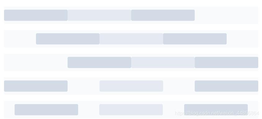
如果你想要多个布局,(混合布局),就像这样: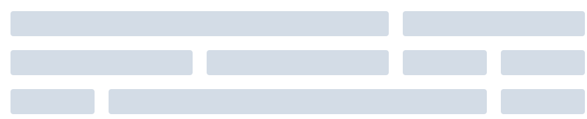
其实也简单,官方的解释是:通过基础的 \(\frac {{1}} {{24}}\) 分栏任意扩展组合形成较为复杂的混合布局。通过制定el-col组件的offset属性可以指定分栏偏移的栏数。
代码:
<el-row :gutter="20">
  <el-col :span="16"><div class="grid-content bg-purple"></div></el-col>
  <el-col :span="8"><div class="grid-content bg-purple"></div></el-col>
</el-row>
<el-row :gutter="20">
  <el-col :span="8"><div class="grid-content bg-purple"></div></el-col>
  <el-col :span="8"><div class="grid-content bg-purple"></div></el-col>
  <el-col :span="4"><div class="grid-content bg-purple"></div></el-col>
  <el-col :span="4"><div class="grid-content bg-purple"></div></el-col>
</el-row>
<el-row :gutter="20">
  <el-col :span="4"><div class="grid-content bg-purple"></div></el-col>
  <el-col :span="16"><div class="grid-content bg-purple"></div></el-col>
  <el-col :span="4"><div class="grid-content bg-purple"></div></el-col>
</el-row>

<style>
  .el-row {
    margin-bottom: 20px;
    &:last-child {
      margin-bottom: 0;
    }
  }
  .el-col {
    border-radius: 4px;
  }
  .bg-purple-dark {
    background: #99a9bf;
  }
  .bg-purple {
    background: #d3dce6;
  }
  .bg-purple-light {
    background: #e5e9f2;
  }
  .grid-content {
    border-radius: 4px;
    min-height: 36px;
  }
  .row-bg {
    padding: 10px 0;
    background-color: #f9fafc;
  }
</style>
要移一点位置?很简单,偏移就可以了。
<el-row :gutter="20">
  <el-col :span="6"><div class="grid-content bg-purple"></div></el-col>
  <el-col :span="6" :offset="6"><div class="grid-content bg-purple"></div></el-col>
</el-row>
<el-row :gutter="20">
  <el-col :span="6" :offset="6"><div class="grid-content bg-purple"></div></el-col>
  <el-col :span="6" :offset="6"><div class="grid-content bg-purple"></div></el-col>
</el-row>
<el-row :gutter="20">
  <el-col :span="12" :offset="6"><div class="grid-content bg-purple"></div></el-col>
</el-row>

<style>
  .el-row {
    margin-bottom: 20px;
    &:last-child {
      margin-bottom: 0;
    }
  }
  .el-col {
    border-radius: 4px;
  }
  .bg-purple-dark {
    background: #99a9bf;
  }
  .bg-purple {
    background: #d3dce6;
  }
  .bg-purple-light {
    background: #e5e9f2;
  }
  .grid-content {
    border-radius: 4px;
    min-height: 36px;
  }
  .row-bg {
    padding: 10px 0;
    background-color: #f9fafc;
  }
</style>通过flex布局来对分栏进行灵活的对齐。
对齐方式:
将 type 属性赋值为 'flex',可以启用 flex 布局,并可通过 justify 属性来指定 start, center, end, space-between, space-around 其中的值来定义子元素的排版方式。
<el-row type="flex" class="row-bg">
  <el-col :span="6"><div class="grid-content bg-purple"></div></el-col>
  <el-col :span="6"><div class="grid-content bg-purple-light"></div></el-col>
  <el-col :span="6"><div class="grid-content bg-purple"></div></el-col>
</el-row>
<el-row type="flex" class="row-bg" justify="center">
  <el-col :span="6"><div class="grid-content bg-purple"></div></el-col>
  <el-col :span="6"><div class="grid-content bg-purple-light"></div></el-col>
  <el-col :span="6"><div class="grid-content bg-purple"></div></el-col>
</el-row>
<el-row type="flex" class="row-bg" justify="end">
  <el-col :span="6"><div class="grid-content bg-purple"></div></el-col>
  <el-col :span="6"><div class="grid-content bg-purple-light"></div></el-col>
  <el-col :span="6"><div class="grid-content bg-purple"></div></el-col>
</el-row>
<el-row type="flex" class="row-bg" justify="space-between">
  <el-col :span="6"><div class="grid-content bg-purple"></div></el-col>
  <el-col :span="6"><div class="grid-content bg-purple-light"></div></el-col>
  <el-col :span="6"><div class="grid-content bg-purple"></div></el-col>
</el-row>
<el-row type="flex" class="row-bg" justify="space-around">
  <el-col :span="6"><div class="grid-content bg-purple"></div></el-col>
  <el-col :span="6"><div class="grid-content bg-purple-light"></div></el-col>
  <el-col :span="6"><div class="grid-content bg-purple"></div></el-col>
</el-row>

<style>
  .el-row {
    margin-bottom: 20px;
    &:last-child {
      margin-bottom: 0;
    }
  }
  .el-col {
    border-radius: 4px;
  }
  .bg-purple-dark {
    background: #99a9bf;
  }
  .bg-purple {
    background: #d3dce6;
  }
  .bg-purple-light {
    background: #e5e9f2;
  }
  .grid-content {
    border-radius: 4px;
    min-height: 36px;
  }
  .row-bg {
    padding: 10px 0;
    background-color: #f9fafc;
  }
</style>响应式参考了BootStrap,预设5个响应尺寸:xs、sm、md、lg 和xl
<el-row :gutter="10">
  <el-col :xs="8" :sm="6" :md="4" :lg="3" :xl="1"><div class="grid-content bg-purple"></div></el-col>
  <el-col :xs="4" :sm="6" :md="8" :lg="9" :xl="11"><div class="grid-content bg-purple-light"></div></el-col>
  <el-col :xs="4" :sm="6" :md="8" :lg="9" :xl="11"><div class="grid-content bg-purple"></div></el-col>
  <el-col :xs="8" :sm="6" :md="4" :lg="3" :xl="1"><div class="grid-content bg-purple-light"></div></el-col>
</el-row>

<style>
  .el-col {
    border-radius: 4px;
  }
  .bg-purple-dark {
    background: #99a9bf;
  }
  .bg-purple {
    background: #d3dce6;
  }
  .bg-purple-light {
    background: #e5e9f2;
  }
  .grid-content {
    border-radius: 4px;
    min-height: 36px;
  }
</style>此外,提供基于断点的隐藏类:Element 额外提供了一系列类名,用于在某些条件下隐藏元素。这些类名可以添加在任何 DOM 元素或自定义组件上。如果需要,请自行引入以下文件:
import 'element-ui/lib/theme-chalk/display.css';包含的类名及其含义为:
hidden-xs-only - 当视口在 xs 尺寸时隐藏
hidden-sm-only - 当视口在 sm 尺寸时隐藏
hidden-sm-and-down - 当视口在 sm 及以下尺寸时隐藏
hidden-sm-and-up - 当视口在 sm 及以上尺寸时隐藏
hidden-md-only - 当视口在 md 尺寸时隐藏
hidden-md-and-down - 当视口在 md 及以下尺寸时隐藏
hidden-md-and-up - 当视口在 md 及以上尺寸时隐藏
hidden-lg-only - 当视口在 lg 尺寸时隐藏
hidden-lg-and-down - 当视口在 lg 及以下尺寸时隐藏
hidden-lg-and-up - 当视口在 lg 及以上尺寸时隐藏
hidden-xl-only - 当视口在 xl 尺寸时隐藏
el-row元素列表:
| 参数 | 说明 | 类型 | 可选值 | 默认值 |
|---|---|---|---|---|
| gutter | 栅格间隔 | number | - | 0 |
| type | 布局模式,可选flex,现代浏览器下有效 | String | — | — |
| justify | flex 布局下的水平排列方式 | string | start/end/center/space-around/space-between | start |
| align | flex 布局下的垂直排列方式 | string | top/middle/bottom | top |
| tag | 自定义元素标签 | string | * | div |
el-col元素列表
| 参数 | 说明 | 类型 | 可选值 | 默认值 |
|---|---|---|---|---|
| span | 栅格占据的列数 | number | — | 24 |
| offset | 栅格左侧的间隔格数 | number | — | 0 |
| push | 栅格向右移动格数 | number | — | 0 |
| pull | 栅格向左移动格数 | number | — | 0 |
| xs | <768px | 响应式栅格数或者栅格属性对象 | number/object (例如: {span: 4, offset: 4}) | — |
| sm | ≥768px | 响应式栅格数或者栅格属性对象 | number/object (例如: {span: 4, offset: 4}) | — |
| md | ≥992px | 响应式栅格数或者栅格属性对象 | number/object (例如: {span: 4, offset: 4}) | — |
| lg | ≥1200px | 响应式栅格数或者栅格属性对象 | number/object (例如: {span: 4, offset: 4}) | — |
| xl | ≥1920px | 响应式栅格数或者栅格属性对象 | number/object (例如: {span: 4, offset: 4}) | — |
| tag | 自定义元素标签 | string | * | div |
表格、源代码搬运自官方文档:https://element.eleme.cn/#/zh-CN/component/layout