%matplotlib inline
%config InlineBackend.figure_format='retina'

from __future__ import absolute_import, division, print_function
import matplotlib as mpl
from matplotlib import pyplot as plt
from matplotlib.pyplot import GridSpec
import seaborn as sns
import numpy as np
import pandas as pd
import os, sys
from tqdm import tqdm
import warnings
warnings.filterwarnings('ignore')
sns.set_context("poster", font_scale=1.3)

import missingno as msno
import pandas_profiling

from sklearn.datasets import make_blobs
import time
def save_subgroup(dataframe, g_index, subgroup_name, prefix='raw_'):
    save_subgroup_filename = "".join([prefix, subgroup_name, ".csv.gz"])
    dataframe.to_csv(save_subgroup_filename, compression='gzip', encoding='UTF-8')
    test_df = pd.read_csv(save_subgroup_filename, compression='gzip', index_col=g_index, encoding='UTF-8')
    # Test that we recover what we send in
    if dataframe.equals(test_df):
        print("Test-passed: we recover the equivalent subgroup dataframe.")
    else:
        print("Warning -- equivalence test!!! Double-check.")
def load_subgroup(filename, index_col=[0]):
    return pd.read_csv(filename, compression='gzip', index_col=index_col)
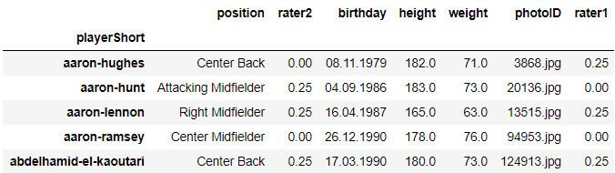
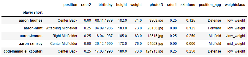
Players
players = load_subgroup("raw_players.csv.gz")
players.head()
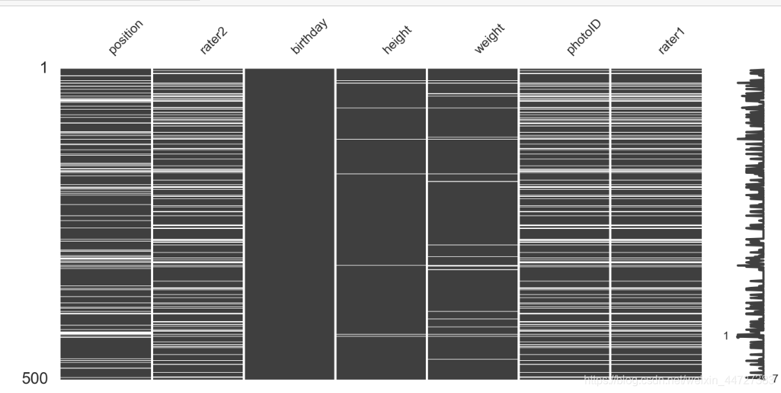
Visualize the missing-ness of data
msno.matrix(players.sample(500),
            figsize=(16, 7),
            width_ratios=(15, 1))
msno.heatmap(players.sample(500),
            figsize=(16, 7),)

print("All players:", len(players))
print("rater1 nulls:", len(players[(players.rater1.isnull())]))
print("rater2 nulls:", len(players[players.rater2.isnull()]))
print("Both nulls:", len(players[(players.rater1.isnull()) & (players.rater2.isnull())]))
All players: 2053
rater1 nulls: 468
rater2 nulls: 468
Both nulls: 468
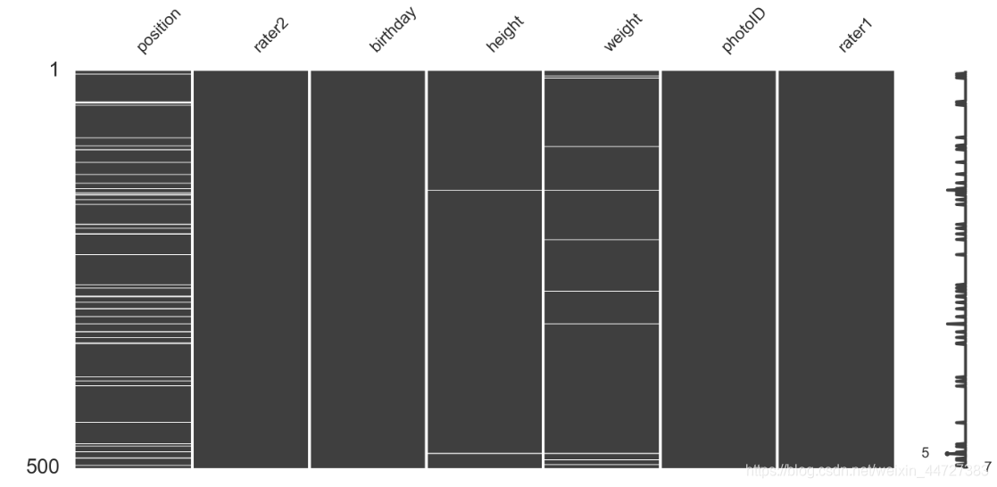
# modifying dataframe
players = players[players.rater1.notnull()]
players.shape[0]
msno.matrix(players.sample(500),
            figsize=(16, 7),
            width_ratios=(15, 1))
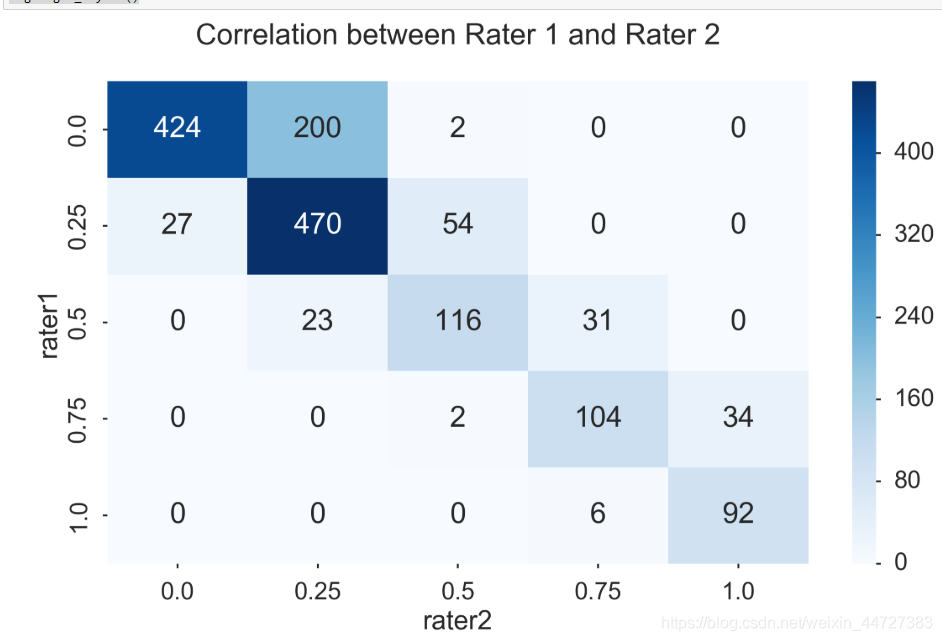
pd.crosstab(players.rater1, players.rater2)
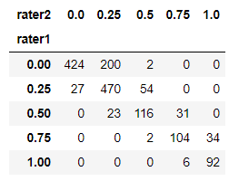
fig, ax = plt.subplots(figsize=(12, 8))
sns.heatmap(pd.crosstab(players.rater1, players.rater2), cmap='Blues', annot=True, fmt='d', ax=ax)
ax.set_title("Correlation between Rater 1 and Rater 2\n")
fig.tight_layout()
Create useful new columns
# modifying dataframe
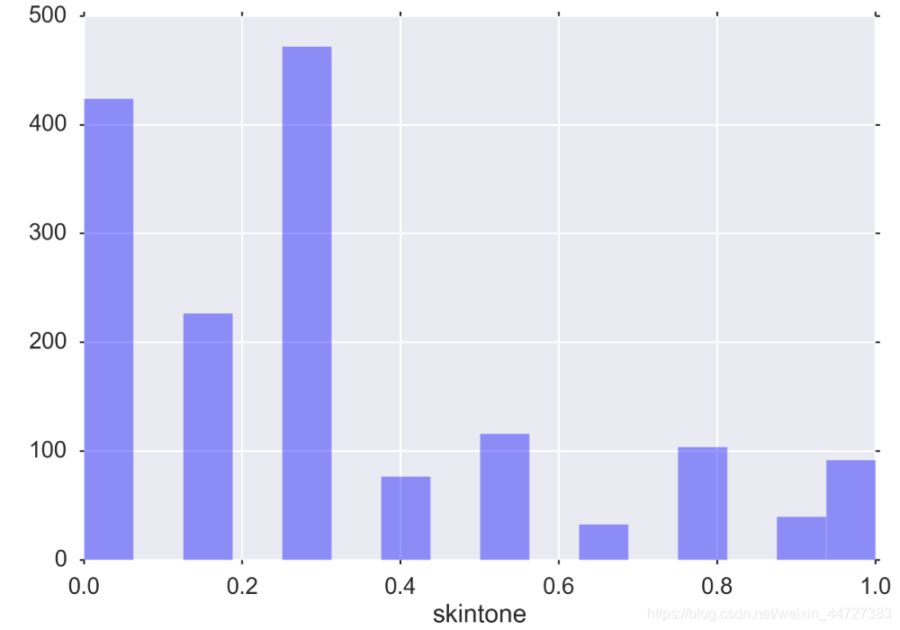
players['skintone'] = players[['rater1', 'rater2']].mean(axis=1)
players.head()
Visualize distributions of univariate features
sns.distplot(players.skintone, kde=False);
Positions
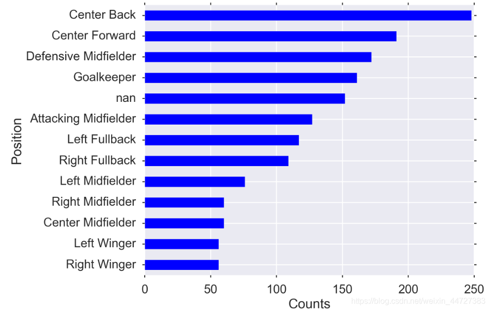
Might the player’s position correlate with the baseline susceptibility to redcards? Likely that a defender would have a higher rate than a keeper, for example.
MIDSIZE = (12, 8)
fig, ax = plt.subplots(figsize=MIDSIZE)
players.position.value_counts(dropna=False, ascending=True).plot(kind='barh', ax=ax)
ax.set_ylabel("Position")
ax.set_xlabel("Counts")
fig.tight_layout()
Create higher level categories
Intuitively, the different positions in the field probably have different redcard rates, but we have data that’s very granular.
Recommendation:
- create a new column
- Don’t overwrite the original data in case you need it or decide later that the higher level category is not useful
I chose to split up the position types by their primary roles (you can disagree with my categorization and do it differently if you feel).
position_types = players.position.unique()
position_types
array([‘Center Back’, ‘Attacking Midfielder’, ‘Right Midfielder’,
‘Center Midfielder’, ‘Goalkeeper’, ‘Defensive Midfielder’,
‘Left Fullback’, nan, ‘Left Midfielder’, ‘Right Fullback’,
‘Center Forward’, ‘Left Winger’, ‘Right Winger’], dtype=object)
defense = ['Center Back','Defensive Midfielder', 'Left Fullback', 'Right Fullback', ]
midfield = ['Right Midfielder', 'Center Midfielder', 'Left Midfielder',]
forward = ['Attacking Midfielder', 'Left Winger', 'Right Winger', 'Center Forward']
keeper = 'Goalkeeper'

# modifying dataframe -- adding the aggregated position categorical position_agg
players.loc[players['position'].isin(defense), 'position_agg'] = "Defense"
players.loc[players['position'].isin(midfield), 'position_agg'] = "Midfield"
players.loc[players['position'].isin(forward), 'position_agg'] = "Forward"
players.loc[players['position'].eq(keeper), 'position_agg'] = "Keeper"
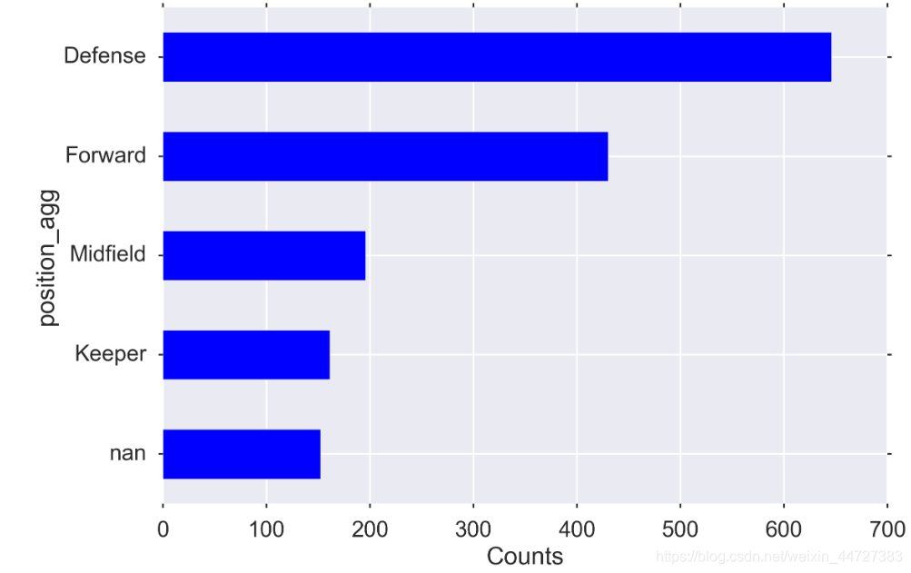
MIDSIZE = (12, 8)
fig, ax = plt.subplots(figsize=MIDSIZE)
players['position_agg'].value_counts(dropna=False, ascending=True).plot(kind='barh', ax=ax)
ax.set_ylabel("position_agg")
ax.set_xlabel("Counts")
fig.tight_layout()
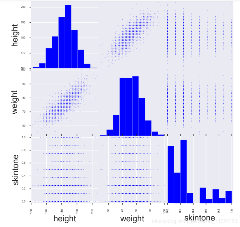
Examine pair-wise relationships
Take a look at measures that will let you quickly see if there are problems or opportunities in the data.
from pandas.tools.plotting import scatter_matrix
fig, ax = plt.subplots(figsize=(10, 10))
scatter_matrix(players[['height', 'weight', 'skintone']], alpha=0.2, diagonal='hist', ax=ax);
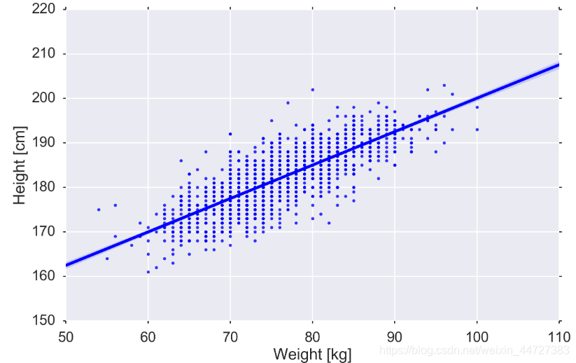
fig, ax = plt.subplots(figsize=MIDSIZE)
sns.regplot('weight', 'height', data=players, ax=ax)
ax.set_ylabel("Height [cm]")
ax.set_xlabel("Weight [kg]")
fig.tight_layout()
Create quantile bins for continuous variables
weight_categories = ["vlow_weight",
                     "low_weight",
                     "mid_weight",
                     "high_weight",
                     "vhigh_weight",
                    ]

players['weightclass'] = pd.qcut(players['weight'],
                                 len(weight_categories),
                                 weight_categories)
height_categories = ["vlow_height",
                     "low_height",
                     "mid_height",
                     "high_height",
                     "vhigh_height",
                    ]

players['heightclass'] = pd.qcut(players['height'],
                                 len(height_categories),
                                 height_categories)
print (players['skintone'])
pd.qcut(players['skintone'], 3)

players['skintoneclass'] = pd.qcut(players['skintone'], 3)
Pandas profiling
There is a library that gives a high level overview – https://github.com/JosPolfliet/pandas-profiling
# modifying dataframe
players['birth_date'] = pd.to_datetime(players.birthday, format='%d.%m.%Y')
players['age_years'] = ((pd.to_datetime("2013-01-01") - players['birth_date']).dt.days)/365.25
players['age_years']
players_cleaned_variables = players.columns.tolist()
players_cleaned_variables

players_cleaned_variables = [#'birthday',
                             'height',
                             'weight',
#                              'position',
#                              'photoID',
#                              'rater1',
#                              'rater2',
                             'skintone',
                             'position_agg',
                             'weightclass',
                             'heightclass',
                             'skintoneclass',
#                              'birth_date',
                             'age_years']
pandas_profiling.ProfileReport(players[players_cleaned_variables])
