CSS+html写轮播图
1.基本思想
将所需要轮播的图片紧挨着排成一行,设置一个图片大小的div,让第一张图片处于div里,溢出部分设置为隐藏,设置步进动画,步进动画使用每次偏移一行图片的长度。
2.html代码
<!DOCTYPE html>
<html lang="en">
<head>
    <meta charset="UTF-8">
    <meta name="viewport" content="width=device-width, initial-scale=1.0">
    <meta http-equiv="X-UA-Compatible" content="ie=edge">
    <title>Document</title>
    <link rel="stylesheet" href="assets\css\index.css" type="text/css">
</head>
<body>


  <main>
        <section>
         <diV><img src="images/1.jpg" alt=""></diV>
         <diV><img src="images/2.jpg" alt=""></diV>
         <diV><img src="images/3.jpg" alt=""></diV>
         <diV><img src="images/4.jpg" alt=""></diV>

        </section>
        <ul>
                <li></li>
                <li></li>
                <li></li>
                <li></li>
            </ul>
    </main>

</body>
</html>
3.CSS代码
body{

    display: grid;
}
main{
    width: 300px;
    height: 200px;
    align-self: center;
    justify-self: center;
    overflow: hidden;
    position: relative;
    z-index: 0;
}
img{
    width: 300px;
    height: 200px;
}
div{
   overflow: hidden;
}
section{
    width: 1200px;
    height: 200px;
    display: grid;
    grid-template: 1fr/repeat(4,300px);
    animation-name: first;
    animation-duration: 4s;
    animation-iteration-count: infinite;
    animation-timing-function: steps(4,end);
}
section:hover ,section:hover+ul::after{
    animation-play-state: paused;
}

@keyframes first{
    to{
        transform: translateX(-1200px);
    }
}

li{
    width: 10px;
    height: 10px;
    border-radius: 50%;
    background-color :brown;


}
ul{
    display: grid;
    position: absolute;
    grid-template: 1fr/repeat(4,1fr);
   left: 20%;
   bottom: 0%;
   list-style: none;
   width: 120px;
   align-items: center;
   justify-items: center;

}
ul::after{

    content: '';
    width: 10px;
    height: 10px;
    border-radius: 50%;
    background-color :red;
    position: absolute;
    left: 50px;

    animation-name: point;
    animation-duration: 4s;
    animation-iteration-count: infinite;
    animation-timing-function: steps(4,end);

}
@keyframes point{
    to{
        transform: translateX(120px);
    }
}
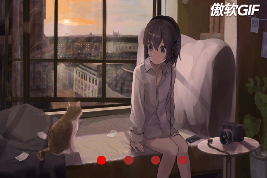
4.效果图
上传不上去,我也没办法~