Android用户界面布局简介
布局定义了一个用户界面(UI)中的视觉结构

类似于div嵌套

- Android界面布局:控制子视图对象(View对象或 ViewGroup对象)在界面中的显示方式(即如何显示这 些View控件或ViewGroup)。
- Android中内置的常用布局方式有
- – LinearLayout:线性布局
- – RelativeLayout:相对布局
- – TableLayout:表格布局
- – GridLayout:网格布局
- – FrameLayout:帧布局

1. Android中线性布局的使用
线性布局(LinearLayout)是一种 重要的界面布局中,所有的子元素都按 照垂直或水平的顺序在界面上排列 ,不会跨行
Android中布局创建的方式有两种:
–通过XML文件
–通过Java代码
使用XML文件创建用户界面布局的基本流程
- 建立XML文件(res / layout / ***.xml文件)
- 在XML文件中设置界面布局 • 选择根元素(一般为布局方式) • 添加View控件或ViewGroup控件(嵌套添加)
- 在Activity中设置布局文件(setContentView方法

fill_parent已弃用
layout_weight是比重的意思,共占母体的比例


使用Java代码方式实现
不推荐,仅此一次
 基本格式:
 –先创建布局元素的对象(LinearLayout)
 –设置布局属性
 –为布局元素添加子元素(View控件或其它布局元素)
 –使用setContentView( )方法加载布局对象


public class MainActivity extends AppCompatActivity {

    @Override
    protected void onCreate(Bundle savedInstanceState) {
        super.onCreate(savedInstanceState);
        //setContentView(R.layout.activity_main);//引用外界布局文件

        //用Java纯代码方式实现LinearLayout
        1.  创建布局
        LinearLayout ll=new LinearLayout(this);

        2.  设置布局属性
        ll.setOrientation(LinearLayout.HORIZONTAL);

		3.  创建视图控件
        Button btn=new Button(this);
        btn.setText("按钮哦");

        控件对象加入到布局当中
        ll.addView(btn);

        //视图对象显示到界面, 在Activity的onCreate( )回调函数中
        setContentView(ll);
    }
}
• Android中通过XML文件创建布局:
    – 优点:界面与逻辑控制代码相分离,同一个布局文件可适用于 多个Activity
    – 缺点:在程序运行前确定界面的布局形式,运行中不易更改

• Android中通过Java代码创建布局:
    – 优点:在程序运行过程中确定界面的布局形式,界面可伴随程 序运行过程中修改
    – 缺点:界面与逻辑控制代码在一起,同一个布局文件仅能用于 当前Activity
2. Android中相对布局的使用
相对布局(RelativeLayout)是一种 非常灵活的布局方式,能够通过指定 界面元素与其它元素的相对位置关系, 确定界面中所有元素的布局位置 –
特点:能够最大程度保证在各种屏幕 类型的手机上正确显示界面布局
XML文件中布局元素的常用属性

<?xml version="1.0" encoding="utf-8"?>
下面这行是创建布局文件时自己改的,自动添加
<RelativeLayout xmlns:android="http://schemas.android.com/apk/res/android"
    android:layout_width="match_parent" android:layout_height="match_parent">

	插入图片,可以放在res--drawable
    <ImageView
        android:id="@+id/img1"                    加ID确定相对坐标
        android:layout_width="100dp"
        android:layout_height="100dp"
        android:layout_centerInParent="true"      相对于父母居中
        android:background="@drawable/charger"    用背景图片方式插入图片
        />

        <ImageView
            android:layout_width="100dp"
            android:layout_height="100dp"
            android:background="@drawable/house"
            android:layout_above="@+id/img1"       相对于参照物   上
            android:layout_alignLeft="@+id/img1"   相对于参照物   左对齐
            />


        <ImageView
            android:layout_width="100dp"
            android:layout_height="100dp"
            android:background="@drawable/house"
            android:layout_toLeftOf="@+id/img1"     相对于参照物   左
            android:layout_centerVertical="true"    相互对父母容器规定的排列方式   居中
            />

        <ImageView
            android:layout_width="100dp"
            android:layout_height="100dp"
            android:background="@drawable/house"
            android:layout_below="@+id/img1"          相对    下
            android:layout_alignRight="@+id/img1"/>   相对    左对齐

        <ImageView
            android:layout_width="100dp"
            android:layout_height="100dp"
            android:background="@drawable/house"·
            android:layout_toRightOf="@+id/img1"      相对    右
            android:layout_alignBottom="@+id/img1"/>  相对    下


	    <Button
	        android:layout_width="wrap_content"
	        android:layout_height="wrap_content"
	        android:layout_alignParentBottom="true"       相对父母  最下面
	        android:layout_alignParentRight="true"        相对父母  最右面
	        android:text="想睡觉"/>

</RelativeLayout>
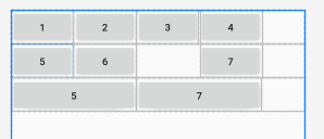
3. Android中表格布局的使用
表格布局(TableLayout)也是一种常用的界面布局,
继承了LinearLayout,采用行和列的形式来管理UI组件
• 表格的边界对用户是不可见的
• 表格布局还支持嵌套,可以将另一个表格布局放置在前一个 表格布局的单元格中,也可以在表格布局中添加其他界面布 局,例如线性布局、相对布局等等

TableLayout元素的XML属性 (属性值全为数字,图片错了)
属性值全为数字,图片错了

//TableRow不会自动换行
    <TableRow>   必须结合这个使用
        <Button android:text="1"/>
        <Button android:text="2"/>
        <Button android:text="3"/>
        <Button android:text="4"/>
    </TableRow>

    <TableRow>
        <Button android:text="5"/>
        <Button android:text="6"/>
        <Button android:text="7"
            android:layout_column="3"/>     设置在的位置,从0开始定位
    </TableRow>


    <TableRow>
        <Button android:text="5"
            android:layout_span="2"/>
        <Button android:text="7"
            android:layout_column="2"
            android:layout_span="2"/>       设置横向的跨度
    </TableRow>
<?xml version="1.0" encoding="utf-8"?>
<TableLayout xmlns:android="http://schemas.android.com/apk/res/android"
    android:layout_width="match_parent"
    android:layout_height="match_parent"
    android:stretchColumns="2,1"   自动伸展列
    android:shrinkColumns="0"      自动收缩列
    android:collapseColumns="1"    隐藏那些列
    >


//TableRow不会自动换行
    <TableRow>
        <Button android:text="1"/>
        <Button android:text="2"/>
        <Button android:text="3"/>
        <Button android:text="4"/>
        <Button android:text="4"/>
    </TableRow>
    <TableRow>
        <Button android:text="5"/>
        <Button android:text="6"/>
        <Button android:text="7"
            android:layout_column="3"/>
    </TableRow>

</TableLayout>
4. Android中网格布局的使用
网格布局(GridLayout)是Android4.0新增的布局管理器
上来就指定一个整体大小
它把整个容器划分成rows*columns个网格
每个网格可以放置一个组件
也可以设置一个组件横跨多少列、或者设置一个组件纵跨多少行

<?xml version="1.0" encoding="utf-8"?>
<GridLayout xmlns:android="http://schemas.android.com/apk/res/android"
    android:layout_width="wrap_content"      内容自适应
    android:layout_height="wrap_content"     内容自适应
    android:columnCount="4"            规定一共几列,必须写
    android:rowCount="3">              规定应该几行,可以多可以少,可以不写

    <Button android:text="1"/>
    <Button android:text="2"/>
    <Button android:text="3"/>
    <Button android:text="4"/>
    <Button android:text="5"
        android:textSize="30sp"/>      调整字体大小
    <Button android:text="7"
        android:layout_gravity="fill"   填充内容
        android:layout_columnSpan="3"   控制几列
        android:layout_rowSpan="2"/>    控制几行
    <Button android:text="8"/>
    <Button android:text="9"/>
    <Button android:text="10"/>
    <Button android:text="11"/>
    <Button android:text="12"/>
    <Button android:text="13"
        android:layout_gravity="fill"    填满一行
        android:layout_columnSpan="4"   />


</GridLayout>

5. Android中帧布局的使帧布局
帧布局(FrameLayout)又称为框架布局,是最简单的界面布 局,所有放在布局内的控件,都按照层次堆叠在屏幕左上角。
如果有多个控件,后放置的子元素将遮挡先放置的控件,即默 认情况下FrameLayout里的控件是左上角对齐。 –
FrameLayout 就像画布,固定从屏幕的左上角开始填充图片, 文字等。

    //View类型是所有类型的基类类型
    <View
        android:layout_width="300dp"
        android:layout_height="300dp"
        android:background="@android:color/background_dark"   背景色
        android:foreground="@drawable/charger"                设置前景土图片,这是分层显示的关键
        android:foregroundGravity="right"/>                   前景图片的位置,相对父容器来说的
        使用时注意原始图片大小。
        //foreground前景图片,使得元素不被遮挡,永远在最上方
        //android:background="@android:color/background_dark"


    <View
        android:layout_width="200dp"
        android:layout_height="200dp"
        android:background="@android:color/holo_blue_bright"/>
</FrameLayout>
补充
-
minSdkVersion:当前APK所能安装的最低手机API Level •
-
compileSdkVersion:编译当前APK的sdk版本,默认使 用当前有API Level中最高的
-
targetSdkVersion:此APK兼容的最新的手机API Level, 同compileSdkVersion
-
屏幕尺寸: 3.2寸、4寸-4.8寸、5寸、7寸、10寸 •
-
屏幕的分辨率: • 480x800, 480x854, 540x960, 720x1280, 800x1280
-
屏幕密度:点数/inch
-
density值表示每个英寸有多个显示点 •
-
分辨率:屏幕长宽的显示点数 –
- QVGA屏density=120 –
- WQVGA屏density=120 –
- HVGA屏density=160 –
- WVGA屏density=240
-
px(pixels)-像素:不同的设备显示效果相同。 •
-
dip(device independent pixels)-设备独立像素:这个和 设备的硬件有关,一般我们为了支持WCGA、HVGA和 QVGA推荐使用这个,不依赖像素,等同于dp。 •
-
pt(points)-磅:1pt=1/72英寸 •
-
in(inches)-英寸 •
-
mm(millimeters)-毫米 •
-
sp(scaled pixels)-放大像素:主要用于字体显示
-
字体大小一般使用sp,此单位的字体能够根据用户的设 置而自动缩放 •
-
空间等相对距离一般使用dp,随密度变化而变化 •
-
px与实际像素有关,与密度有关,不建议使用