GitHub地址:
https://github.com/ajuner/create-mock-3d
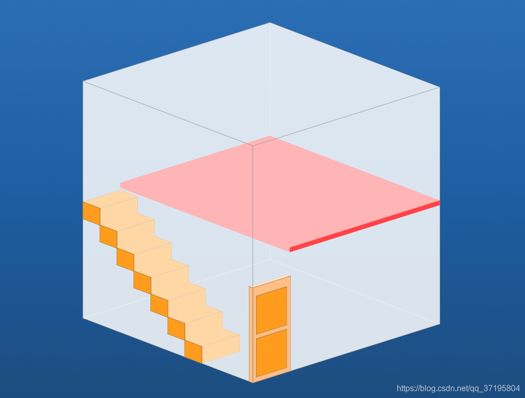
效果图如下:
效果图为3D效果并且可旋转。
由主home.vue及创建长方体组件cuboid.vue构成
home.vue:
<template>
  <div class="container" ref="container" @mousedown="getStart">
    <div class="warp" ref="warp">
      <!--场景  设置为500*500*500 px的大小-->
      <div class="box box1"></div>
      <div class="box box2"></div>
      <div class="box box3"></div>
      <div class="box box4"></div>
      <div class="box box5"></div>
      <div class="box box6"></div>
      <!--二层隔板-->
      <cuboid :x="100" :y="250" :z="0" :w="401" :h="10" :d="500" backColor="#FF4346" borderColor="none"></cuboid>
      <!--门-->
      <cuboid :x="0" :y="0" :z="490" :w="100" :h="200" :d="10" backColor="#FFBE83"></cuboid>
      <cuboid :x="10" :y="100" :z="490" :w="80" :h="80" :d="10" backColor="#FF9C1D"></cuboid>
      <cuboid :x="10" :y="10" :z="490" :w="80" :h="80" :d="10" backColor="#FF9C1D"></cuboid>
      <!--楼梯-->
      <cuboid :x="0" :y="0" :z="300" :w="100" :h="35" :d="50" backColor="#FF9C1D"></cuboid>
      <cuboid :x="0" :y="35" :z="250" :w="100" :h="35" :d="50" backColor="#FF9C1D"></cuboid>
      <cuboid :x="0" :y="70" :z="200" :w="100" :h="35" :d="50" backColor="#FF9C1D"></cuboid>
      <cuboid :x="0" :y="105" :z="150" :w="100" :h="35" :d="50" backColor="#FF9C1D"></cuboid>
      <cuboid :x="0" :y="140" :z="100" :w="100" :h="35" :d="50" backColor="#FF9C1D"></cuboid>
      <cuboid :x="0" :y="175" :z="50" :w="100" :h="35" :d="50" backColor="#FF9C1D"></cuboid>
      <cuboid :x="0" :y="210" :z="0" :w="100" :h="35" :d="50" backColor="#FF9C1D"></cuboid>
    </div>
  </div>
</template>

<script lang="ts">
import {

     Component, Vue } from 'vue-property-decorator';
import cuboid from './cuboid.vue'
@Component({


  name: "home",
  components:{


    cuboid
  }
})
export default class extends Vue {


  isMove = false
  rotateModel = {


    x:0,
    y:0
  }
  warp: any
  container: any
  getStart(el: MouseEvent){


    this.isMove = true
    this.rotateModel.x = el.clientX
    this.rotateModel.y = el.clientY
    this.container.onmousemove = (e: any) => {


      if (this.isMove) {


        const y = e.clientX / 4 - this.rotateModel.x / 4
        const x = e.clientY / 4 - this.rotateModel.y / 4
        this.warp.style.transition = ''
        this.warp.style.transform = 'rotateX(' + (-45 - x) + 'deg) rotateY(' + (-45 + y) + 'deg)'
      }
    }
    this.container.onmouseup = () =>{


      this.isMove = false
      this.warp.style.transition = 'all .8s'
      this.warp.style.transform = 'rotateX(-45deg) rotateY(-45deg)'
    }
  }
  created(){


    this.$nextTick(()=>{


      this.warp = this.$refs.warp
      this.container = this.$refs.container
    })
  }
}
</script>
<style scoped>
  .container{


    display: flex;
    justify-content: center;
    height: 100vh;
  }
  .warp{


    /*perspective:1000px;*/
    margin-top:200px;
    width: 500px;
    height: 500px;
    transform-style: preserve-3d;
    position: relative;
    color:black;
    transition: all .1s;
    transform: rotateX(-45deg) rotateY(-45deg);
    /*animation: play 20s infinite;*/
  }
  .box{


    width:500px;
    height:500px;
    position: absolute;
    border: 1px solid rgba(100,100,100,0.5);
    background-color:rgba(255,255,255,0.6);
  }
  .box1{


    transform: translateZ(250px);
  }
  .box2{


    transform: rotateY(90deg) translateZ(250px);
  }
  .box3{


    transform: rotateY(-90deg) translateZ(250px);
  }
  .box4{


    transform: rotateX(90deg) translateZ(250px);
  }
  .box5{


    transform: rotateX(-90deg) translateZ(250px);
  }
  .box6{


    transform: rotateY(180deg) translateZ(250px);
  }
  @keyframes play
  {


    from {


      transform: rotateX(0deg) rotateY(0deg) rotateZ(0deg);
    }
    to {


      transform: rotateX(720deg) rotateY(360deg) rotateZ(0deg);
    }
  }
</style>
踩坑点:
直接在页面上添加@mousemove方法会出现拖动幅度较大时出现卡屏、卡顿的情况出现,通过直接操作dom-onmousemove防止每次@mousemove会重新渲染场景导致卡顿。
子组件 cuboid.vue
<template>
    <div class="content" :style="{bottom:(h+y)+'px',left:x+'px',transform:'translateZ('+(-250+d/2+z)+'px)'}">
        <div class="box front" :style="{border:borderColor,background:backColor,width:w+'px',height:h+'px',transform:'translateZ(' +d/2+ 'px)'}"></div>
        <div class="box left" :style="{border:borderColor,background:backColor,width:d+'px',height:h+'px',transform:'rotateY(-90deg) translateZ('+d/2+ 'px)'}"></div>
        <div class="box right" :style="{border:borderColor,background:backColor,width:d+'px',height:h+'px',transform:'rotateY(90deg) translateZ('+(w-d/2)+ 'px)'}"></div>
        <div class="box top" :style="{border:borderColor,background:backColor,width:w+'px',height:d+'px',transform:'rotateX(90deg) translateZ('+d/2+ 'px)'}"></div>
        <div class="box bottom" :style="{border:borderColor,background:backColor,width:w+'px',height:d+'px',transform:'rotateX(-90deg) translateZ('+(h-d/2)+ 'px)'}"></div>
        <div class="box behind" :style="{border:borderColor,background:backColor,width:w+'px',height:h+'px',transform:'rotateY(180deg) translateZ('+d/2+ 'px)'}"></div>
    </div>
</template>

<script lang="ts">
    import {

    Component, Prop, Vue} from 'vue-property-decorator';
    @Component({


        name: "cuboid",
    })
    export default class extends Vue {


        @Prop({

    default: 0}) private x!: number | string;
        @Prop({

    default: 0}) private y!: number | string;
        @Prop({

    default: 0}) private z!: number | string;
        @Prop({

    default: 0}) private w!: number | string;
        @Prop({

    default: 0}) private h!: number | string;
        @Prop({

    default: 0}) private d!: number | string;
        @Prop({

    default: 'rgba(255,255,255,0.5)'}) private backColor!: string;
        @Prop({

    default: '1px solid rgba(100,100,100,0.5)'}) private borderColor!: string;
    }
</script>

<style scoped>
.content{


    width: 0;
    height: 0;
    position: absolute;
    transform-style: preserve-3d;
}
.box{


    position: absolute;
    /*border: rgba(100,100,100,0.5);*/
}
.box:hover{


    background-color: rgba(200, 128, 0, 0.5);
}
</style>