CSS实现垂直水平居中的三种方法
方法一:确定容器的宽高 宽500 高300的 利用外边距 margin
/*确定容器的宽高宽500高300的层设置层的外边距*/
div{


position: absolute;/*绝对定位*/
width: 500px;
height: 300px;
top: 50%;
left: 50%;
margin: -150px 0 0 -250px;/*外边距为自身宽高的一半*/
background-color: pink;/*方便看效果*/
}
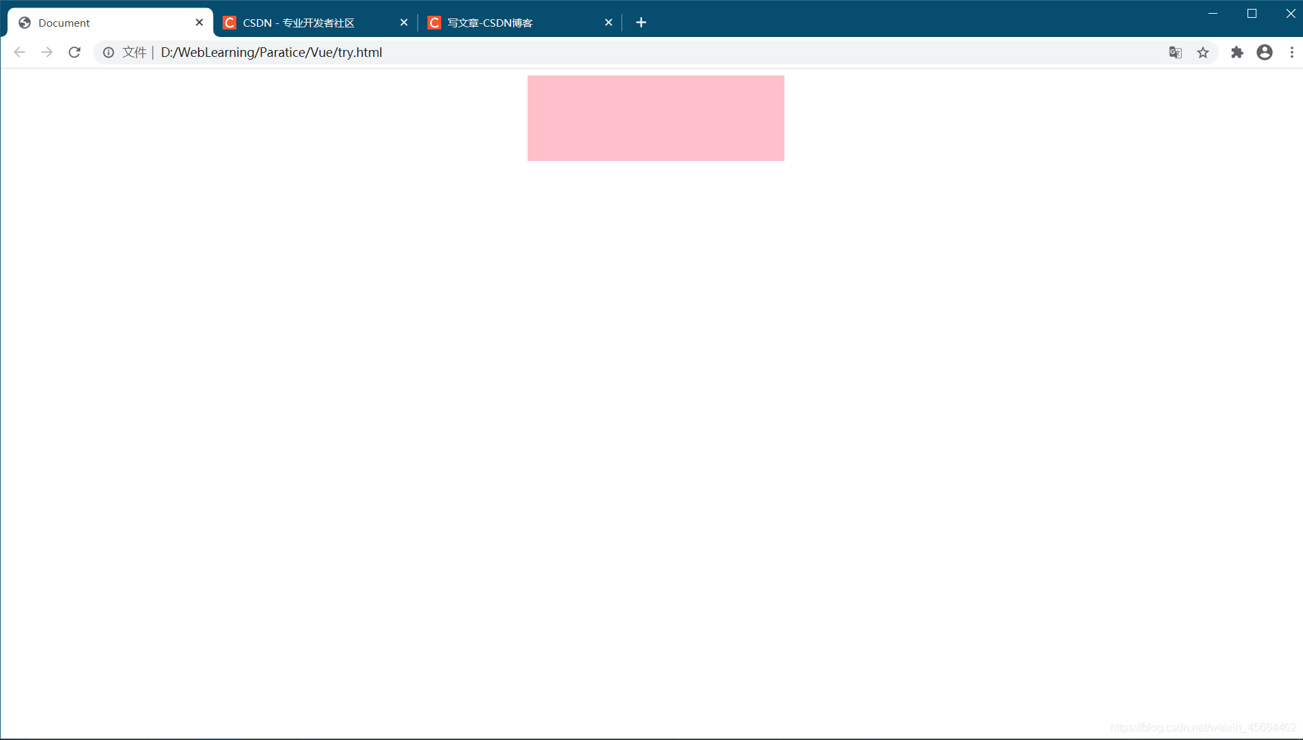
实例:
<body>
    <style>
        div {


            position: absolute;
            /*相对定位或绝对定位均可*/
            width: 400px;
            height: 300px;
            top: 50%;
            left: 50%;
            margin: -150px 0 0 -200px;
            background-color: pink;
            /*方便看效果*/
        }
    </style>
    <div></div>

</body>
效果:
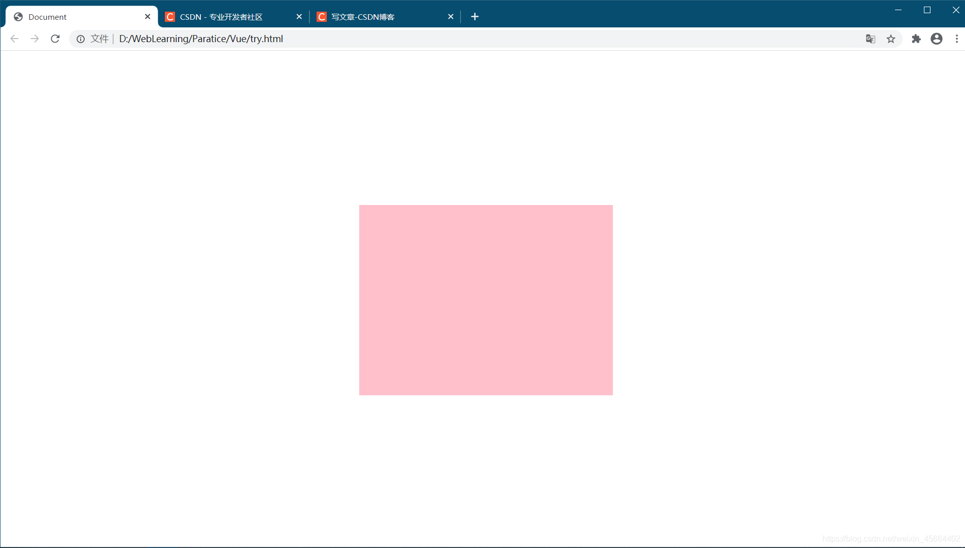
方法二:未知容器的宽高,利用transform属性
/*未知容器的宽高,利用`transform`属性*/
div {


  position: absolute; /*相对定位或绝对定位均可*/
  width: 500px;
  height: 300px;
  top: 50%;
  left: 50%;
  transform: translate(-50%, -50%);
  background-color: pink; /*方便看效果*/
}
实例:
<body>
    <style>
        div {


            position: absolute;
            /*相对定位或绝对定位均可*/
            width: 500px;
            height: 300px;
            top: 50%;
            left: 50%;
            transform: translate(-50%, -50%);
            background-color: pink;
            /*方便看效果*/
        }
    </style>
    <div></div>

</body>
效果:
方法三:利用flex布局
实际使用时应考虑兼容性
/*利用flex布局实际使用时应考虑兼容性*/
.container {


  display: flex;
  align-items: center; /*垂直居中*/
  justify-content: center; /*水平居中*/
}
.containerdiv {


  width: 100px;
  height: 100px;
  background-color: pink; /*方便看效果*/
}
实例:
<body>
    <style>
        .container {


            display: flex;
            align-items: center;
            /*垂直居中*/
            justify-content: center;
            /*水平居中*/
        }

        .containerdiv {


            width: 100px;
            height: 100px;
            background-color: pink;
            /*方便看效果*/
        }
    </style>
    <div class="container">
        <div class="containerdiv"></div>
        <div class="containerdiv"></div>
        <div class="containerdiv"></div>
    </div>
</body>
效果如下: