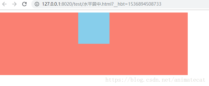
效果图:
html:
<div class="parent">
	<div class="child"></div>
</div>
1.通过margin: 0 auto; text-align: center实现CSS水平居中。
.parent{
	width: 600px;
	height: 200px;
	background: salmon;
}
.child{
	width: 100px;
	height: 100px;
	background: skyblue;
	margin: 0 auto;
	text-align: center;
}
2.通过display:flex实现CSS水平居中
.parent{
    width: 600px;
	height: 200px;
	background: salmon;
	display: flex;
	flex-direction: column;
}
.child{
	width: 100px;
	height: 100px;
	background: skyblue;
	align-self: center;
}
3.通过display:table-cell和margin-left实现CSS水平居中。
.parent{
	width: 600px;
	height: 200px;
	background: salmon;
	display: table-cell;
}
.child{
	width: 100px;
	height: 100px;
	background: skyblue;
	margin-left: 250px;
}
4.通过position:absolute实现CSS水平居中。
.parent{
	width: 600px;
	height: 200px;
	background: salmon;
	position: absolute;
}
.child{
	width: 100px;
	height: 100px;
	background: skyblue;
	margin-left: 250px;
}
5.通过width:fit-content实现CSS水平居中。
.parent{
	width: 600px;
	height: 200px;
	background: salmon;
}
.child{
	width: -webkit-fit-content;
	height: 100px;
	background: skyblue;
	margin: 0 auto;
}
6.通过display:inline-block和margin:0 auto实现CSS水平居中。
.parent{
	width: 600px;
	height: 200px;
	background: salmon;
	display: inline-block;
}
.child{
	width: 100px;
	height: 100px;
	background: skyblue;
	margin: 0 auto;
}