内部折现图的按照指数级的缩放
核心代码
customPlot->yAxis->setScaleType(QCPAxis::stLogarithmic);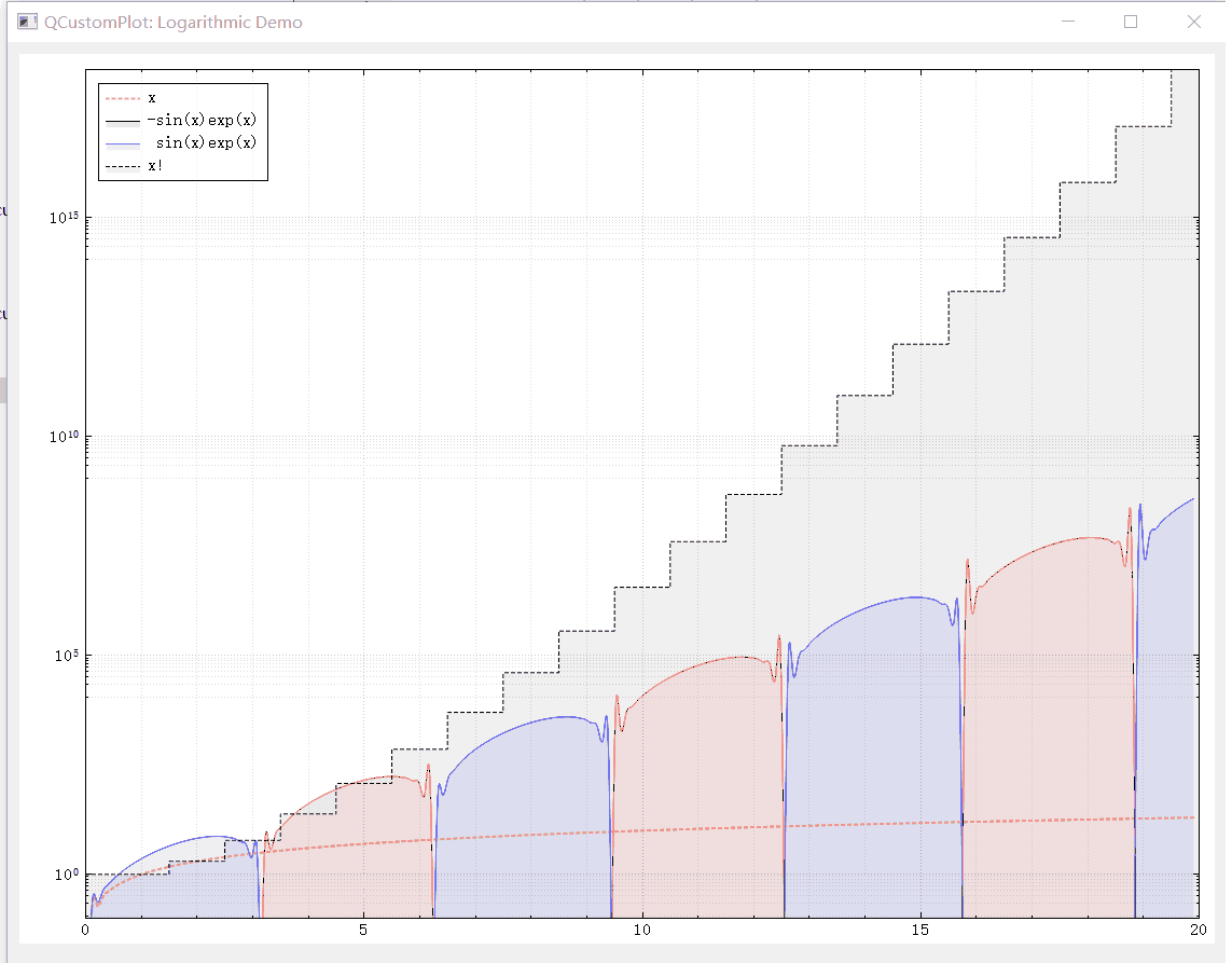
void MainWindow::setupLogarithmicDemo(QCustomPlot *customPlot)
{
  demoName = "Logarithmic Demo";
  customPlot->setNoAntialiasingOnDrag(true); // more performance/responsiveness during dragging
//  1
  customPlot->addGraph();
  QPen pen;
  pen.setColor(QColor(255,170,100));
  pen.setWidth(2);
  pen.setStyle(Qt::DotLine);
  customPlot->graph(0)->setPen(pen);
  customPlot->graph(0)->setName("x");
//  2
  customPlot->addGraph();
  customPlot->graph(1)->setPen(QPen(Qt::red));
  customPlot->graph(1)->setBrush(QBrush(QColor(255, 0, 0, 20)));
  customPlot->graph(1)->setName("-sin(x)exp(x)");
//  3
  customPlot->addGraph();
  customPlot->graph(2)->setPen(QPen(Qt::blue));
  customPlot->graph(2)->setBrush(QBrush(QColor(0, 0, 255, 20)));
  customPlot->graph(2)->setName(" sin(x)exp(x)");
//  4
  customPlot->addGraph();
  pen.setColor(QColor(0,0,0));
  pen.setWidth(1);
  pen.setStyle(Qt::DashLine);
  customPlot->graph(3)->setPen(pen);
  customPlot->graph(3)->setBrush(QBrush(QColor(0,0,0,15)));
  customPlot->graph(3)->setLineStyle(QCPGraph::lsStepCenter);
  customPlot->graph(3)->setName("x!");

  const int dataCount = 200;
  const int dataFactorialCount = 21;
//  使用QCustomPlot的数据类
  QVector<QCPGraphData> dataLinear(dataCount), dataMinusSinExp(dataCount), dataPlusSinExp(dataCount), dataFactorial(dataFactorialCount);
//  构造数据
  for (int i=0; i<dataCount; ++i)
  {
    dataLinear[i].key = i/10.0;
    dataLinear[i].value = dataLinear[i].key;
    dataMinusSinExp[i].key = i/10.0;
    dataMinusSinExp[i].value = -qSin(dataMinusSinExp[i].key)*qExp(dataMinusSinExp[i].key);
    dataPlusSinExp[i].key = i/10.0;
    dataPlusSinExp[i].value = qSin(dataPlusSinExp[i].key)*qExp(dataPlusSinExp[i].key);
  }
  for (int i=0; i<dataFactorialCount; ++i)
  {
    dataFactorial[i].key = i;
    dataFactorial[i].value = 1.0;
    for (int k=1; k<=i; ++k) dataFactorial[i].value *= k; // factorial
  }
//  给Plot设置显示数据
  customPlot->graph(0)->data()->set(dataLinear);
  customPlot->graph(1)->data()->set(dataMinusSinExp);
  customPlot->graph(2)->data()->set(dataPlusSinExp);
  customPlot->graph(3)->data()->set(dataFactorial);
//显示网格,网格的每一根线都对对应1个点
  customPlot->yAxis->grid()->setSubGridVisible(true);
  customPlot->xAxis->grid()->setSubGridVisible(true);
//   经测试就是对内部的每一个grap进行不同程度的缩放 线性缩放和指数极缩放
  customPlot->yAxis->setScaleType(QCPAxis::stLogarithmic);
//  customPlot->yAxis2->setScaleType(QCPAxis::stLogarithmic);

  QSharedPointer<QCPAxisTickerLog> logTicker(new QCPAxisTickerLog);
  customPlot->yAxis->setTicker(logTicker);
  customPlot->yAxis2->setTicker(logTicker);
  customPlot->yAxis->setNumberFormat("eb"); // e = exponential, b = beautiful decimal powers
  customPlot->yAxis->setNumberPrecision(0); // makes sure "1*10^4" is displayed only as "10^4"
  customPlot->rescaleAxes(true);
//  customPlot->xAxis->setRange(0, 19.9);
//  customPlot->yAxis->setRange(1e-2, 1e10);
  // Plot可以拖动和缩放 make range draggable and zoomable:
  customPlot->setInteractions(QCP::iRangeDrag | QCP::iRangeZoom);

  // make top right axes clones of bottom left axes:
  customPlot->axisRect()->setupFullAxesBox();
  // connect signals so top and right axes move in sync with bottom and left axes:
//  自动调整坐标轴轴
  connect(customPlot->xAxis, SIGNAL(rangeChanged(QCPRange)), customPlot->xAxis2, SLOT(setRange(QCPRange)));
  connect(customPlot->yAxis, SIGNAL(rangeChanged(QCPRange)), customPlot->yAxis2, SLOT(setRange(QCPRange)));

  customPlot->legend->setVisible(true);
//  图例背景色
  customPlot->legend->setBrush(QBrush(QColor(255,255,255,150)));
//  图例显示位置设置
  customPlot->axisRect()->insetLayout()->setInsetAlignment(0, Qt::AlignLeft|Qt::AlignTop); // make legend align in top left corner or axis rect
}
使用时间刻度作为X轴的刻度
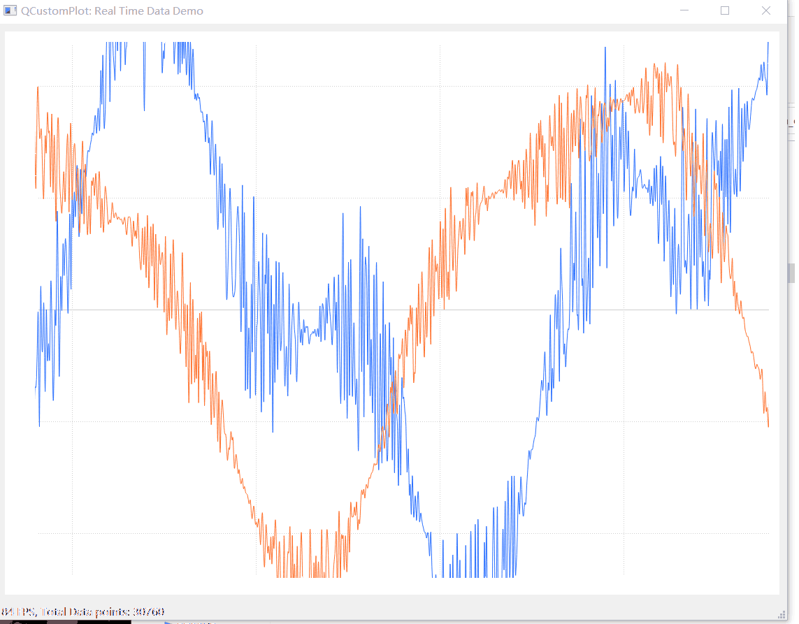
创建折线图
void MainWindow::setupRealtimeDataDemo(QCustomPlot *customPlot)
{
  demoName = "Real Time Data Demo";

  // include this section to fully disable antialiasing for higher performance:
  /*
  customPlot->setNotAntialiasedElements(QCP::aeAll);
  QFont font;
  font.setStyleStrategy(QFont::NoAntialias);
  customPlot->xAxis->setTickLabelFont(font);
  customPlot->yAxis->setTickLabelFont(font);
  customPlot->legend->setFont(font);
  */
  customPlot->addGraph(); // blue line
  customPlot->graph(0)->setPen(QPen(QColor(40, 110, 255)));
  customPlot->addGraph(); // red line
  customPlot->graph(1)->setPen(QPen(QColor(255, 110, 40)));
//   使用时间作为X轴
  QSharedPointer<QCPAxisTickerTime> timeTicker(new QCPAxisTickerTime);
//  设置时间格式
  timeTicker->setTimeFormat("%h:%m:%s");
//  添加时间刻度到x轴
  customPlot->xAxis->setTicker(timeTicker);
  customPlot->axisRect()->setupFullAxesBox();
  customPlot->yAxis->setRange(-1.2, 1.2);

  // make left and bottom axes transfer their ranges to right and top axes:
  connect(customPlot->xAxis, SIGNAL(rangeChanged(QCPRange)), customPlot->xAxis2, SLOT(setRange(QCPRange)));
  connect(customPlot->yAxis, SIGNAL(rangeChanged(QCPRange)), customPlot->yAxis2, SLOT(setRange(QCPRange)));

  // setup a timer that repeatedly calls MainWindow::realtimeDataSlot:
  connect(&dataTimer, SIGNAL(timeout()), this, SLOT(realtimeDataSlot()));
  dataTimer.start(0); // Interval 0 means to refresh as fast as possible
}
不断更新数据
void MainWindow::realtimeDataSlot()
{
  static QTime timeStart = QTime::currentTime();
  // calculate two new data points:
  double key = timeStart.msecsTo(QTime::currentTime())/1000.0; // time elapsed since start of demo, in seconds
  static double lastPointKey = 0;
  if (key-lastPointKey > 0.002) // at most add point every 2 ms
  {
    // add data to lines:
//      定时器循环添加数据
    ui->customPlot->graph(0)->addData(key, qSin(key)+std::rand()/(double)RAND_MAX*1*qSin(key/0.3843));
    ui->customPlot->graph(1)->addData(key, qCos(key)+std::rand()/(double)RAND_MAX*0.5*qSin(key/0.4364));
    // rescale value (vertical) axis to fit the current data:
    //ui->customPlot->graph(0)->rescaleValueAxis();
    //ui->customPlot->graph(1)->rescaleValueAxis(true);
    lastPointKey = key;
  }
  // make key axis range scroll with the data (at a constant range size of 8):
//  自动更新坐标轴范围保证只是显示一部分内容
  ui->customPlot->xAxis->setRange(key, 8, Qt::AlignRight);
//   ui->customPlot->rescaleAxes();
  ui->customPlot->replot();

  // calculate frames per second:
//  状态栏更新统计数据
  static double lastFpsKey;
  static int frameCount;
  ++frameCount;
  if (key-lastFpsKey > 2) // average fps over 2 seconds
  {
    ui->statusBar->showMessage(
          QString("%1 FPS, Total Data points: %2")
          .arg(frameCount/(key-lastFpsKey), 0, 'f', 0)
          .arg(ui->customPlot->graph(0)->data()->size()+ui->customPlot->graph(1)->data()->size())
          , 0);
    lastFpsKey = key;
    frameCount = 0;
  }
}
参数方程形式的点描述Curve Plot 图
Plot类: QCPCurve 用于画曲线方程
数据集 QCPCurveData
-
QCPCurve与QCPGraph的区别在于它引入了第三个坐标t,而QCPGraph只有x,y两个坐标,这是因为在参数方程曲线中,可能会有多个点对应同个key坐标,而t坐标的引入决定了参数方程x,y坐标的顺序,这样就不会混乱
-
在数据方面,t坐标在QCPCurve表现为排序键sortKey,x坐标表现为主键mainKey,y坐标表现为mainValue,在QCPGraph中排序键sortKey和主键mainKey都是x坐标,y坐标表现为mainValue
-

void MainWindow::setupParametricCurveDemo(QCustomPlot *customPlot)
{
  demoName = "Parametric Curves Demo";

  // 创建曲线图 参数方程 create empty curve objects:
  QCPCurve *fermatSpiral1 = new QCPCurve(customPlot->xAxis, customPlot->yAxis);
  QCPCurve *fermatSpiral2 = new QCPCurve(customPlot->xAxis, customPlot->yAxis);
  QCPCurve *deltoidRadial = new QCPCurve(customPlot->xAxis, customPlot->yAxis);
  // generate the curve data points:
  const int pointCount = 500;
//  创建参数方程数据集
  QVector<QCPCurveData> dataSpiral1(pointCount), dataSpiral2(pointCount), dataDeltoid(pointCount);
  for (int i=0; i<pointCount; ++i)
  {
    double phi = i/(double)(pointCount-1)*8*M_PI;
    double theta = i/(double)(pointCount-1)*2*M_PI;
    dataSpiral1[i] = QCPCurveData(i, qSqrt(phi)*qCos(phi), qSqrt(phi)*qSin(phi));
    dataSpiral2[i] = QCPCurveData(i, -dataSpiral1[i].key, -dataSpiral1[i].value);
    dataDeltoid[i] = QCPCurveData(i, 2*qCos(2*theta)+qCos(1*theta)+2*qSin(theta), 2*qSin(2*theta)-qSin(1*theta));
  }
  // pass the data to the curves; we know t (i in loop above) is ascending, so set alreadySorted=true (saves an extra internal sort):
//  填充数据至Curv Plot
  fermatSpiral1->data()->set(dataSpiral1, true);
  fermatSpiral2->data()->set(dataSpiral2, true);
  deltoidRadial->data()->set(dataDeltoid, true);
  // color the curves:
  fermatSpiral1->setPen(QPen(Qt::blue));
  fermatSpiral1->setBrush(QBrush(QColor(0, 0, 255, 20)));
  fermatSpiral2->setPen(QPen(QColor(255, 120, 0)));
  fermatSpiral2->setBrush(QBrush(QColor(255, 120, 0, 30)));

  QRadialGradient radialGrad(QPointF(310, 180), 200);
  radialGrad.setColorAt(0, QColor(170, 20, 240, 100));
  radialGrad.setColorAt(0.5, QColor(20, 10, 255, 40));
  radialGrad.setColorAt(1,QColor(120, 20, 240, 10));
  deltoidRadial->setPen(QPen(QColor(170, 20, 240)));
  deltoidRadial->setBrush(QBrush(radialGrad));
  // set some basic customPlot config:
  customPlot->setInteractions(QCP::iRangeDrag | QCP::iRangeZoom | QCP::iSelectPlottables);
  customPlot->axisRect()->setupFullAxesBox();
  customPlot->rescaleAxes();
}
柱状图使用示例
1. 柱状图简单使用

void Widget::barchart2(QCustomPlot *customPlot)
{
    QCPAxis *keyAxis = customPlot->xAxis;
    QCPAxis *valueAxis = customPlot->yAxis;
    QCPBars *fossil = new QCPBars(keyAxis, valueAxis); // 使用xAxis作为柱状图的key轴,yAxis作为value轴


    // 为柱状图设置一个文字类型的key轴,ticks决定了轴的范围,而labels决定了轴的刻度文字的显示
    QVector<double> ticks;
    QVector<QString> labels;
    ticks << 1 << 2 << 3 << 4 << 5 << 6 << 7;
    labels << "USA"
           << "Japan"
           << "Germany"
           << "France"
           << "UK"
           << "Italy"
           << "Canada";
    QSharedPointer<QCPAxisTickerText> textTicker(new QCPAxisTickerText);
    textTicker->addTicks(ticks, labels);

    fossil->setAntialiased(true);                          // 为了更好的边框效果,关闭抗齿锯
    fossil->setName("Fossil fuels");                        // 设置柱状图的名字,可在图例中显示
    fossil->setPen(QPen(QColor(0, 168, 140).lighter(130))); // 设置柱状图的边框颜色
    fossil->setBrush(QColor(0, 168, 140));                  // 设置柱状图的画刷颜色
    //设置坐标轴
    keyAxis->setTicker(textTicker); // 设置为文字轴

    keyAxis->setTickLabelRotation(60); // 轴刻度文字旋转60度
    keyAxis->setSubTicks(false);       // 不显示子刻度
    keyAxis->setTickLength(0, 4);      // 轴内外刻度的长度分别是0,4,也就是轴内的刻度线不显示
    keyAxis->setRange(0, 8);           // 设置范围
    keyAxis->setUpperEnding(QCPLineEnding::esSpikeArrow);//设置坐标轴箭头

    valueAxis->setRange(0, 12.1);
    valueAxis->setPadding(35); // 轴的内边距,可以到QCustomPlot之开始(一)看图解
    valueAxis->setLabel("Power Consumption in\nKilowatts per Capita (2007)");
    valueAxis->setUpperEnding(QCPLineEnding::esSpikeArrow);
    QVector<double> fossilData;
    fossilData << 0.86 * 10.5 << 0.83 * 5.5 << 0.84 * 5.5 << 0.52 * 5.8 << 0.89 * 5.2 << 0.90 * 4.2 << 0.67 * 11.2;
    fossil->setData(ticks, fossilData);
}
2. 堆叠柱状图

void MainWindow::setupBarChartDemo(QCustomPlot *customPlot)
{
  demoName = "Bar Chart Demo";
  // set dark background gradient:
  QLinearGradient gradient(0, 0, 0, 400);
  gradient.setColorAt(0, QColor(90, 90, 90));
  gradient.setColorAt(0.38, QColor(105, 105, 105));
  gradient.setColorAt(1, QColor(70, 70, 70));
  customPlot->setBackground(QBrush(gradient));

  // create empty bar chart objects:
//  创建3个柱状图
  QCPBars *regen = new QCPBars(customPlot->xAxis, customPlot->yAxis);
  QCPBars *nuclear = new QCPBars(customPlot->xAxis, customPlot->yAxis);
  QCPBars *fossil = new QCPBars(customPlot->xAxis, customPlot->yAxis);
//  关闭卡昂锯齿
  regen->setAntialiased(false); // gives more crisp, pixel aligned bar borders
  nuclear->setAntialiased(false);
  fossil->setAntialiased(false);
//   设置堆叠间距
  regen->setStackingGap(10);
  nuclear->setStackingGap(10);
  fossil->setStackingGap(10);
  // set names and colors:
  fossil->setName("Fossil fuels");
//  设置画笔就是bar的矩形边线的使用,设置画刷就是矩形填充使用
  fossil->setPen(QPen(QColor(111, 9, 176).lighter(170)));
  fossil->setBrush(QColor(111, 9, 176));
  nuclear->setName("Nuclear");
  nuclear->setPen(QPen(QColor(250, 170, 20).lighter(150)));
  nuclear->setBrush(QColor(250, 170, 20));
  regen->setName("Regenerative");
  regen->setPen(QPen(QColor(0, 168, 140).lighter(130)));
  regen->setBrush(QColor(0, 168, 140));
  // stack bars on top of each other:
//  堆积柱状图,设置谁在谁的上边
  nuclear->moveAbove(fossil);
  regen->moveAbove(nuclear);

  // prepare x axis with country labels:
  QVector<double> ticks;
  QVector<QString> labels;
  ticks << 1 << 2 << 3 << 4 << 5 << 6 << 7;
  labels << "USA" << "Japan" << "Germany" << "France" << "UK" << "Italy" << "Canada";
//  构建文本刻度
  QSharedPointer<QCPAxisTickerText> textTicker(new QCPAxisTickerText);
//  设置编号和文本对应
  textTicker->addTicks(ticks, labels);
//  设置X轴使用文本刻度
  customPlot->xAxis->setTicker(textTicker);
//  刻度旋转60°
  customPlot->xAxis->setTickLabelRotation(60);
  customPlot->xAxis->setSubTicks(false);
  customPlot->xAxis->setTickLength(0, 4);
  customPlot->xAxis->setRange(0, 8);
  customPlot->xAxis->setBasePen(QPen(Qt::white));
//  设置刻度颜色
  customPlot->xAxis->setTickPen(QPen(Qt::green));
  customPlot->xAxis->setSubTickPen(QPen(Qt::yellow));

  customPlot->xAxis->grid()->setVisible(true);
  customPlot->xAxis->grid()->setPen(QPen(QColor(130, 130, 130), 0, Qt::DotLine));
// 设置刻度文字颜色
  customPlot->xAxis->setTickLabelColor(Qt::white);
//  设置x轴标签色
  customPlot->xAxis->setLabelColor(Qt::white);

  // prepare y axis:
  customPlot->yAxis->setRange(0, 12.1);
  customPlot->yAxis->setPadding(5); // a bit more space to the left border
  customPlot->yAxis->setLabel("Power Consumption in\nKilowatts per Capita (2007)");
  customPlot->yAxis->setBasePen(QPen(Qt::white));
  customPlot->yAxis->setTickPen(QPen(Qt::white));
  customPlot->yAxis->setSubTickPen(QPen(Qt::white));
  customPlot->yAxis->grid()->setSubGridVisible(true);
  customPlot->yAxis->setTickLabelColor(Qt::white);
  customPlot->yAxis->setLabelColor(Qt::white);
  customPlot->yAxis->grid()->setPen(QPen(QColor(130, 130, 130), 0, Qt::SolidLine));
  customPlot->yAxis->grid()->setSubGridPen(QPen(QColor(130, 130, 130), 0, Qt::DotLine));

  // 构造数据Add data:
  QVector<double> fossilData, nuclearData, regenData;
  fossilData  << 0.86*10.5 << 0.83*5.5 << 0.84*5.5 << 0.52*5.8 << 0.89*5.2 << 0.90*4.2 << 0.67*11.2;
  nuclearData << 0.08*10.5 << 0.12*5.5 << 0.12*5.5 << 0.40*5.8 << 0.09*5.2 << 0.00*4.2 << 0.07*11.2;
  regenData   << 0.06*10.5 << 0.05*5.5 << 0.04*5.5 << 0.06*5.8 << 0.02*5.2 << 0.07*4.2 << 0.25*11.2;
  fossil->setData(ticks, fossilData);
  nuclear->setData(ticks, nuclearData);
  regen->setData(ticks, regenData);

  // 显示图例setup legend:
  customPlot->legend->setVisible(true);
//  设置图例位置
  customPlot->axisRect()->insetLayout()->setInsetAlignment(0, Qt::AlignTop|Qt::AlignHCenter);
  customPlot->legend->setBrush(QColor(20, 200, 200, 100));
  customPlot->legend->setBorderPen(Qt::NoPen);
  QFont legendFont = font();
  legendFont.setPointSize(10);
  customPlot->legend->setFont(legendFont);
//  Plot可以缩放和拖动
  customPlot->setInteractions(QCP::iRangeDrag | QCP::iRangeZoom);
}
3.组柱状图使用
1.创建一个分组
QCPBarsGroup *group = new QCPBarsGroup(customPlot);2.创建多个QCPBar
QCPBars *regen = new QCPBars(customPlot->xAxis, customPlot->yAxis);
QCPBars *nuclear = new QCPBars(customPlot->xAxis, customPlot->yAxis);
QCPBars *fossil = new QCPBars(customPlot->xAxis, customPlot->yAxis);  // 使用xAxis作为柱状图的key轴,yAxis作为value轴
3. 将bar添加到组中
void QCPBarsGroup::append(QCPBars *bars)4.以为QCustomPlot 管理的是组组柱状图,所以需要将组内的柱状图平均分配柱子宽度
bar->setWidth(bar->width() / bars.size()); //5.可以设置bar间的间距
group->setSpacingType(QCPBarsGroup::stAbsolute);  // 设置组内柱状图的间距,按像素
group->setSpacing(2);     // 设置较小的间距值,这样看起来更紧凑
void Widget::groupbar_chart(QCustomPlot *customPlot)
{
    //分组的核心QCPBarsGroup
    QCPBarsGroup *group = new QCPBarsGroup(customPlot);
    QCPBars *regen = new QCPBars(customPlot->xAxis, customPlot->yAxis);
    QCPBars *nuclear = new QCPBars(customPlot->xAxis, customPlot->yAxis);
    QCPBars *fossil = new QCPBars(customPlot->xAxis, customPlot->yAxis);  // 使用xAxis作为柱状图的key轴,yAxis作为value轴

    QVector<double> fossilData, nuclearData, regenData;
    fossilData  << 0.86*10.5 << 0.83*5.5 << 0.84*5.5 << 0.52*5.8 << 0.89*5.2 << 0.90*4.2 << 0.67*11.2;
    nuclearData << 0.08*10.5 << 0.12*5.5 << 0.12*5.5 << 0.40*5.8 << 0.09*5.2 << 0.00*4.2 << 0.07*11.2;
    regenData   << 0.06*10.5 << 0.05*5.5 << 0.04*5.5 << 0.06*5.8 << 0.02*5.2 << 0.07*4.2 << 0.25*11.2;

    QVector<double> ticks;
     ticks << 1 << 2 << 3 << 4 << 5 << 6 << 7;
    fossil->setData(ticks, fossilData);
    nuclear->setData(ticks, nuclearData);
    regen->setData(ticks, regenData);

    QList<QCPBars*> bars;
    bars << fossil << nuclear << regen;

    foreach (QCPBars *bar, bars) {
      // 设置柱状图的宽度类型为以key坐标轴计算宽度的大小,其实默认就是这种方式
     // bar->setWidthType(QCPBars::wtPlotCoords);
      bar->setWidth(bar->width() / bars.size()); // 设置柱状图的宽度大小
      group->append(bar);  // 将柱状图加入柱状图分组中
    }

    group->setSpacingType(QCPBarsGroup::stAbsolute);  // 设置组内柱状图的间距,按像素
    group->setSpacing(2);     // 设置较小的间距值,这样看起来更紧凑

    // 设置坐标轴范围
    customPlot->xAxis->setRange(0,8);
    customPlot->yAxis->setRange(0,12);

    //设置画刷也即是柱状图的内部填充颜色
    regen->setBrush(Qt::blue);
    nuclear->setBrush(Qt::red);
    fossil->setBrush(Qt::green);
}
箱式图,盒式图的使用
什么是箱式图 ,要素获取方法 统计学---之箱形图_zxyhhjs2017的博客-CSDN博客_箱型图![]() https://blog.csdn.net/zxyhhjs2017/article/details/79570081显示图要素
https://blog.csdn.net/zxyhhjs2017/article/details/79570081显示图要素
核心类:
箱式图类 QCPStatisticalBox


//添加数据函数
/*void QCPStatisticalBox::addData(
double key,
double minimum,
double lowerQuartile,
double median,
double upperQuartile,
double maximum,
const QVector<double> &outliers)

    箱式图:盒须图、盒式图,用作显示一组数据分散情况资料的统计图
    箱线图的绘制方法是:先找出一组数据的上边缘、下边缘、中位数和两个四分位数;然后, 连接两个四分位数画出箱体;再将上边缘和下边缘与箱体相连接,中位数在箱体中间
*/
  statistical->addData(1, 1.1, 1.9, 2.25, 2.7, 4.2);
上边缘、下边缘、中位数和两个四分位数
void MainWindow::setupStatisticalDemo(QCustomPlot *customPlot)
{
  demoName = "Statistical Demo";
  QCPStatisticalBox *statistical = new QCPStatisticalBox(customPlot->xAxis, customPlot->yAxis);
  QBrush boxBrush(QColor(60, 60, 255, 100));
  boxBrush.setStyle(Qt::Dense6Pattern); // make it look oldschool
  statistical->setBrush(boxBrush);

  // specify data:
/*void QCPStatisticalBox::addData(double key, double minimum, double lowerQuartile, double median, double upperQuartile, double maximum, const QVector<double> &outliers)

    箱式图:盒须图、盒式图,用作显示一组数据分散情况资料的统计图
    箱线图的绘制方法是:先找出一组数据的上边缘、下边缘、中位数和两个四分位数;然后, 连接两个四分位数画出箱体;再将上边缘和下边缘与箱体相连接,中位数在箱体中间
*/
//  添加数据到箱式图
  statistical->addData(1, 1.1, 1.9, 2.25, 2.7, 4.2);
  statistical->addData(2, 0.8, 1.6, 2.2, 3.2, 4.9, QVector<double>()<<2.25 << 0.7 << 0.34 << 0.45 << 6.2 << 5.84); // provide some outliers as QVector
  statistical->addData(3, 0.2, 0.7, 1.1, 1.6, 2.9);

  // prepare manual x axis labels:
  customPlot->xAxis->setSubTicks(false);
  customPlot->xAxis->setTickLength(0, 4);
  customPlot->xAxis->setTickLabelRotation(20);
//  创建txt形式的刻度
  QSharedPointer<QCPAxisTickerText> textTicker(new QCPAxisTickerText);
  textTicker->addTick(1, "Sample 1");
  textTicker->addTick(2, "Sample 2");
  textTicker->addTick(3, "Control Group");
//  设置X轴为txt形式的刻度
  customPlot->xAxis->setTicker(textTicker);

  // prepare axes:
  customPlot->yAxis->setLabel(QString::fromUtf8("O₂ Absorption [mg]"));
  customPlot->rescaleAxes();
  customPlot->xAxis->scaleRange(1.7, customPlot->xAxis->range().center());
  customPlot->yAxis->setRange(0, 7);
  customPlot->setInteractions(QCP::iRangeDrag | QCP::iRangeZoom);
}