添加插件
npm i element-ui -S
新建一个scss 文件elementui-variables.scss

文件elementui-variables.scss 代码
/* theme color */
$--color-primary: #4593ff;//默认主题色
$--color-success: #13ce66;
$--color-warning: #FFBA00;
$--color-danger: #ff4949;
// $--color-info: #1E1E1E;

$--button-font-weight: 400;

// $--color-text-regular: #1f2d3d;

$--border-color-light: #dfe4ed;
$--border-color-lighter: #e6ebf5;

$--table-border:1px solid #dfe6ec;

/* icon font path, required */
$--font-path: '~element-ui/lib/theme-chalk/fonts';

// @import "~element-ui/packages/theme-chalk/src/index";

:export {
  theme: $--color-primary;
}
没有安装scss,先装好scss
main.js引入element-ui 和上面创建的scss文件
import ElementUI from 'element-ui';
import 'element-ui/lib/theme-chalk/index.css';
import './common/css/elementui-variables.scss';//主题文件
如果这里引入elementui-variables.scss报错启动不了项目,检查一下这里把它注释或者删掉

如果没什么异常,咋们参考一下使用别人写的组件(这里的组件是拷贝一个博主的)
创建theme_picker组件
<template>
    <el-color-picker
      v-model="theme"
      :predefine="['#409EFF', '#67C23A', '#E6A23C', '#f5222d', '#11a983', '#13c2c2', '#6959CD', '#434f5d', ]"
      class="theme-picker"
      popper-class="theme-picker-dropdown" title="换肤"
    />
</template>

<script>
  const version = require('element-ui/package.json').version // element-ui version from node_modules
  const ORIGINAL_THEME = '#409EFF' // default color

  export default {


    name:"theme_picker",
    data() {


      return {


        chalk: '', // content of theme-chalk css
        theme: ''
      }
    },
    computed: {


      defaultTheme() {


        return this.$store.state.web_color;
      }
    },
    watch: {


      defaultTheme: {


        handler: function(val, oldVal) {


          this.theme = val;
          this.update_web_color(val)
        },
        immediate: true
      },
      theme(newVal,oldVal){


       this.$emit("change",newVal);
      }
    },

    methods: {


      update_web_color(color){


        var that=this;
        //异步函数去执行
        async function theme(val) {


          const oldVal = that.chalk ? that.theme : ORIGINAL_THEME
          if (typeof val !== 'string') return
          const themeCluster = that.getThemeCluster(val.replace('#', ''))
          const originalCluster = that.getThemeCluster(oldVal.replace('#', ''))
          // console.log(themeCluster, originalCluster)

          const $message = that.$message({


            message: '更换主题中...',
            customClass: 'theme-message',
            type: 'success',
            duration: 0,
            iconClass: 'el-icon-loading'
          })

          const getHandler = (variable, id) => {


            return () => {


              const originalCluster = that.getThemeCluster(ORIGINAL_THEME.replace('#', ''))
              const newStyle = that.updateStyle(that[variable], originalCluster, themeCluster)

              let styleTag = document.getElementById(id)

              if (!styleTag) {


                styleTag = document.createElement('style')
                styleTag.setAttribute('id', id)

                document.head.appendChild(styleTag)
                //document.getElementsByTagName('style')[0].insertBefore(styleTag, null)
              }
              styleTag.innerText = newStyle
            }
          }

          if (!that.chalk) {


            const url = `https://unpkg.com/element-ui@${

      version}/lib/theme-chalk/index.css`
            await that.getCSSString(url, 'chalk')
          }

          const chalkHandler = getHandler('chalk', 'chalk-style')

          chalkHandler()

          const styles = [].slice.call(document.querySelectorAll('style'))
            .filter(style => {


              const text = style.innerText
              return new RegExp(oldVal, 'i').test(text) && !/Chalk Variables/.test(text)
            })
          styles.forEach(style => {


            const {

     innerText } = style
            if (typeof innerText !== 'string') return
            style.innerText = that.updateStyle(innerText, originalCluster, themeCluster)
          })
          $message.close()
        };
        //调用
        theme(color);
      },

      updateStyle(style, oldCluster, newCluster) {


        let newStyle = style
        oldCluster.forEach((color, index) => {


          newStyle = newStyle.replace(new RegExp(color, 'ig'), newCluster[index])
        })
        return newStyle
      },

      getCSSString(url, variable) {


        return new Promise(resolve => {


          const xhr = new XMLHttpRequest()
          xhr.onreadystatechange = () => {


            if (xhr.readyState === 4 && xhr.status === 200) {


              this[variable] = xhr.responseText.replace(/@font-face{[^}]+}/, '')
              resolve()
            }
          }
          xhr.open('GET', url)
          xhr.send()
        })
      },

      getThemeCluster(theme) {


        const tintColor = (color, tint) => {


          let red = parseInt(color.slice(0, 2), 16)
          let green = parseInt(color.slice(2, 4), 16)
          let blue = parseInt(color.slice(4, 6), 16)

          if (tint === 0) {

     // when primary color is in its rgb space
            return [red, green, blue].join(',')
          } else {


            red += Math.round(tint * (255 - red))
            green += Math.round(tint * (255 - green))
            blue += Math.round(tint * (255 - blue))

            red = red.toString(16)
            green = green.toString(16)
            blue = blue.toString(16)

            return `#${

      red}${

      green}${

      blue}`
          }
        }

        const shadeColor = (color, shade) => {


          let red = parseInt(color.slice(0, 2), 16)
          let green = parseInt(color.slice(2, 4), 16)
          let blue = parseInt(color.slice(4, 6), 16)

          red = Math.round((1 - shade) * red)
          green = Math.round((1 - shade) * green)
          blue = Math.round((1 - shade) * blue)

          red = red.toString(16)
          green = green.toString(16)
          blue = blue.toString(16)

          return `#${

      red}${

      green}${

      blue}`
        }

        const clusters = [theme]
        for (let i = 0; i <= 9; i++) {


          clusters.push(tintColor(theme, Number((i / 10).toFixed(2))))
        }
        clusters.push(shadeColor(theme, 0.1))
        return clusters
      }
    }
  }
</script>

<style>
  .theme-picker {


    float: left;
    margin-top: 15px;
  }

  .theme-message,
  .theme-picker-dropdown {


    z-index: 99999 !important;
  }

  .theme-picker .el-color-picker__trigger {


    height: 26px !important;
    width: 26px !important;
    padding: 2px;
  }


  .theme-picker-dropdown .el-color-dropdown__link-btn {


    display: none;
  }
</style>
注意这里有个vuex 的使用


ui引入样式先后顺序的原因 ,这里document.head.appendChild(styleTag)不行的话,可以尝试使用document.getElementsByTagName(‘style’)[0].insertBefore(styleTag,null),这两者切换使用尝试一下
document.head.appendChild(styleTag)
//document.getElementsByTagName(‘style’)[0].insertBefore(styleTag,null)
使用组件
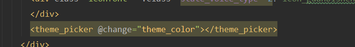
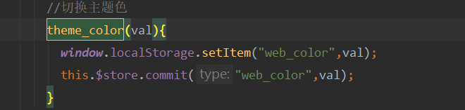
这里回调触发函数根据需求,这里更新vuex值,这里缓存也存到颜色值
看一下成果


如果是制定义的组件的话,直接绑定样式:style="{}"来获取vuex里面的值
这里vuex 还写了一个获取主题色的透明度,写在getters节点里面
getters:{


    /**
     *主题色透明度获取
     * @param opacity 透明度
     * @returns {string}
     */
    web_color_opacity:state => {


      return function (opacity) {


        return "rgba(" + parseInt("0x" + state.web_color.slice(1, 3)) + "," + parseInt("0x" +  state.web_color.slice(3, 5)) + "," + parseInt("0x" + state.web_color.slice(5, 7)) + "," + opacity + ")";
      }
    },
    }
简单粗暴直接使用
