情景引入
问题分析
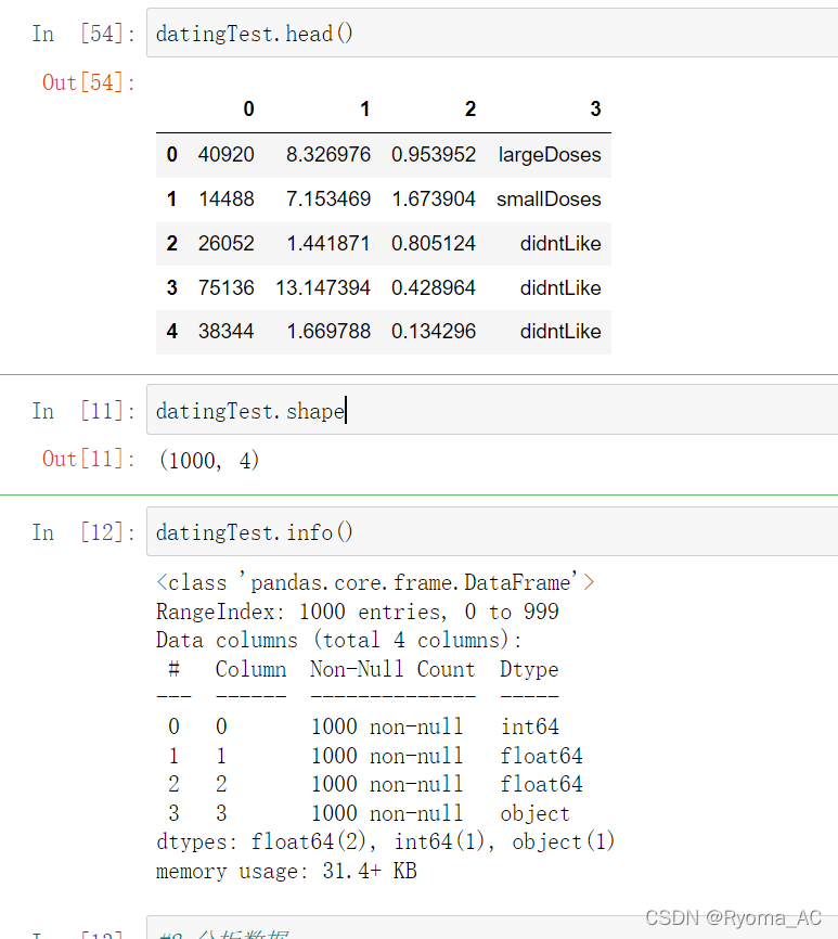
1.准备数据
import pandas as pd
#导入数据集数据
datingTest = pd.read_table('datingTestSet.txt', header=None)
对数据切片查看可得数据集的各种属性:
2.分析数据
根据导入的数据集,画出散点图分析数据
import matplotlib as mpl
import matplotlib.pyplot as plt

# 不同的标签用不同的颜色区分
Colors = []
for i in range(datingTest.shape[0]):
    m = datingTest.iloc[i, -1]
    if m == 'didntLike':
        Colors.append('black')
    if m == 'smallDoses':
        Colors.append('orange')
    if m == 'largeDoses':
        Colors.append('red')

plt.rcParams['font.sans-serif'] = ['Simhei']  # 图中字体设置为黑体
pl = plt.figure(figsize=(12, 8))
fig1 = pl.add_subplot(221)
plt.scatter(datingTest.iloc[:, 1], datingTest.iloc[:, 2], marker='.', c=Colors)
plt.xlabel('玩游戏视频所占时间比')
plt.ylabel('每周消费冰淇淋公升数')

fig2 = pl.add_subplot(222)
plt.scatter(datingTest.iloc[:, 0], datingTest.iloc[:, 1], marker='.', c=Colors)
plt.xlabel('每年飞行常客里程')
plt.ylabel('玩游戏视频所占时间比')

fig3 = pl.add_subplot(223)
plt.scatter(datingTest.iloc[:, 0], datingTest.iloc[:, 2], marker='.', c=Colors)
plt.xlabel('每年飞行常客里程')
plt.ylabel('每周消费冰淇淋公升数')
plt.show()
关于代码中一些函数的使用(建议调看源码理清函数功能及各参数的作用):
'''
1. plt.rcParams[]
pylot使用rc配置文件来自定义图形的各种默认属性,称之为rc配置或rc参数。
通过rc参数可以修改默认的属性,包括窗体大小、每英寸的点数、线条宽度、颜色、样式、坐标轴、坐标和网络属性、文本、字体等。
rc参数存储在字典变量中,通过字典的方式进行访问

一些该函数常用的用法
plt.rcParams['font.sans-serif'] = 'SimHei' #设置rc参数显示中文标题,设置字体为SimHei显示中文
plt.rcParams['axes.unicode_minus'] = False #设置正常显示字符
plt.rcParams['lines.linestyle'] = '-.' #设置线条样式
plt.rcParams['lines.linewidth'] = 3 #设置线条宽度
plt.rcParams['savefig.dpi'] = 300 #图片像素
plt.rcParams['figure.dpi'] = 300 #分辨率
plt.rcParams['figure.figsize'] = (10, 10)        # 图像显示大小
plt.rcParams['image.interpolation'] = 'nearest'  # 最近邻差值: 像素为正方形
plt.rcParams['image.cmap'] = 'gray'  # 使用灰度输出而不是彩色输出

'''
'''
2. plt.figure
参数解释:
    num : 图像的编号(名称),参数没有提供时,会自动的维持一个自增的数字名称。当提供了参数时,如果此figure存在,则返回此对象,如果不存在,则创建并返回figure。
    figsize : 整数型的元组格式,默认为 None,以元组形式(宽,高)提供宽高的大小,单位为英尺,若没有提供,则大小为 rc figure.figsize 定义的值。
    dpi : 整数,默认为 None (默认值 rc figure.dpi.),设置 figure 的分辨率。
    facecolor : 背景颜色,默认为  rc figure.facecolor. 的值。
    edgecolor : 边框颜色,默认为 rc figure.edgecolor. 的值。
    frameon : 是否显示绘制图框。
    FigureClass : 从matplotlib.figure.Figure派生的类,可用于自定义Figure实例。
    clear:bool,可选,默认为False。如果为True并且已经存在figure,那么它将被清除。
返回值:
    figure : Figure

源码:
def figure(num=None,  # autoincrement if None, else integer from 1-N
           figsize=None,  # defaults to rc figure.figsize
           dpi=None,  # defaults to rc figure.dpi
           facecolor=None,  # defaults to rc figure.facecolor
           edgecolor=None,  # defaults to rc figure.edgecolor
           frameon=True,
           FigureClass=Figure,
           clear=False,
           **kwargs
           ):

'''

'''
3.  figure.add_subplot()
画子图函数
参数解释:
    例如:figure.add_subplot(221)
    即,将生成的figure图像按照 2 * 2分隔,取第一个子图

'''


'''
4.plt.scatter

参数解释:
    x,y:表示的是shape大小为(n,)的数组,也就是我们即将绘制散点图的数据点,输入数据。
    s:表示的是大小,是一个标量或者是一个shape大小为(n,)的数组,可选,默认20。
    c:表示的是色彩或颜色序列,可选,默认蓝色’b’。但是c不应该是一个单一的RGB数字,也不应该是一个RGBA的序列,因为不便区分。c可以是一个RGB或RGBA二维行数组。
    marker:MarkerStyle,表示的是标记的样式,可选,默认’o’。
    cmap:Colormap,标量或者是一个colormap的名字,cmap仅仅当c是一个浮点数数组的时候才使用。如果没有申明就是image.cmap,可选,默认None。
    norm:Normalize,数据亮度在0-1之间,也是只有c是一个浮点数的数组的时候才使用。如果没有申明,就是默认None。
    vmin,vmax:标量,当norm存在的时候忽略。用来进行亮度数据的归一化,可选,默认None。
    alpha:标量,0-1之间,可选,默认None。
    linewidths:也就是标记点的长度,默认None。

源码:
plt.scatter(
    x,
	y,
	s=20,
	c='b',
	marker='o',
	cmap=None,
	norm=None,
	vmin=None,
	vmax=None,
	alpha=None,
	linewidths=None,
	verts=None,
	hold=None,
	**kwargs)


'''
运行代码可以得到下列图像:
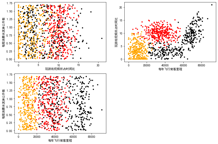
根据图像我们大致可以得到,海伦喜欢的异性类型的一些特点分布。
3.数据归一化
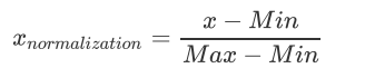
由于我们最终要使用KNN算法对数据进行分类。在KNN算法中,我们需要计算新数据与各个数据的距离,由欧氏距离公式我们可以看到。里程的数据太过庞大,所占的权重远远大于的其他两个类的数据,为了让各个数据所占的比重相等。我们可以对数据进行归一化处理,将数据映射到区间[0, 1]上,这样我们的各个数据的属性的权重就相等了
我们可以写下面函数:
通过各个数据集的最大值最小值将数据映射到区间[0, 1]上
"""
函数功能:归一化
参数说明:
    dataSet:原始数据集
返回:
    0-1标准化之后的数据集
"""


def minmax(dataSet):
    minDf = dataSet.min()
    maxDf = dataSet.max()
    normSet = (dataSet - minDf) / (maxDf - minDf)
    return normSet
datingT = pd.concat([minmax(datingTest.iloc[:, :3]), datingTest.iloc[:, 3]], axis=1)
#pd.concat()函数,实现数据拼接
#axis:默认为0。
#axis = 0, 表示在水平方向(row)进行连接
#axis = 1, 表示在垂直方向(column)进行连接
这里我们也可以切片查看数据处理情况:
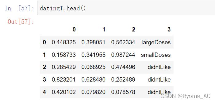
可以看到数据被映射到了[0, 1 ]的区间上
4. 划分训练集和测试集
我们按照数据集9:1的比例划分训练集与测试集
"""
函数功能:切分训练集和测试集
参数说明:
dataSet:原始数据集
rate:训练集所占比例
返回:
切分好的训练集和测试集
"""
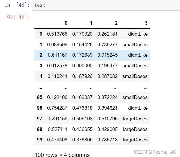
def randSplit(dataSet, rate=0.9):
n = dataSet.shape[0]
m = int(n * rate)
train = dataSet.iloc[:m, :]
test = dataSet.iloc[m:, :]
test.index = range(test.shape[0])
return train, test
train,test=randSplit(datingT)
同样,简单切片查看代码运行情况
5. 分类器针对于约会网站的测试代码
对数据处理差不多了,接下来就是主角KNN算法上场了,我们对之前书写的函数进行简单的改写,就能得到
"""
函数功能:k-近邻算法分类器
参数说明:
    train:训练集
    test:测试集
    k:k-近邻参数,即选择距离最小的k个点
返回:
    预测好分类的测试集
"""


def datingClass(train, test, k):
    n = train.shape[1] - 1
    m = test.shape[0]
    result = []
    for i in range(m):
        dist = list((((train.iloc[:, :n] - test.iloc[i, :n]) ** 2).sum(1)) ** 5)
        dist_l = pd.DataFrame({

    'dist': dist, 'labels': (train.iloc[:, n])})
        dr = dist_l.sort_values(by='dist')[:k]
        re = dr.loc[:, 'labels'].value_counts()
        result.append(re.index[0])
    result = pd.Series(result)
    test['predict'] = result
    acc = (test.iloc[:, -1] == test.iloc[:, -2]).mean()
    print(f'模型预测准确率为{

      acc}')
    return test
这段代码需要注意的是,之前我们计算距离的时候,因为只有一个新数据点,所以直接就可以求得距离,这次需要对测试集的每一个数据都求出距离和预测值
好了,接下来我们只需要运行一下函数,就可以得到预测的结果了
datingClass(train, test, 5)
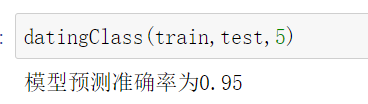
可以得到,预测的准确率达到了95%,相当高的准确率了
完整代码:
import pandas as pd

datingTest = pd.read_table('datingTestSet.txt', header=None)
datingTest.head()

import matplotlib as mpl
import matplotlib.pyplot as plt

# 不同的标签用不同的颜色区分
Colors = []
for i in range(datingTest.shape[0]):
    m = datingTest.iloc[i, -1]
    if m == 'didntLike':
        Colors.append('black')
    if m == 'smallDoses':
        Colors.append('orange')
    if m == 'largeDoses':
        Colors.append('red')

plt.rcParams['font.sans-serif'] = ['Simhei']  # 图中字体设置为黑体
pl = plt.figure(figsize=(12, 8))
fig1 = pl.add_subplot(221)
plt.scatter(datingTest.iloc[:, 1], datingTest.iloc[:, 2], marker='.', c=Colors)
plt.xlabel('玩游戏视频所占时间比')
plt.ylabel('每周消费冰淇淋公升数')

fig2 = pl.add_subplot(222)
plt.scatter(datingTest.iloc[:, 0], datingTest.iloc[:, 1], marker='.', c=Colors)
plt.xlabel('每年飞行常客里程')
plt.ylabel('玩游戏视频所占时间比')

fig3 = pl.add_subplot(223)
plt.scatter(datingTest.iloc[:, 0], datingTest.iloc[:, 2], marker='.', c=Colors)
plt.xlabel('每年飞行常客里程')
plt.ylabel('每周消费冰淇淋公升数')
plt.show()

"""
函数功能:归一化
参数说明:
    dataSet:原始数据集
返回:
    0-1标准化之后的数据集
"""


def minmax(dataSet):
    minDf = dataSet.min()
    maxDf = dataSet.max()
    normSet = (dataSet - minDf) / (maxDf - minDf)
    return normSet


datingT = pd.concat([minmax(datingTest.iloc[:, :3]), datingTest.iloc[:, 3]], axis=1)
datingT.head()

"""
函数功能:切分训练集和测试集
参数说明:
    dataSet:原始数据集
    rate:训练集所占比例
返回:
    切分好的训练集和测试集
"""


def randSplit(dataSet, rate=0.9):
    n = dataSet.shape[0]
    m = int(n * rate)
    train = dataSet.iloc[:m, :]
    test = dataSet.iloc[m:, :]
    test.index = range(test.shape[0])
    return train, test


train, test = randSplit(datingT)

"""
函数功能:k-近邻算法分类器
参数说明:
    train:训练集
    test:测试集
    k:k-近邻参数,即选择距离最小的k个点
返回:
    预测好分类的测试集
"""


def datingClass(train, test, k):
    n = train.shape[1] - 1
    m = test.shape[0]
    result = []
    for i in range(m):
        dist = list((((train.iloc[:, :n] - test.iloc[i, :n]) ** 2).sum(1)) ** 5)
        dist_l = pd.DataFrame({

    'dist': dist, 'labels': (train.iloc[:, n])})
        dr = dist_l.sort_values(by='dist')[:k]
        re = dr.loc[:, 'labels'].value_counts()
        result.append(re.index[0])
    result = pd.Series(result)
    test['predict'] = result
    acc = (test.iloc[:, -1] == test.iloc[:, -2]).mean()
    print(f'模型预测准确率为{

      acc}')
    return test


datingClass(train, test, 5)