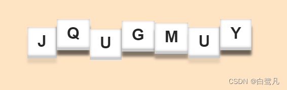
css —— 3d文字跳跃动画
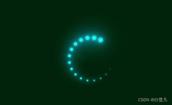
css —— 加载旋转变色效果
3d文字跳跃动画的代码
<!DOCTYPE html>
<html lang="en">
<head>
    <meta charset="UTF-8">
    <meta name="viewport" content="width=device-width, initial-scale=1.0">
    <title>Document</title>
</head>
<style>
    body{


        margin: 0;
        padding: 0;
        background-color: bisque;
    }
    .H1{


        margin: 0;
        padding: 0;
        position: absolute;
        top: 50%;
        left: 50%;
        transform: translate(-50% ,-50%);

    }

    h1 span{


        color: #262626;
        background: #fff;
        padding: 10px 20px;
        font-family: Arial, Helvetica, sans-serif;
        display: table-cell;
        box-shadow:inset 0 0 5px rgba(0,0,0,.3),  0 5px 0 #ccc;
        animation: animate .5s infinite;
    }
    @keyframes animate {


        0%{


            transform: translateY(0px);
            box-shadow:inset 0 0 5px rgba(0,0,0,.3),  0 5px 0 #ccc, 0 15px 5px rgba(0,0,0,0);

        }
        50%{


            transform: translateY(-20px);
            box-shadow:inset 0 0 5px rgba(0,0,0,.3),  0 5px 0 #ccc, 0 15px 5px rgba(0,0,0,.6);

        }
        100%{


            transform: translateY(0px);
            box-shadow:inset 0 0 5px rgba(0,0,0,.3),  0 5px 0 #ccc, 0 15px 5px rgba(0,0,0,0);

        }

    }

    h1 span:nth-child(1){


        animation-delay: .2s;
    }

    h1 span:nth-child(2){


        animation-delay: .4s;
    }

    h1 span:nth-child(3){


        animation-delay: .6s;
    }

    h1 span:nth-child(4){


        animation-delay: .8s;
    }

    h1 span:nth-child(5){


        animation-delay: 1s;
    }

    h1 span:nth-child(6){


        animation-delay: 1.2s;
    }

    h1 span:nth-child(7){


        animation-delay: 1.4s;
    }
</style>
<body>
 <h1>
    <span>J</span>
    <span>Q</span>
    <span>U</span>
    <span>G</span>
    <span>M</span>
    <span>U</span>
    <span>Y</span>
 </h1>
</body>
</html>
加载旋转变色效果的代码
<!DOCTYPE html>
<html lang="en">
<head>
    <meta charset="UTF-8">
    <meta name="viewport" content="width=device-width, initial-scale=1.0">
    <title>Document</title>
</head>
<style>
    *{


        margin: 0;
        padding: 0;
        box-sizing: border-box;
    }
    section{


        display: flex;
        justify-content: center;
        align-items: center;
        min-height: 100vh;
        background: #042104;
        animation: animateBg 10s linear infinite;
    }
    /* 颜色变化 */
    @keyframes animateBg{


        0%{


            filter: hue-rotate(0deg);
        }
        100%{


            filter: hue-rotate(260deg);
        }
    }
    section .loader{


        position: relative;
        width: 120px;
        height: 120px;
    }
    section .loader span{


        position: absolute;
        top: 0;
        left: 0;
        width: 100%;
        height: 100%;
        transform: rotate(calc(18deg * var(--i)));
    }
    section .loader span::before{


        content: "";
        position: absolute;
        top: 0;
        left: 0;
        width: 15px;
        height: 15px;
        border-radius: 50%;
        background-color: aqua;
        box-shadow: 0 0 10px aquamarine,
        0 0 20px aqua,
        0 0 40px aqua,
        0 0 60px aqua,
        0 0 80px aqua,
        0 0 100px aqua;
        /* animation: animate 1s linear infinite; */
        animation: animate 2s linear infinite;
        /* 转动 */
        animation-delay: calc(0.1s * var(--i));
    }
    /* 缩放 */
    @keyframes animate{


        0%{


            transform: scale(1);
        }
        80%,100%{


            transform: scale(0);
        }
    }
</style>
<body>
    <section>
        <div class="loader">
            <span style="--i:1"> </span>
            <span style="--i:2"> </span>
            <span style="--i:3"> </span>
            <span style="--i:4"> </span>
            <span style="--i:5"> </span>
            <span style="--i:6"> </span>
            <span style="--i:7"> </span>
            <span style="--i:8"> </span>
            <span style="--i:9"> </span>
            <span style="--i:10"> </span>
            <span style="--i:11"> </span>
            <span style="--i:12"> </span>
            <span style="--i:13"> </span>
            <span style="--i:14"> </span>
            <span style="--i:15"> </span>
            <span style="--i:16"> </span>
            <span style="--i:17"> </span>
            <span style="--i:18"> </span>
            <span style="--i:19"> </span>
            <span style="--i:20"> </span>

        </div>
    </section>
</body>
</html>
更多案例可以看:
https://download.csdn.net/download/weixin_43506403/88009054
或者
https://gitee.com/plxvervewvr434232/css-animation.git