如何通过CSS实现一个物体在屏幕中无限的边界碰撞回弹呢?我们可以使用动画效果实现
代码
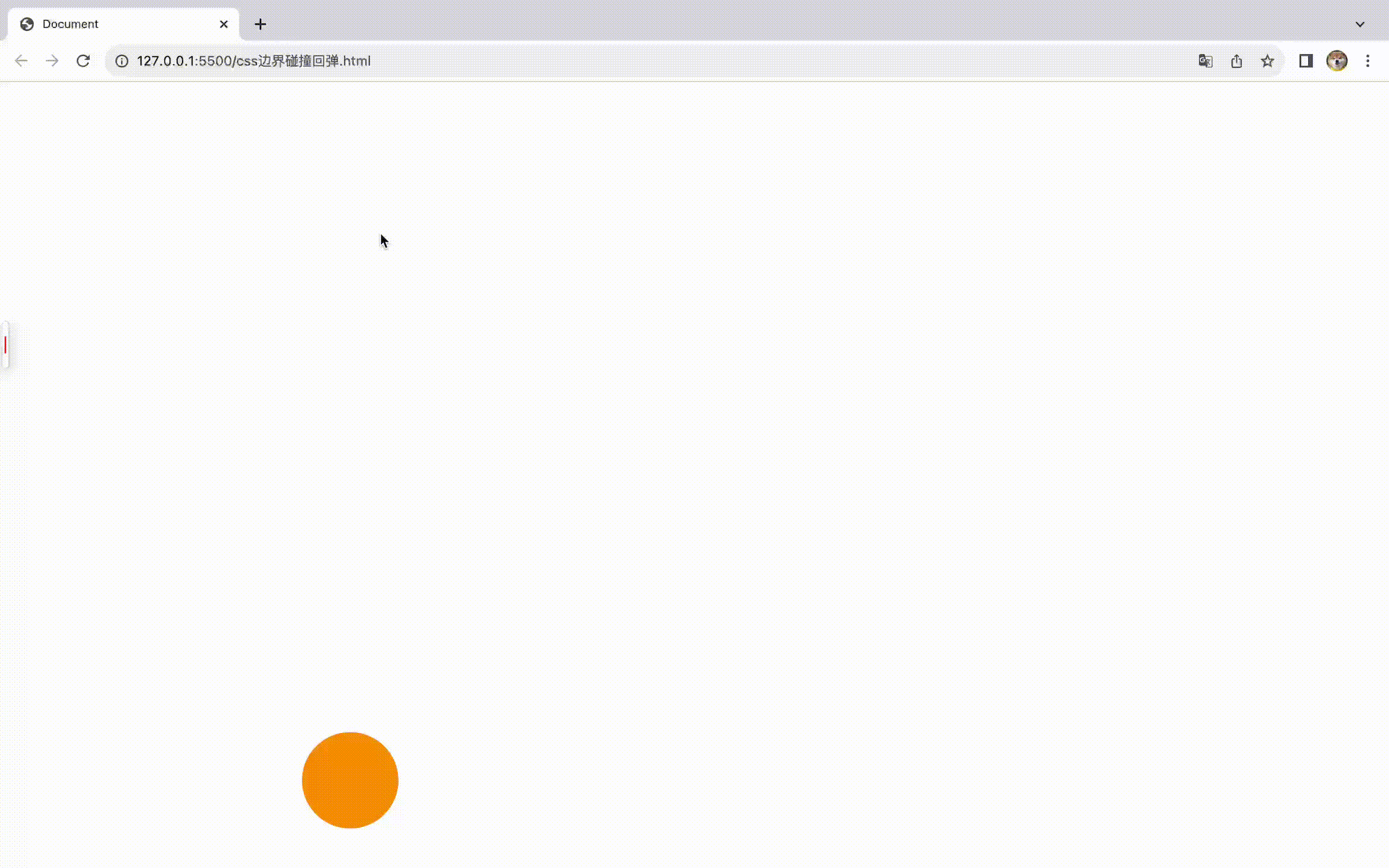
我们只做一个小球,通过定位属性叠加动画的方式, 让小球在屏幕中进行运动,通过设置animation的alternate属性来设置回弹。最后,只需要设置两个运动的持续时间不同就能完成多方向的边界碰撞事件了。
<!DOCTYPE html>
<html lang="en">
  <head>
    <meta charset="UTF-8" />
    <meta name="viewport" content="width=device-width, initial-scale=1.0" />
    <title>Document</title>
    <style>
      div {
        position: absolute;
        top: 0;
        left: 0;
        width: 100px;
        height: 100px;
        background-color: orange;
        border-radius: 50%;
        animation: w_move 2.5s linear infinite alternate,
          h_move 3.2s linear infinite alternate;
      }
      @keyframes w_move {
        to {
          left: calc(100vw - 100px);
        }
      }

      @keyframes h_move {
        to {
          top: calc(100vh - 100px);
        }
      }
    </style>
  </head>
  <body>
    <div></div>
  </body>
</html>