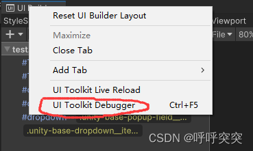
使用UI Toolkit Debugger查看元素
1、打开面板
2、找到元素
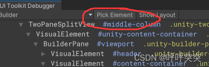
在UI Builder窗体,别忘了打开Preview再选择元素
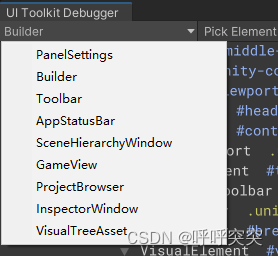
3、可以选择不同类型的窗体
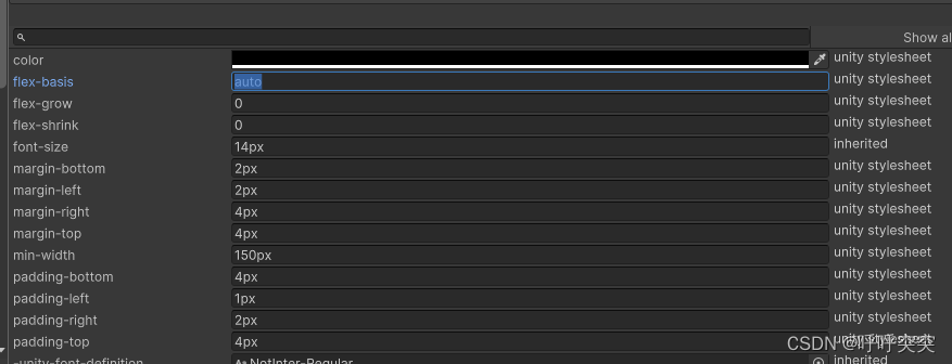
4、查看元素的样式
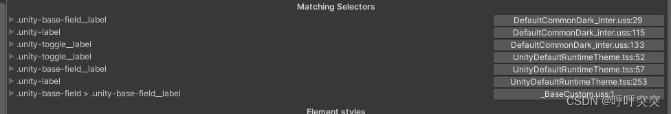
需要注意的是下面的样式会覆盖上面的
5、调试
修改内置控件样式
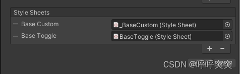
1、找到PanelSettings>Theme Style Sheet的资源文件,然后新建uss样式文件
2、将uss文件拖拽到Style Sheets中,需要注意的是下面的样式会覆盖上面的样式
使用在UI Toolkit Debugger面板中查看元素
USS变量
:root{


	--font-color-primary:#C2C262;
	--font-color-second:rgb(255,0,0);
}
.unity-base-field>.unity-base-field__label{


	color:var(--font-color-primary);
}
.unity-base-field:focus>.unity-base-field__label{


    color:var(--font-color-second);
}
要两个-开头
示例
1、修改所有文字focus状态下颜色
.unity-base-field>.unity-base-field__label{


	color:rgb(0,0,0)
}
.unity-base-field:focus>.unity-base-field__label{


    color:rgb(0,0,0)
}
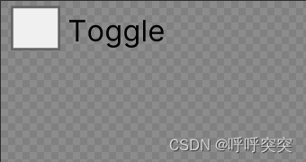
2、修改Toggle样式
#unity-checkmark .unity-toggle__checkmark:checked {


    background-image: url('project://database/Assets/UnityDefaultRuntimeTheme.tss?fileID=-1304905567622442630&guid=9d716a99319f7ee45ab37997fac08f69&type=3#arrow-down@2x');
}
.unity-toggle__checkmark
{


   -unity-background-image-tint-color:rgb(255,255,255);
   min-width:20px;
}
.unity-toggle>.unity-toggle__input:checked>.unity-toggle__checkmark{


    background-color: rgb(64,158,255);
}
.unity-base-field:checked>.unity-base-field__label{


    color:rgb(64,158,255);
}
3、修改DropDownItem样式
.unity-base-dropdown__item {


    -unity-font-style: normal;
    -unity-text-align: upper-left;
    font-size: 30px;
    color: rgb(255, 0, 0);
    background-color: rgba(0, 0, 0, 0);
    -unity-text-outline-width: 0;
    }
4、自定义一个Toggle
1、在Toggle里添加一个Label
2、Label添加.toggle-label-right
3、样式
.unity-toggle > .unity-base-field__label {


    display: none;
}

.unity-toggle > .unity-base-field__input {


    justify-content: flex-start;
    flex-direction: row;
    flex-grow: 0;
    display: flex;
    visibility: visible;
    overflow: visible;
    flex-basis: auto;
}

#unity-checkmark {


    width: auto;
    height: auto;
    justify-content: space-around;
    align-self: auto;
}

.unity-toggle > .toggle-label-right {


    height: auto;
    flex-basis: auto;
    flex-shrink: 0;
    flex-grow: 1;
    flex-direction: column;
    flex-wrap: nowrap;
    font-size: 10px;
    -unity-text-align: upper-left;
    white-space: normal;
    text-overflow: clip;
    color: rgb(0, 0, 0);
    -unity-font-style: normal;
    text-shadow: 0 0 0 rgba(0, 0, 0, 0);
    -unity-text-outline-width: 0;
}
.unity-toggle:checked>.toggle-label-right{


    color:rgb(64,158,255);
}
.unity-toggle > .unity-toggle__input > .unity-toggle__checkmark {


    transition-duration: 0.3s;
    transition-timing-function: linear;

}
.unity-toggle > .unity-toggle__input:checked > .unity-toggle__checkmark {


    transition-duration: 0.3s;
    transition-timing-function: linear;

}
伪标签 pseudo
hover
active
inactive
selected
disabled
enabled
focus
checked
root