Android_Drawable介绍之使用篇(1)
导言:
关于Android Drawable这是个系列文章,总来的来说分为使用篇和原理篇,每篇又分为各个不同的小篇.
Drawable
定义:drawable包中含有很多管理管理视觉元素的类,它们用来展示bitmap和一些渐变,经常用来显示一些背景和指示器,
成员:安卓中为了应对开发中的各种ui效果需求提供了很多不同种类的drawable
(1)状态改变类
- StateListDrawable,图片选择drawable
- ColorStateList(不属于drawable,但是我们经常用到,这里顺便说下)颜色选择器
(2)动画类
- RotateDrawable 旋转drawable
- ScaleDrawable 缩放drawale
- TransitionDrawable 平移drawable
- AnimationDrawable 动画drawable
(3)特殊图形类,我们可自己绘制形成的特殊图形
- ShapeDrawable 我们常用的shape图
- NinePatchDrawable .9图
- VectorDrawable 矢量图
(4)多个drawable形成特殊的图形效果,这时通过将多个drawable
进行处理形成特殊的图形效果
- LayerDrawable 层次图,多个drawable重叠显示的
- ClipDrawable 裁剪图,通过将两张图片进行裁剪拼接形成特殊的效果,
- LevelListDrawable 层级drawable
- InsetDrawable 嵌套drawable
(5)直接形成的drawable
- ColorDrawable 使用颜色生成的drawable
- BitmapDrawable 使用bitmap生成的drawable
- GradientDrawable 颜色渐变drawable
- PaintDrawable 画笔drawable 使用画笔绘制drawable的边界和角度
- PictureDrawable 图片drawable
(6)Android5.0新增的Drawable
- RippleDrawable 水波纹drawable
- AnimatedStateListDrawable 渐变drawable
接下来我们逐个分析drawable的子类
StateListDrawable
描述:状态选择器,也就是我们常用的图片选择器,
使用场景:比如一个button有多种状态(获取焦点,按下,正常),我们可以给其设置StateListDrawable使其在不同的状态下显示不同的drawable
使用:
(1)在xml中使用:
官方实例:
<?xml version="1.0" encoding="utf-8"?>
<selector xmlns:android="http://schemas.android.com/apk/res/android"
android:constantSize=["true" | "false"]
android:dither=["true" | "false"]
android:variablePadding=["true" | "false"] >
<item
//在当前的状态下要显示的drawable
android:drawable="@[package:]drawable/drawable_resource"
//是否按下
android:state_pressed=["true" | "false"]
//是否有焦点
android:state_focused=["true" | "false"]
//光标是否悬停在该控件上
android:state_hovered=["true" | "false"]
//是否选中
android:state_selected=["true" | "false"]
//是否可选择
android:state_checkable=["true" | "false"]
//是否选中
android:state_checked=["true" | "false"]
//是否可用
android:state_enabled=["true" | "false"]
//是否激活
android:state_activated=["true" | "false"]
//window是否获取焦点
android:state_window_focused=["true" | "false"] />
</selector>
在xml中设置StateListDrawable,根节点必须是selector,在子节点item中设置不同状态下的drawable,
参数说明:
android:constantSize
drawable的大小是否变化,true表示大小不变,false表示drawable的大小随着状态的变化而改变,默认是false.
android:dither:
当drawable的色素配置和屏幕当前的色素不同时(例如,颜色的ARGB 8888 bitmap在RGB 565的屏幕上),是否允许色素抖动,true时可以,false时不可以,默认是可以,
android:variablePadding:
是否允许padding变化,
代码实例
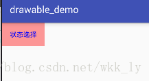
<Button
android:id="@+id/bt_statelist"
android:layout_width="wrap_content"
android:text="状态选择"
android:background="@drawable/seletor_bt"
android:layout_height="wrap_content" />
seletor_bt
<?xml version="1.0" encoding="utf-8"?>
<selector xmlns:android="http://schemas.android.com/apk/res/android" >
<item android:drawable="@drawable/shape_bt_normal_bg" android:state_focused="false" android:state_pressed="false" android:state_checked="false"/>
<item android:drawable="@drawable/shape_bt_press" android:state_pressed="true"/>
</selector>
shape_bt_normal_bg
<?xml version="1.0" encoding="utf-8"?>
<shape xmlns:android="http://schemas.android.com/apk/res/android" android:shape="rectangle">
<solid android:color="#fff"/>
</shape>
shape_bt_press
<?xml version="1.0" encoding="utf-8"?>
<shape xmlns:android="http://schemas.android.com/apk/res/android" android:shape="rectangle">
<solid android:color="#6f00"/>
</shape>
效果如下:
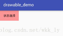
note:注意StateListDrawable能够起效果,控件一定要支持,否则是无法显示的,例如keyboard就是不支持ColorStateList,所以在自定义View中如果我们也想要实现这种效果我们要在自定义View中使用代码实现
**代码实现**

//接下来我们用代码实现上述的功能
Button bt = findViewById(R.id.bt_state);
    bt.setBackgroundDrawable(createStateDrawable());
    bt.setOnClickListener(new View.OnClickListener() {
        @Override
        public void onClick(View v) {
            Toast.makeText(DrawableActivity.this, "点击", Toast.LENGTH_SHORT).show();
        }
    });
}

/**
 * 代码实现创建图片选择器
 */
public StateListDrawable createStateDrawable(){
    StateListDrawable stateListDrawable = new StateListDrawable();
//  stateListDrawable.addState();
    //press
    int[] press_state= new int[]{android.R.attr.state_pressed};
    stateListDrawable.addState(press_state,getResources().getDrawable(R.drawable.shape_bt_normal_bg));
    //n属性负号代表false否则代表true,
    int[] normal_state= new int[]{-android.R.attr.state_pressed};
    stateListDrawable.addState(normal_state,getResources().getDrawable(R.drawable.shape_bt_fcouse_bg));
    return stateListDrawable;
}
ColorStateList
描述:颜色选择器,(不属于drawable但是和StateListDrawable的选择效果类似,这里随便说下),在不同的状态下显示不同的颜色
使用场景:textView在不同的状态下设置不同的颜色

官方实例:


<?xml version="1.0" encoding="utf-8"?>
<selector xmlns:android="http://schemas.android.com/apk/res/android" >
    <item
        //在特定状态下显示的颜色
        android:color="hex_color"
        //状态如上(StateListDrawable)
        android:state_pressed=["true" | "false"]
        android:state_focused=["true" | "false"]
        android:state_selected=["true" | "false"]
        android:state_checkable=["true" | "false"]
        android:state_checked=["true" | "false"]
        android:state_enabled=["true" | "false"]
        android:state_window_focused=["true" | "false"] />
</selector>
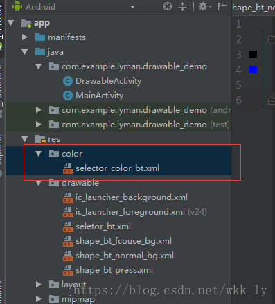
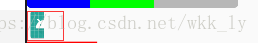
//注意:颜色选择器要在res文件下的color文件夹如下图
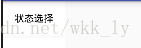
效果如下:注意这个是和上面的状态选择器一起做的,注意关注字体颜色的变化
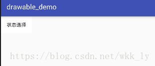
代码如下:
<Button
    android:id="@+id/bt_statelist"
    android:layout_width="wrap_content"
    android:text="状态选择"
    android:background="@drawable/seletor_bt"
    android:textColor="@color/selector_color_bt"//使用颜色选择器
    android:layout_height="wrap_content" />

    selector_color_bt文件
    <?xml version="1.0" encoding="utf-8"?>
<selector xmlns:android="http://schemas.android.com/apk/res/android">
<item android:color="#000" android:state_pressed="false" android:state_focused="false"/>
<item android:color="#00f" android:state_pressed="true"/>
</selector>
代码实现:
关于颜色选择器其实我们在自定义View开发用的比较多,这里介绍下代码使用
private ColorStateList createColorSelector(int selectedColor, int normalColor) {
    // 创建一个颜色选择器,
    int[] state1 = {android.R.attr.state_pressed};      // 第一个状态,按下状态
    int[] state2 = {android.R.attr.state_selected};     // 第二个状态,选择状态
    int[] state3 = {};                                  // 第三个状态,其它任何状态
    int[][] states = new int[3][1];
    states[0] = state1;
    states[1] = state2;
    states[2] = state3;

    int[] colors = {
            selectedColor,  // 按下状态的颜色
            selectedColor,  // 选中状态的颜色
            normalColor     // 未选状态的颜色
    };
    ColorStateList colorStateList = new ColorStateList(states, colors);
    return colorStateList;
}
ClipDrawable裁剪drawable
定义:
裁剪drawable可以将两个drawable裁剪拼接在一起,方向上可以在横向或是纵向,裁剪程度是从0到10000

官方实例:
<?xml version="1.0" encoding="utf-8"?>
//主标签
<clip
    xmlns:android="http://schemas.android.com/apk/res/android"
    //drawable文件
    android:drawable="@drawable/drawable_resource"
    //裁剪方向可以是横向的也可以的是竖直的
    android:clipOrientation=["horizontal" | "vertical"]
    //指定裁剪的位置可以是,可以是一个也可以是多个属性用|连接
    android:gravity=["top" | "bottom" | "left" | "right" | "center_vertical" |
                     "fill_vertical" | "center_horizontal" | "fill_horizontal" |
                     "center" | "fill" | "clip_vertical" | "clip_horizontal"] />
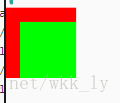
demo实例:
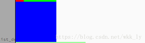
裁剪一张drawable:
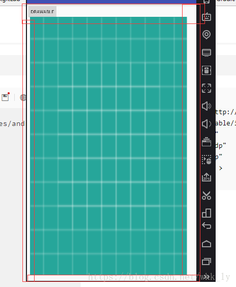
效果图:注意红线部分是图片应该显示的全部区域但是因为裁剪一半所以图片只是显示一半
代码:
    xml
    <ImageView
    app:layout_constraintTop_toBottomOf="@+id/iv_clip"
    android:id="@+id/iv_clip_single"
    android:layout_width="wrap_content"
    android:background="@drawable/clip_single"
    android:layout_height="wrap_content" />
    iv_clip_single文件
    <?xml version="1.0" encoding="utf-8"?>
<clip android:clipOrientation="horizontal"
android:gravity="left"
android:drawable="@mipmap/ic_launcher"
xmlns:android="http://schemas.android.com/apk/res/android">
</clip>
Activity;
ImageView iv_single =findViewById(R.id.iv_clip_single);
    ClipDrawable clipDrawable_single = (ClipDrawable) iv_single.getBackground();
    clipDrawable_single.setLevel(5000);
裁剪多个drawable:(仿照系统的进度条)
效果图(这个也是和layerdrawable一起使用的,android官方的progress就是用的这种方式实现进度条的)

代码:
 xml:
  <ImageView
    android:id="@+id/iv_clip"
    android:layout_width="300dp"
    android:layout_height="20dp"
    //设置多层的裁剪图片
    android:background="@drawable/clip_iv"
    app:layout_constraintTop_toBottomOf="@+id/view" />
    clip_iv文件
    <?xml version="1.0" encoding="utf-8"?>
    <layer-list xmlns:android="http://schemas.android.com/apk/res/android"
android:clipOrientation="vertical"
>
<!--底层-->
<item android:id="@+id/botttom">
    <clip android:clipOrientation="horizontal" android:gravity="left">
        <shape android:shape="rectangle">
            <solid android:color="#4000"/>
            <corners android:radius="5dp" />
        </shape>
    </clip>
</item>
<!--第二层-->
<item android:id="@+id/second">
    <clip android:clipOrientation="horizontal" android:gravity="left">
        <shape android:shape="rectangle">
            <solid android:color="#0f0"/>
            <corners android:radius="5dp" />
        </shape>
    </clip>
</item>
<!--顶层-->
<item android:id="@+id/first">
    <clip android:clipOrientation="horizontal" android:gravity="left">
        <shape android:shape="rectangle">
            <solid android:color="#00f"/>
            <corners android:radius="5dp" />
        </shape>
    </clip>
</item>
</layer-list>

程序
    注意clib的level值是从0到10000
  ImageView iv = findViewById(R.id.iv_clip);
    LayerDrawable layerDrawable = (LayerDrawable) iv.getBackground();
    //获取第二层drawable
    ClipDrawable secondDrawable = (ClipDrawable) layerDrawable.findDrawableByLayerId(R.id.second);
    //获取第一层drawable
    ClipDrawable firstDrawable = (ClipDrawable) layerDrawable.findDrawableByLayerId(R.id.first);
        ClipDrawable botttomDrawable = (ClipDrawable) layerDrawable.findDrawableByLayerId(R.id.botttom);
    firstDrawable.setLevel(3000);
    secondDrawable.setLevel(6000);
    botttomDrawable.setLevel(10000);
LayerDrawable 层叠drawable
定义:
层叠drawable,这个是管理多个drawable使其顺序(从下而上)堆叠,
形成多个drawable堆叠而成形成的特殊drawable,最外层的drawable是最外面显示的,他遮盖所有的drawable,
使用
LayerDrawable主要是在xml中使用
标签介绍:
<?xml version="1.0" encoding="utf-8"?>
//主标签,代表着要创建LayerDrawable
<layer-list
    xmlns:android="http://schemas.android.com/apk/res/android" >
    //item,每一个item代表一个drawable,下面item会遮盖上面的item,但是上面的item可以通过top,right属性来和下面的item形成偏移,进而显示错位的那一部分
    <item
        android:drawable="@[package:]drawable/drawable_resource"
        android:id="@[+][package:]id/resource_name"
        //向上偏移
        android:top="dimension"
        //向右偏移
        android:right="dimension"
        //向下偏移
        android:bottom="dimension"
        //向左偏移
        android:left="dimension" />
    //这个item会遮盖上面一个item
    <item
        android:drawable="@[package:]drawable/drawable_resource"
        android:id="@[+][package:]id/resource_name"
        //向上偏移
        android:top="dimension"
        //向右偏移
        android:right="dimension"
        //向下偏移
        android:bottom="dimension"
        //向左偏移
        android:left="dimension" />
</layer-list>
使用
效果如下:
代码如下:
xml:
 <ImageView
    android:id="@+id/iv_layer"
    android:layout_width="100dp"
    android:layout_height="100dp"
    app:layout_constraintTop_toBottomOf="@id/iv_clip_single"
    android:background="@drawable/layer_demo1"
    />
layer_demo1文件
<?xml version="1.0" encoding="utf-8"?>
<layer-list xmlns:android="http://schemas.android.com/apk/res/android">
<item android:id="@+id/bottom" >
    <shape android:shape="rectangle">
        <solid android:color="#f00"/>
    </shape>
</item>
//top=20dp就是向下平移20dp left就是想右平移20dp bottom和right以此类推
<item android:id="@+id/top" android:top="20dp" android:left="20dp">
    <shape android:shape="rectangle">
        <solid android:color="#0f0"/>
    </shape>
</item>
</layer-list>
LevelListDrawable ##
描述
LevelListDrawable包含了一系列的drawable,这些drawable设置了不同的level等级,当LevelListDrawable设置哪个level时就显示level对应的drawable
官方示例:
在xml经常如此定义
 <level-list xmlns:android="http://schemas.android.com/apk/res/android">
<item android:maxLevel="0" android:drawable="@drawable/ic_wifi_signal_1" />
<item android:maxLevel="1" android:drawable="@drawable/ic_wifi_signal_2" />
<item android:maxLevel="2" android:drawable="@drawable/ic_wifi_signal_3" />
<item android:maxLevel="3" android:drawable="@drawable/ic_wifi_signal_4" />
</level-list>
说明:
<?xml version="1.0" encoding="utf-8"?>
//level-list定义LevelListDrawable的根节点
<level-list
    xmlns:android="http://schemas.android.com/apk/res/android" >
    //每一个item代表着包含的drawable
    <item
        android:drawable="@drawable/drawable_resource"
        //这个drawable所对应的最高等级
        android:maxLevel="integer"
        ////这个drawable所对应的最低等级,只要LevelListDrawable设置的level在minLevel和maxLevel之间则就会显示这个这个drawable(换而言就是用当前这个drawable替换之前显示的drawable)
        android:minLevel="integer" />
</level-list>
官方使用
在Android系统中用到LevelListDrawable的地方主要有电量显示,wifi显示,但是在实际开发中使用的比较少,主要是用于较少的图片切换
demo示例
效果:(这个是静态图,没有录制动态图)
代码如下:
xml:
    <ImageView
    android:id="@+id/iv_level_demo"
    android:layout_width="100dp"
    android:background="@drawable/level_list_demo1"
    app:layout_constraintTop_toBottomOf="@id/iv_layer"
    android:layout_height="100dp" />

level_list_demo1文件:
<?xml version="1.0" encoding="utf-8"?>
<level-list xmlns:android="http://schemas.android.com/apk/res/android">
<item android:maxLevel="10">
    <shape android:shape="rectangle">
        <solid android:color="#f00"/>
    </shape>
</item>
<item android:maxLevel="20">
    <shape android:shape="rectangle">
        <solid android:color="#00f"/>
    </shape>
</item>
<item android:maxLevel="30">
    <shape android:shape="rectangle">
        <solid android:color="#0f0"/>
    </shape>
</item>
<item android:maxLevel="40">
    <shape android:shape="rectangle">
        <solid android:color="#aff"/>
    </shape>
</item>
<item android:maxLevel="50">
    <shape android:shape="rectangle">
        <solid android:color="#f0f"/>
    </shape>
</item>
</level-list>

Activity中:
ImageView ivLevel = findViewById(R.id.iv_level_demo);
    levelListDrawable = (LevelListDrawable) ivLevel.getBackground();
    levelListDrawable.setLevel(20);
    ivLevel.setOnClickListener(new View.OnClickListener() {
        @Override
        public void onClick(View v) {
        //此处是每点击一次将level提高10进而显示下一个图片,一次循环显示
            int level = levelListDrawable.getLevel();
            if (level>50){
                level=10;
            }else {
                level+=10;
            }
            levelListDrawable.setLevel(level);
        }
    });
InsetDrawable
描述
A Drawable that insets another Drawable by a specified distance. This is used when a View needs a background that is smaller than the View's actual bounds
嵌入drawable,这个是说这是一个drawable通过特定的距离插入(inset)到另一个drawable中,这个常常用来设置一个View需要的背景不能全充满需要在一个或者是多个的边界留有一定的空间,接下来看例子可以更好的理解,
官方举例一般用于在xml中
?xml version="1.0" encoding="utf-8"?>
//根节点 inset是设置InsetDrawable的标志
<inset
xmlns:android="http://schemas.android.com/apk/res/android"
android:drawable="@drawable/drawable_resource"
//相对于被插入的drawable的上面留有的距离
android:insetTop="dimension"
//相对于被插入的drawable的右边留有的距离
android:insetRight="dimension"
//相对于被插入的drawable的下面留有的距离
android:insetBottom="dimension"
//相对于被插入的drawable的左边留有的距离
android:insetLeft="dimension" />
demo示例
xml文件
 <ImageView
    app:layout_constraintTop_toTopOf="parent"
    app:layout_constraintBottom_toBottomOf="parent"
    app:layout_constraintLeft_toLeftOf="parent"
    app:layout_constraintRight_toRightOf="parent"
    android:id="@+id/iv_insert_demo"
    android:layout_width="match_parent"
    android:layout_height="match_parent"
    android:background="@drawable/insert_demo"
    />
insert_demo文件:
<?xml version="1.0" encoding="utf-8"?>
<inset xmlns:android="http://schemas.android.com/apk/res/android"
android:drawable="@drawable/ic_launcher_background"
android:insetLeft="10dp"
android:insetBottom="20dp"
android:insetRight="30dp"
android:insetTop="40dp" >
</inset>
效果图:(注意红线部分就是图片插入时甚至的间隔)