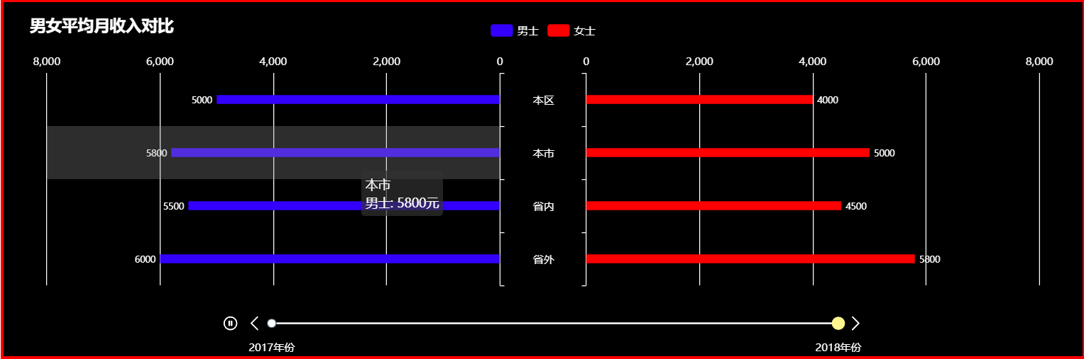
双向条形图图表效果如下:
具体代码如下:
<!DOCTYPE html>
<html>
<head>
<meta charset="UTF-8">
<title>双向条形图案例</title>
<!-- 引入 ECharts 文件 -->
<script src="js/echarts4.0.js" type="text/javascript" charset="utf-8"></script>
</head>
<body>
<!-- 为 ECharts 准备一个具备大小(宽高)的 容器 -->
<div id="chart1" style="width: 80%;height: 400px;top: 50px;left: 10%;border: 3px solid #FF0000;"></div>
</body>
</html>
<script type="text/javascript">
// 基于准备好的容器(这里的容器是id为chart1的div),初始化echarts实例
var chart1 = echarts.init(document.getElementById("chart1"));
var years = [2017, 2018];
var myData = ['本区', '本市', '省内', '省外'];
var dataMan = {
2017: [4500, 5000, 4800, 5500],
2018: [5000, 5800, 5500, 6000],
};
var dataWomen = {
2017: [3500, 4200, 4000, 5200],
2018: [4000, 5000, 4500, 5800],
};
/* option 开始 */
option = {
/* baseOption 开始 */
baseOption: { // baseOption 是一个 『原子option』,options 数组中的每一项也是一个 『原子option』。每个『原子option』中就是ECharts文档中描述的各种配置项。
// timeline 组件,提供了在多个 ECharts option 间进行切换、播放等操作的功能。
// timeline 和其他组件有些不同,它需要操作『多个option』。 假设,我们把 ECharts 的传统的 option 称为原子option,
// 那么使用 timeline 时,传入 ECharts 的 option 就成为了一个集合多个原子option的复合option。
timeline: {
show: true, // 是否显示 timeline 组件。如果设置为false,不会显示,但是功能还存在。[ default: true ]
type: 'slider', // 这个属性目前只支持为 slider,不需要更改。[ default: 'slider' ]
axisType: 'category', // 轴的类型。[ default: 'time' ], 可选值为:'value' 数值轴,适用于连续数据。'category' 类目轴,适用于离散的类目数据。'time' 时间轴,适用于连续的时序数据,与数值轴相比时间轴带有时间的格式化,在刻度计算上也有所不同,例如会根据跨度的范围来决定使用月,星期,日还是小时范围的刻度。
currentIndex: 0, // 表示当前选中项是哪项, [ default: 0 ]。比如,currentIndex 为 0 时,表示当前选中项为 timeline.data[0](即使用 options[0])。
autoPlay: true, // 表示是否自动播放。[ default: false ]
rewind: false, // 表示是否反向播放。[ default: false ]
loop: true, // 表示是否循环播放。[ default: true ]
playInterval: 2000, // 表示播放的速度(跳动的间隔),单位毫秒(ms)。[ default: 2000 ]
realtime: true, // 拖动圆点的时候,是否实时更新视图。[ default: true ]
controlPosition: 'left', // 表示『播放』按钮的位置。可选值:'left'、'right'。[ default: 'left' ]
zlevel: 0, // 所有图形的 zlevel 值。[ default: 0 ]
z: 2, // 组件的所有图形的z值。控制图形的前后顺序。z值小的图形会被z值大的图形覆盖。z相比zlevel优先级更低,而且不会创建新的 Canvas。
//left: 'auto', // timeline组件离容器左侧的距离。[ default: 'auto' ], left 的值可以是像 20 这样的具体像素值,可以是像 '20%' 这样相对于容器高宽的百分比,也可以是 'left', 'center', 'right'。
//top: 'auto', // timeline组件离容器上侧的距离。[ default: 'auto' ], top 的值可以是像 20 这样的具体像素值,可以是像 '20%' 这样相对于容器高宽的百分比,也可以是 'top', 'middle', 'bottom'。
//right: 'auto', // timeline组件离容器右侧的距离。
//bottom: 'auto', // timeline组件离容器下侧的距离。
padding: 5, // timeline内边距,单位px,默认各方向内边距为5,接受数组分别设定上右下左边距。如:[100,20,20,20]
orient: 'horizontal', // 时间线 摆放方式,可选值有:'vertical':竖直放置。'horizontal':水平放置。
inverse: false, // 是否反向放置 timeline,反向则首位颠倒过来。[ default: false ]
symbol: 'emptyCircle', // timeline标记的图形。ECharts 提供的标记类型包括 'circle', 'rect', 'roundRect', 'triangle', 'diamond', 'pin', 'arrow'
symbolSize: 10, // timeline标记的大小
lineStyle: { // 轴线
show: true, // 是否显示轴线。可以设置为 false 不显示轴线,则可以做出不同的样式效果。[ default: true ]
color: '#fff', // timeline 线的颜色。[ default: '#304654' ]
width: 2, // timeline 线宽。[ default: 2 ]
type: 'solid', // timeline 线的类型。'solid','dashed','dotted'
opacity: 1 // 图形透明度
},
label: { // 轴的文本标签
normal: {
show: true, // 是否显示 label。[ default: true ]
position: 'bottom', // 'auto': 完全自动决定。'left': 贴左边界放置。 当 timline.orient 为 'vertical' 时有效。'right':当 timline.orient 为 'vertical' 时有效。 贴右边界放置。
// 'top': 贴上边界放置。 当 timline.orient 为 'horizontal' 时有效。'bottom': 贴下边界放置。 当 timline.orient 为 'horizontal' 时有效。
// number: 指定某个数值时,表示 label 和轴的距离。为 0 时则和坐标轴重合,可以为正负值,决定 label 在坐标轴的哪一边。
color: '#fff', // timeline.lable文字的颜色。[ default: '#304654' ]
fontSize: 12, // timeline.lable文字的字体大小
interval: 'auto', // label 的间隔。当指定为数值时,例如指定为 2,则每隔两个显示一个 label。[ default: 'auto' ]
rotate: 0, // label 的旋转角度。正值表示逆时针旋转。[ default: 0 ]
backgroundColor: 'transparent', // 文字块背景色。[ default: 'transparent' ]默认透明
formatter: '{value}年份', // 刻度标签的内容格式器,支持字符串模板和回调函数两种形式。[ default: null ]
},
},
checkpointStyle: { // 『当前项』(checkpoint)的图形样式。
symbol: 'circle', // timeline.checkpointStyle 标记的图形。
symbolSize: 13, // timeline.checkpointStyle 标记的大小
color: '#FFF68F', // timeline组件中『当前项』(checkpoint)的颜色。[ default: '#c23531' ]
borderWidth: 2, // timeline组件中『当前项』(checkpoint)的边框宽度。
borderColor: '#FFF68F', // timeline组件中『当前项』(checkpoint)的边框颜色。[ default: 'rgba(194,53,49, 0.5)' ]
animation: true, // timeline组件中『当前项』(checkpoint)在 timeline 播放切换中的移动,是否有动画。[ default: true ]
animationDuration: 500, // timeline组件中『当前项』(checkpoint)的动画时长。[ default: 300 ]
animationEasing: 'backln' // timeline组件中『当前项』(checkpoint)的动画的缓动效果。不同的缓动效果可以参考 缓动示例。
},
controlStyle: { // 『控制按钮』的样式。『控制按钮』包括:『播放按钮』、『前进按钮』、『后退按钮』。
show: true, // 是否显示『控制按钮』。设置为 false 则全不显示。[ default: true ]
showPlayBtn: true, // 是否显示『播放按钮』。[ default: true ]
showNextBtn: true, // 是否显示『前进按钮』。[ default: true ]
showPrevBtn: true, // 是否显示『后退按钮』。[ default: true ]
color: '#fff', // 按钮颜色。[ default: '#304654' ]
borderColor: '#fff', // 按钮边框颜色。[ default: '#304654' ]
borderWidth: 1, // 按钮边框线宽。
itemSize: 15, // 『控制按钮』的尺寸,单位为像素(px)。[ default: 22 ]
itemGap: 12, // 『控制按钮』的间隔,单位为像素(px)。[ default: 12 ]
position: 'left' // 『控制按钮』的位置。[ default: 'left' ], 当 timeline.orient 为 'horizontal'时,'left'、'right'有效。当 timeline.orient 为 'horizontal'时,'left'、'right'有效。
},
/*emphasis: { // 高亮样式 (包括 label,itemStyle,checkpoint,controlStyle)
label: {
},
itemStyle: {
},
checkpoint: {
},
controlStyle: {
}
},*/
// timeline 数据。Array 的每一项,可以是直接的数值。 如果需要对每个数据项单独进行样式定义,则数据项写成 Object。Object中,value属性为数值。
data: [], // timeline.data 中的每一项,对应于 options 数组中的每个 option。
},
backgroundColor: '#000', // 背景色
title: {
text: '男女平均月收入对比', // 标题文本
top: '3%',
left: '2%', // 标题距左侧距离
textStyle: { // 标题文本样式
color: '#fff',
fontSize: 18
},
},
legend: { // 图例
top: '5%', // 图例距离顶部距离
left: 'center', // 图例距离左侧距离(此处水平居中)
textStyle: { // 图例文本样式
color: '#fff',
},
data: ['男士', '女士'] // 图例的数据数组,一般对应系列名称,即 series.name
},
tooltip: { // 提示框
show: true,
trigger: 'axis',
axisPointer: { // 坐标轴指示器配置项。
type: 'shadow', // 'line' 直线指示器;'shadow' 阴影指示器.
},
formatter: '{b}<br/>{a}: {c}元' // 提示框所提示的文本内容
},
// 网格grid区域
grid: [{
show: false, // 男士grid区域
left: '4%',
top: '15%',
bottom: '20%',
containLabel: true, // grid 区域是否包含坐标轴的刻度标签。
width: '42%', // grid 组件的宽度。默认自适应。
}, {
show: false, // 中间区域(本区,本市,省内,省外)
left: '51.7%',
top: '20%',
bottom: '20%',
//width: '10%',
tooltip: {
show: false // 中间部分的提示框不显示也没必要显示
}
}, {
show: false, // 女士grid区域
right: '4%',
top: '15%',
bottom: '20%',
containLabel: true, // grid 区域是否包含坐标轴的刻度标签。
width: '42%', // grid 组件的宽度。默认自适应。
}, ],
// X轴线配置
xAxis: [{ // 左侧区域
gridIndex: 0, // x 轴所在的 grid 的索引,默认位于第一个 grid。[ default: 0 ]
type: 'value', // 轴线类型: 数值轴
position: 'top', // 轴线位置(此处位于顶部)
inverse: true, // 是否是反向坐标轴.[ default: false ]
axisLine: {
show: false, // 轴线不显示
},
axisTick: {
show: false, // 轴线刻度不显示
},
axisLabel: { // 轴线刻度标签
show: true, // 显示刻度标签
textStyle: { // 标签样式
color: '#fff',
fontSize: 12
},
},
splitLine: { // 垂直于X轴的分隔线
show: true, // 显示分隔线
lineStyle: { // 分隔线样式
color: '#fff',
width: 1,
type: 'solid',
},
},
// 强制设置坐标轴分割间隔
interval: 2000,
min: 0, // 最小值
max: 8000 // 最大值
},
{ // 中间区域
gridIndex: 1,
show: false, // 中间部分不显示X轴
},
{ // 右侧区域
gridIndex: 2,
type: 'value',
position: 'top',
inverse: false, // 是否是反向坐标轴.[ default: false ]
axisLine: {
show: false,
},
axisTick: {
show: false,
},
axisLabel: {
show: true,
textStyle: {
color: '#fff',
fontSize: 12
},
},
splitLine: {
show: true,
lineStyle: {
color: '#fff',
width: 1,
type: 'solid',
},
},
// 强制设置坐标轴分割间隔
interval: 2000,
min: 0, // 最小值
max: 8000 // 最大值
}, ],
// Y轴线配置
yAxis: [{ // 左侧区域
gridIndex: 0, // y 轴所在的 grid 的索引,默认位于第一个 grid。[ default: 0 ]
type: 'category', // 轴线类型: 类目轴
// 类目轴中 boundaryGap 可以配置为 true 和 false。默认为 true,这时候刻度只是作为分隔线,标签和数据点都会在两个刻度之间的带(band)中间。
boundaryGap: true, // 坐标轴两边留白策略,类目轴和非类目轴的设置和表现不一样。
inverse: true, // 是否是反向坐标轴.[ default: false ]
position: 'right', // y轴的位置。'left' or 'right'
axisLine: {
show: false // y轴线不显示
},
axisTick: {
show: true, // y轴线刻度不显示
lineStyle: { // 刻度线样式
color: '#fff'
}
},
axisLabel: {
show: false, // 刻度标签不显示
},
data: myData // Y轴(这里是类目轴)的类目数据
},
{
gridIndex: 1, // 中间区域
type: 'category',
boundaryGap: true,
inverse: true,
position: 'left', // y轴的位置。'left' or 'right'
axisLine: {
show: false
},
axisTick: {
show: false
},
axisLabel: {
show: true, // 显示中间部分的Y轴刻度标签
textStyle: { // 标签样式
color: '#fff',
fontSize: 12,
},
},
data: myData
},
{ // 右侧区域
gridIndex: 2,
type: 'category',
boundaryGap: true,
inverse: true,
position: 'left',
axisLine: {
show: false
},
axisTick: {
show: true,
lineStyle: { // 刻度线样式
color: '#fff'
}
},
axisLabel: {
show: false,
},
data: myData
}],
series: []
},
/* baseOption 结束 */
options: []
};
/* option 结束 */
/* 逐个为配置项中的 data 和 series 赋值 */
for (var i = 0; i < years.length; i++) {
// 给时间线的 data 赋值
option.baseOption.timeline.data.push(years[i]);
// 根据年份的不同 给左侧,中间,右侧(男士,中间部分,女士)的三个不同系列配置系列列表 series[{},{},{}]
// 此处中间部分的系列不必设置
option.options.push({
series: [
{
name: '男士', // 系列名称
type: 'bar',
barGap: 5, // 柱间距离
barWidth: 10, // 男士柱子宽度
xAxisIndex: 0, // 对应在X轴的grid索引
yAxisIndex: 0, // 对应在Y轴的grid索引
label: {
normal: {
show: true,
position: 'left',
textStyle: { // 柱子上数字样式
color: '#fff',
fontSize: 10,
},
},
emphasis: {
show: true,
position: 'left',
textStyle: { // 柱子上数字样式
color: '#fff',
fontSize: 10,
},
},
},
itemStyle: { // 柱条样式。
normal: {
color: '#3300ff', // 普通状态下柱条颜色
},
emphasis: {
color: '#00ffff', // 普通状态下柱条颜色
},
},
data: dataMan[years[i]], // 系列中的数据内容数组
},
{
name: '女士', // 系列名称
type: 'bar',
barGap: 5, // 柱间距离
barWidth: 10, // 女士柱子宽度
xAxisIndex: 2, // 对应在X轴的grid索引
yAxisIndex: 2, // 对应在Y轴的grid索引
label: {
normal: {
show: true,
position: 'right',
textStyle: { // 柱子上数字样式
color: '#fff',
fontSize: 10,
},
},
emphasis: {
show: true,
position: 'right',
textStyle: { // 柱子上数字样式
color: '#fff',
fontSize: 10,
},
},
},
itemStyle: { // 柱条样式。
normal: {
color: '#FF0000', // 普通状态下柱条颜色
},
emphasis: {
color: '#fe89ff', // 高亮状态下柱条颜色
},
},
data: dataWomen[years[i]], // 系列中的数据内容数组
}
]
});
}
// 使用刚指定的配置项和数据显示图表
chart1.setOption(option)
</script>想要使用该图表,只需要 复制以上代码 ,再下载 echarts.js 在页面文件中引入即可.
echarts.js 下载链接: http://echarts.baidu.com/download.html