-
Sigmoid激活函数

import math
import numpy as np
import matplotlib.pyplot as plt
x = np.arange(-10,10)
a=np.array(x)
y1=1/(1+math.e**(-x))
y2=math.e**(-x)/((1+math.e**(-x))**2)
plt.xlim(-11,11)
ax = plt.gca() # get current axis 获得坐标轴对象
ax.spines['right'].set_color('none')
ax.spines['top'].set_color('none') # 将右边 上边的两条边颜色设置为空 其实就相当于抹掉这两条边
ax.xaxis.set_ticks_position('bottom')
ax.yaxis.set_ticks_position('left') # 指定下边的边作为 x 轴 指定左边的边为 y 轴
ax.spines['bottom'].set_position(('data', 0)) #指定 data 设置的bottom(也就是指定的x轴)绑定到y轴的0这个点上
ax.spines['left'].set_position(('data', 0))
plt.plot(x,y1,label='Sigmoid',linestyle="-", color="blue")#label为标签
plt.plot(x,y2,label='Deriv.Sigmoid',linestyle="--", color="red")#l
#plt.legend(loc=0,ncol=2)
plt.legend(['Sigmoid','Deriv.Sigmoid'])
plt.savefig('plot_test.png', dpi=500) #指定分辨率
-
Tanh激活函数

import math
import numpy as np
import matplotlib.pyplot as plt
x = np.arange(-10,10)
a=np.array(x)
y1=(math.e**(x)-math.e**(-x))/(math.e**(x)+math.e**(-x))
plt.xlim(-11,11)
ax = plt.gca() # get current axis 获得坐标轴对象
ax.spines['right'].set_color('none')
ax.spines['top'].set_color('none') # 将右边 上边的两条边颜色设置为空 其实就相当于抹掉这两条边
ax.xaxis.set_ticks_position('bottom')
ax.yaxis.set_ticks_position('left') # 指定下边的边作为 x 轴 指定左边的边为 y 轴
ax.spines['bottom'].set_position(('data', 0)) #指定 data 设置的bottom(也就是指定的x轴)绑定到y轴的0这个点上
ax.spines['left'].set_position(('data', 0))
plt.plot(x,y1,label='Tanh',linestyle="-", color="green")#label为标签
plt.legend(['Tanh'])
plt.savefig('Tanh.png', dpi=500) #指定分辨
-
ReLU激活函数
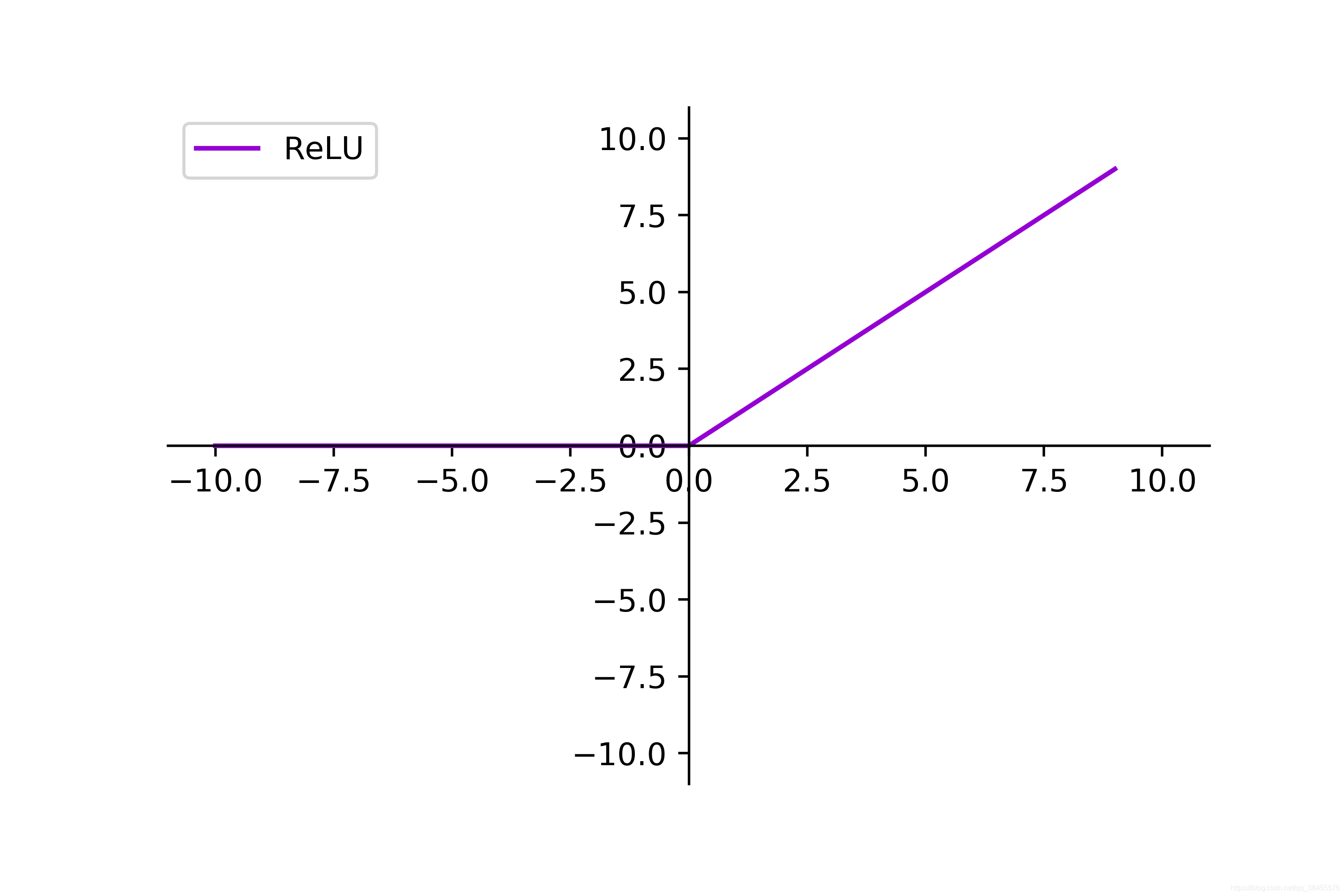
import numpy as np
import matplotlib.pyplot as plt
fig = plt.figure(figsize=(6,4))
ax = fig.add_subplot(111)
x = np.arange(-10, 10)
y = np.where(x<0,0,x)#满足条件(condition),输出x,不满足输出y
plt.xlim(-11,11)
plt.ylim(-11,11)
ax = plt.gca() # get current axis 获得坐标轴对象
ax.spines['right'].set_color('none')
ax.spines['top'].set_color('none') # 将右边 上边的两条边颜色设置为空 其实就相当于抹掉这两条边
ax.xaxis.set_ticks_position('bottom')
ax.yaxis.set_ticks_position('left') # 指定下边的边作为 x 轴 指定左边的边为 y 轴
ax.spines['bottom'].set_position(('data', 0)) #指定 data 设置的bottom(也就是指定的x轴)绑定到y轴的0这个点上
ax.spines['left'].set_position(('data', 0))
plt.plot(x,y,label='ReLU',linestyle="-", color="darkviolet")#label为标签
plt.legend(['ReLU'])
plt.savefig('ReLU.png', dpi=500) #指定分辨