残差=y-yhat
一般我们就停止在这里了
但是如果残差表现的有某种形式,代表我们的模型需要进一步改进,如果残差表现的杂乱无章,代表确实没什么别的信息好提取了
现在用最naive的model--上一个时间的值=yhat看看残差表现吧
关于残差,可以看我的另一篇文章https://mp.csdn.net/postedit/82989567
from pandas import Series
from pandas import DataFrame
from pandas import concat
series = Series.from_csv('daily-total-female-births.csv', header=0)
# create lagged dataset
values = DataFrame(series.values)
dataframe = concat([values.shift(1), values], axis=1)
dataframe.columns = ['t-1', 't+1']
# split into train and test sets
X = dataframe.values
train_size = int(len(X) * 0.66)
train, test = X[1:train_size], X[train_size:]
train_X, train_y = train[:,0], train[:,1]
test_X, test_y = test[:,0], test[:,1]
# persistence model
predictions = [x for x in test_X]
# calculate residuals
residuals = [test_y[i]-predictions[i] for i in range(len(predictions))]
residuals = DataFrame(residuals)
print(residuals.head())
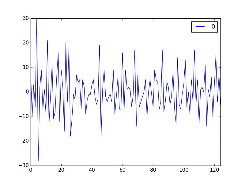
residuals.plot()
pyplot.show()残差表现如下:
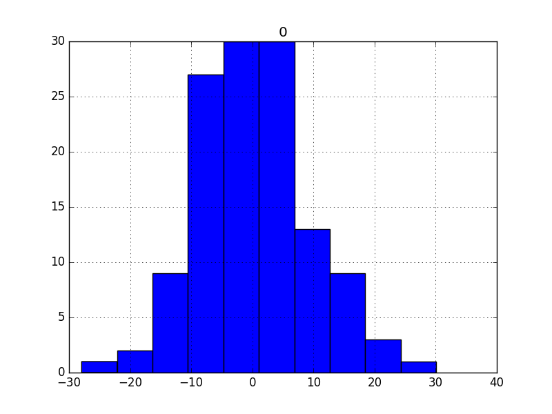
现在看看基本信息
1.均值--越接近0越好
A value close to zero suggests no bias in the forecasts, whereas positive and negative values suggest a positive or negative bias in the forecasts made.
print(residuals.describe())
结果如下
count 125.000000
mean 0.064000
std 9.187776
min -28.000000
25% -6.000000
50% -1.000000
75% 5.000000
max 30.000000
mean和0还是有点差距
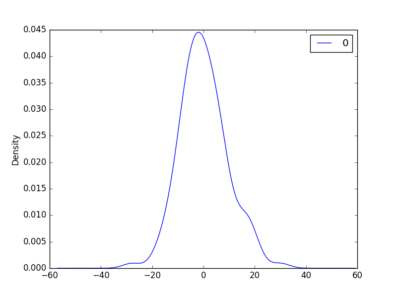
2.直方图密度图about残差
我们希望残差分布越接近正太越好
If the plot showed a distribution that was distinctly non-Gaussian, it would suggest that assumptions made by the modeling process were perhaps incorrect and that a different modeling method may be required.
A large skew may suggest the opportunity for performing a transform to the data prior to modeling, such as taking the log or square root.
# histogram plot
residuals.hist()
pyplot.show()
# density plot
residuals.plot(kind='kde')
pyplot.show()
3.QQ图检验正太更快速的方式
from pandas import Series
from pandas import DataFrame
from pandas import concat
from matplotlib import pyplot
import numpy
from statsmodels.graphics.gofplots import qqplot
series = Series.from_csv('daily-total-female-births.csv', header=0)
# create lagged dataset
values = DataFrame(series.values)
dataframe = concat([values.shift(1), values], axis=1)
dataframe.columns = ['t-1', 't+1']
# split into train and test sets
X = dataframe.values
train_size = int(len(X) * 0.66)
train, test = X[1:train_size], X[train_size:]
train_X, train_y = train[:,0], train[:,1]
test_X, test_y = test[:,0], test[:,1]
# persistence model
predictions = [(x-0.064000) for x in test_X]
# calculate residuals
residuals = [test_y[i]-predictions[i] for i in range(len(predictions))]
residuals = numpy.array(residuals)
qqplot(residuals)
pyplot.show() 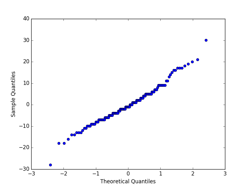
4.自回归图
残差的自回归越小越好!
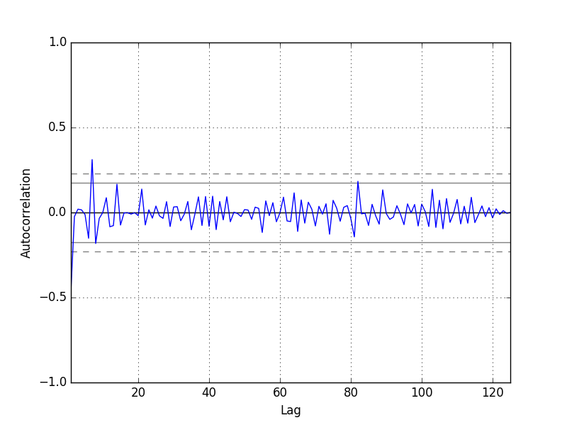
We do not see an obvious autocorrelation trend across the plot. There may be some positive autocorrelation worthy of further investigation at lag 7 that seems significant.
https://machinelearningmastery.com/visualize-time-series-residual-forecast-errors-with-python/