* {
padding: 0;
margin: 0;
}
ul, ol {
list-style: none;
}
a {
text-decoration: none;
color: #000;
}
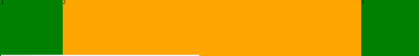
.box {
width: 100%;
overflow: hidden;
}
.box p {
float: left;
height: 200px;
}
.box p:first-child {
width: 200px;
background-color: green;
}
.box p:last-child {
width: 200px;
background-color: green;
}
/*2号元素宽度自适应 计算*/
.box p:nth-child(2) {
/*计算*/
width: calc(100% - 400px);
height: 200px;
background-color: orange;
}
</style>
</head>
<body>
<div class="box">
<p>1</p>
<p>2</p>
<p>3</p>
</div>
</body>
固比固的弹性盒
1	.box {
2		/*父盒子设置弹性盒容器*/
3		width: 100%;
4		display: -webkit-flex;
5		/*子盒子自动并排显示 不需要设置浮动*/
6	}
7	.box p:first-child {
8		width: 200px;
9		height: 200px;
10		background-color: lightblue;
11	}
12	.box p:nth-child(2) {
13		/*宽度自适应*/
14		-webkit-flex: 2222;
15		height: 200px;
16		background-color: green;
17	}
18	.box p:last-child {
19		width: 200px;
20		height: 200px;
21		background-color: orange;
}