::before 和 ::after其实就是附着在元素前后的伪元素。
说他是“伪”元素的意思就是,元素不是在DOM中生成的,而是在浏览器渲染引擎渲染CSS的时候添加上去的。
如果百度它们,会发现有双冒号(::)和单冒号(:)两种写法。那是因为一开始伪元素用的是单冒号(:),后面有人觉得单冒号(:)跟伪类(:hover之类)无法区分了。于是W3C在CSS3中,把伪元素就改成了双冒号(::)。
不过浏览器为了保证兼容性,同时支持双冒号(::)和单冒号(:)。主流浏览器中 ,只有IE8只支持单冒号,如果项目不需要IE8支持,就用双冒号(::)吧。
PS:其实IE8现在也过时了。
基本使用方法如下:
 <style>
        .d1::before{
            content:"#"
        }
        .d1::after{
            content:"?";
        }
</style>

<div class="d1">这个是div</div>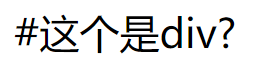
这个两个伪元素的content属性,表示伪元素的内容。设置::before和::after时必须设置其content属性,否则伪元素就不起作用。
content属性的值具体有以下几种情况:
1、字符串
字符串作为伪元素的内容添加到主元素中。如上面的代码,就是给 ::before 添加了 “#”字符串,给::after添加了“?”字符串作为内容。
注意:字符串中若有html字符串,添加到主元素后不会进行html转义,也不会转化为真正的html内容显示,而是会原样输出。
<style>
        .d1::before{
            content:"<h1>你好</h1>";
        }
</style>

<div class="d1">这个是div</div>
2、attr(attr_name)
伪元素的内容跟主元素的某个属性值进行关联,及其内容为主元素的某指定属性的值
好处:可以通过js动态改变主元素的指定属性值,这时伪元素的内容也会跟着改变,可以实现某些特殊效果。
比如,显示超链接的href地址。
a:after {
   content: attr(href) ;
}
3、url()/uri()
引用外部资源,例如图片。比如:
h1::before {
  content: url(logo.png);
}
4、counter()
调用计数器,可以不使用列表元素实现序号问题。
接下来通过几个小梨子来谈谈以上用法的妙处:
1、给图片添加特殊阴影。可以参考本文章
2、制作照片堆叠效果

 <style>
        .d1{
            margin: 50px;
            width: 682px;
            height: 458px;
            position: relative;
            box-shadow: 2px 2px 5px rgba(0,0,0,0.2);
        }
        .d1 img{
            border:1px #ccc solid;
            padding: 5px;
            background: #fff;
        }
        .d1::before{
            transform: rotateZ(-2deg);
        }
        .d1:after{
            transform: rotateZ(2deg);
        }
        .d1::before,
        .d1::after{
            content: "";
            position: absolute;
            display: block;
            z-index: -1;
            top: 0;
            left: 0;
            right:0;
            bottom:0;
            padding: 5px;
            border:1px #ccc solid;
            background: #fff;
        }
</style>

<div class="d1">
        <img  src="images/1.jpg" alt="美女图">
</div>
3、时间线

 <style>
       *{
            margin: 0;
            padding: 0;
        }
        ul,li,ol{
            list-style: none;
        }
        .timeList{
            margin-left: 100px;
        }
        .timeList li{
            position: relative;   /*相对定位,这个很重要*/
            line-height: 24px;
            font-size: 16px;
            padding-bottom: 10px;
        }
        .timeList li::before{
            content: "";
            display: block;
            width: 10px;
            height: 10px;
            background: #ddd;
            border-radius: 10px;
            left:-20px;
            top:6px;
            position: absolute;
            z-index: 1;
        }
        .timeList li::after{
            content:"";
            display: block;
            width: 2px;
            position: absolute;
            top:0;
            height: 100%;    /*线条高度都为 100%,跟li高度一致*/
            left:-16px;
            background: #ddd;
        }
        .timeList li:first-child::after{    /*修正第一个标签的线条位置*/
            top:7px;
        }
        .timeList li:last-child::after{      /*修正最后一个标签的线条高度*/
            height:10px;
        }
        .timeList li.now::before{
            background: #f30;
        }
</style>
<ul class="timeList">
         <li>2016年,我来到了重庆工程学院。</li>
         <li class="now">2019年,我遇到了你。</li>
         <li>2020年,我遇到了他。</li>
         <li>2021年,我们继续努力着。</li>
</ul>
同理,也可以制作出进度线。如图所示:

4、模拟有序列表

<style>
       .list{
            counter-reset: number;
            line-height: 24px;
        }
        .list >li{
            margin-bottom: 4px;
        }
        .list>li::before{
            counter-increment: number;  /*数据增长*/
            content: counter(number);   /*内容是计数器*/
            margin-right: 10px;
            background: #f30;
            color: #fff;
            display: inline-block;
            width: 24px;
            height: 24px;
            vertical-align: middle;
            text-align: center;
        }
        .list>li:nth-child(n+4)::before{
            background: #666;
        }
</style>
 <ul class="list">
        <li>2016年,我来到了重庆工程学院。</li>
        <li>2019年,我遇到了你。</li>
        <li>2020年,我遇到了他。</li>
        <li>2021年,我们继续努力着。</li>
        <li>2022年,我们继续努力着。</li>
    </ul>
 <style>
        .list2{
            margin-left: 100px;
        }
        .list2{
            counter-reset: number;
            line-height: 24px;
        }
        .list2 >li{
            margin-bottom: 4px;
        }
        .list2>li::before{
            counter-increment: number;  /*数据增长*/
            content: counters(number,".");   /*内容是计数器。注意跟上一个代码的区别,层级列表*/
            margin-right: 10px;
            background: #f30;
            color: #fff;
            display: inline-block;
            width: 24px;
            height: 24px;
            vertical-align: middle;
            text-align: center;
        }
        .list2>li:nth-child(n+4)::before{
            background: #666;
        }
    </style>
    <ul class="list2">
        <li>2016年,我来到了重庆工程学院。</li>
        <li>2019年,我遇到了你。</li>
        <li>2020年,我遇到了他。</li>
        <li>2021年,我们继续努力着。
            <ul class="list2">
                <li>2016年,我来到了重庆工程学院。</li>
                <li>2019年,我遇到了你。</li>
                <li>2020年,我遇到了他。</li>
                <li>2021年,我们继续努力着。</li>
                <li>2022年,我们继续努力着。</li>
            </ul>
        </li>
        <li>2022年,我们继续努力着。</li>
</ul>5、做一些炫酷的导航。点击看这里
此外,大名鼎鼎的字体图标,其实也用了伪标签来制作内容,这里就不铺开了。
还有其他例子,后面想起了再来补充。
