数据的可视化
描述连续型变量的分布
条形图(柱状图)
简单条形图
library(vcd)
counts <- table(Arthritis$Improved)
barplot(counts,main="Simple Bar Plot",
+         xlab="Improvement", ylab="Frequency")
barplot(counts,main="Horizontal Bar Plot",
+         ylab="Improvement", xlab="Frequency",horiz=TRUE)
堆砌条形图和分组条形图
counts<-table(Arthritis$Improved, Arthritis$Treatment)
barplot(counts, main="Stacked Bar Plot",
+         xlab="Treatment",ylab="Frequency",
+         col=c("red","yellow","green"),
+         legend=rownames(counts)
+ )
barplot(counts, main="Grouped Bar Plot",
+         xlab="Treatment",ylab="Frequency",
+         col=c("red","yellow","green"),
+         legend=rownames(counts),beside=TRUE)
表示均值、中位数、标准差的条形图: 使用数据整合函数来生成条形图
barplot(means$x, names.arg=means$group.1)
states <- data.frame(state.region, state.x77)
means <- aggregate(states$Illiteracy, by=list(state.region),FUN=mean)
means <- means[order(means$x),]
barplot(means$x, names.arg=means$group.1)
title("Mean Illiteracy Rate")
lines(means$x, type="b", pch=17, lty=2, col="red")
饼图
pie(slices, labels=lbls, main="Simple Pie Chart")
par(mfrow=c(2,2))
slices <- c(10,12,4,16,8)
lbls <- c("US","UK","Australia","Germany","France")
pie(slices, labels=lbls, main="Simple Pie Chart")
pct <- round(slices/sum(slices)*100)
lbls2 <- paste(lbls, "", pct, "%", sep="")
pie(slices,labels=lbls2, col=rainbow(length(lbls2)),
+     main="Pie Chart with Percentages")
mytable <- table(state.region)
lbls3 <- paste(names(mytable),"\n",mytable, sep="")
pie(mytable, labels=lbls,main="Pie Chart from a Table\n(with sample sizes)")
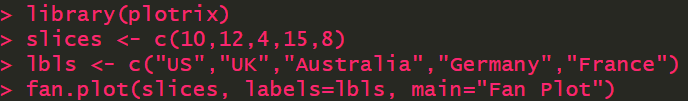
扇形图
library(plotrix)
slices <- c(10,12,4,15,8)
lbls <- c("US","UK","Australia","Germany","France")
fan.plot(slices, labels=lbls, main="Fan Plot")
描述连续型变量的分布
直方图
par(mfrow=c(2,2))
hist(mtcars$mpg)
hist(mtcars$mpg,
+      breaks=12,
+      col="red",
+      xlab="Miles Per Gallon",
+      main="Colored histgram with 12 bins")
hist(mtcars$mpg,
+      freq=FALSE,
+      breaks=12,
+      col="red",
+      xlab="Miles Per Gallon",
+      main="Histgram,rug plot, density")
rug(jitter(mtcars$mpg))
lines(density(mtcars$mpg),col="blue",lwd=2)
x <- mtcars$mpg
> h <- hist(x,breaks=12,
+           col="red",
+           xlab="Miles Per Gallon",
+           main="Histogram with normal curve and box")
xfit <- seq(min(x),max(x),length=40)
yfit <- dnorm(xfit,mean=mean(x),sd=sd(x))
yfit <- yfit*diff(h$mids[1:2])*length(x)
lines(xfit,yfit,col="blue",lwd=2)
box()
核密度图
描述连续型随机变量概率密度的一种方法
par(mfrow=c(2,1))
d <- density(mtcars$mpg)
plot(d)
plot(d,main="Kernel Density of Miles Per Gallon")
polygon(d,col="red",border="blue")
rug(mtcars$mpg,col="brown")
par(lwd=2)
library(sm)
Package 'sm', version 2.2-5.6: type help(sm) for summary information
cyl.f <- factor(mtcars$cyl, levels=c(4,5,6),
+                 labels=c("4 cylinder","6 cy;inder","8 cylinder"))
sm.density.compare(mtcars$mpg,mtcars$cyl, xlab="Miles Per Gallon")
title(main="Mpg Distribution by Car Clyinders")
colfill <- c(2:(1+length(levels(cyl.f))))
legend(locator(1),levels(cyl.f),fill=colfill)
鼠标点击确定放置图例位置
箱线图
boxplot(mtcars$mpg,main="Box Plot", ylab="Miles per Gallon")
boxplot.stats(mtcars$mpg)
boxplot(mpg~cyl,data=mtcars,
+         main="Car Mileage Data",
+         xlab="Number of Cylinders",
+         ylab="Miles Per Gallon")
如果凹槽不重叠,表明它们的中位数有显著差异
boxplot(mpg~cyl,data=mtcars,
+         notch=TRUE,
+         varwidth=TRUE,
+         col="red",
+         main="Car Mileage Data",
+         xlab="Number of Cylinders",
+         ylab="Miles Per Gallon")
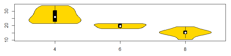
小提琴图
x1<-mtcars$mpg[mtcars$cyl==4]
x2<-mtcars$mpg[mtcars$cyl==6]
x3<-mtcars$mpg[mtcars$cyl==8]
library(vioplot)
vioplot(x1,x2,x3,
+         names=c("4","6","8"),
+         col="gold")
点图
dotchart(mtcars$mpg, labels=row.names(mtcars),cex=.7)
mtc <- mtcars[order(mtcars$mpg),]
mtc$cyl <- factor(mtc$cyl)
mtc$color[mtc$cyl==4] <- "red"
mtc$color[mtc$cyl==6] <- "blue"
mtc$color[mtc$cyl==8] <- "darkgreen"
dotchart(mtc$mpg,
+          labels=row.names(mtc),
+          cex=.7,
+          groups=mtc$cyl,
+          gcolor="black",
+          color=mtc$color,
+          pch=19,
+          main="Gas Mileage for Car Models\ngrounded by cylinder",
+          xlab="Miles Per Gallon")
R语言(三)


猜你喜欢
转载自blog.csdn.net/hxxjxw/article/details/104197290
今日推荐
周排行