说明:本手册所列包来自Awesome-Python ,结合GitHub 和seaborn官方文档,整理所得。
Seaborn是基于matplotlib的Python可视化库。它提供了一个高级界面来绘制有吸引力的统计图形。
seaborn
import numpy as np
import matplotlib.pyplot as plt
import seaborn as sns
%matplotlib inline
Style frontend(前端样式)
Seaborn将matplotlib参数分成两个独立的组。第一组设定美学样式,第二组规定图形的各种元素,以便它可以很容易地融入不同的情境。
| 美学样式 | |
|---|---|
| sns.axes_style(style=None, rc=None) | 获取当前样式,返回参数字典 |
| sns.set_style(style=None, rc=None) | 自定义seaborn样式,将参数字典传递给rc参数seaborn主题(style参数): {darkgrid(default), whitegrid, dark, white, ticks} |
| 绘图元素 | 设置绘图元素大小 |
| sns.plotting_context(context=None, font_scale=1, rc=None) | 获取当前设置,返回参数字典 |
| sns.set_context(context=None, font_scale=1, rc=None) | 控制着绘图元素的比例,四种预设,按相对大小的顺序,依次是{paper, notebook(default), talk, poster} |
- 要切换到seaborn默认值,只需调用该
set()函数即可。
sns.set(context='notebook', style='darkgrid', palette='deep', font='sans-serif', font_scale=1, color_codes=False, rc=None)- 暂时设置图形样式:嵌套
with语句
Examples:
sns.set_style("whitegrid") # seaborn主题
sns.despine(left=True) # 控制边框
sns.set_style("darkgrid", {"axes.facecolor": ".9"}) # 自定义样式
sns.set_context("notebook", font_scale=1.5, rc={"lines.linewidth": 2.5}) # 控制绘图元素大小

# 临时设置模块
iris = sns.load_dataset("iris")
with sns.axes_style("darkgrid"):
    plt.subplot(211)
    iris.plot()
Color palettes(调色板)
| 调色板 | |
|---|---|
sns.color_palette(palette=None, n_colors=None, desat=None) |
创建调色板 |
sns.set_palette(palette, n_colors=None, desat=None, color_codes=False) |
设置默认调色板 |
Parameters:
palette: None, string, or list of colors, optional
n_colors : int, optional
desat : float, optional
| 分类调色板 | |
|---|---|
| sns.color_palette() | 6分类主题palette: {deep, muted, bright, pastel, dark, colorblind}多分类调色 palette: {hls, husl,Paired,Set2} |
| sns.hls_palette(n_colors=6, h=0.01, l=0.6, s=0.65) | l: 亮度 s: 饱和度 |
| sns.husl_palette(n_colors=6, h=0.01, s=0.9, l=0.65) | |
| sns.xkcd_palette(colors) | 传递已命名颜色字符列表 |
| 连续调色板 | |
| sns.color_palette(‘Blues’) | 单颜色字符(添加_r后缀,反转调色板,也可以添加_d后缀创建’dark’调色板) |
| sns.cubehelix_palette() | |
| sns.light_palette() sns.dark_palette() |
from light/dark to color 默认参数:color, n_colors=6, reverse=False, as_cmap, … |
| 发散调色板 | |
| color_palette() | palette: {BRBG, RdBu_r,coolwarm,...} |
| sns.diverging_palette() | 自定义发散调色板 |
| 调色板工具 | |
| sns.choose_colorbrewer_palette(data_type, as_cmap=False) | data_type:{'sequential', 'diverging', 'qualitative'}as_cmap : bool是否离散 |
| choose_light_palette() choose_dark_palette() |
|
| choose_cubehelix_palette() |
# 分类
sns.palplot(sns.color_palette("husl", 8))
sns.palplot(sns.color_palette("Set2", 10))
colors = ["windows blue", "amber", "greyish", "faded green", "dusty purple"]
sns.palplot(sns.xkcd_palette(colors))
# 连续
sns.palplot(sns.color_palette("GnBu_d"))
# 发散
sns.palplot(sns.color_palette("coolwarm", 7))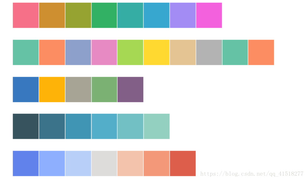
Distribution plots(分布图)
sns.distplot(a,bins, hist, kde, rug, fit) 单变量分布图
Parameters:
a : Series, 1d-array, or list.
hist, kde, rug: (bool, optional) 直方图,核密度图,地毯图
sns.jointplot(x,y,data, kind, stat_func) 双变量分布图
Parameters:
x, y : strings or vectors
data : DataFrame, optional
kind : { “scatter” | “reg” | “resid” | “kde” | “hex” }, optional
kdeplot(data,data2, shade, vertical) 核密度图
Parameters:
data2: 1d array-like, optional
kernel : {‘gau’ | ‘cos’ | ‘biw’ | ‘epa’ | ‘tri’ | ‘triw’ }, optional
bw : {‘scott’ | ‘silverman’ | scalar | pair of scalars }, optional
rugplot(a, height, axis, ax) 地毯图
Categorical plots(分类图)
stripplot(x, y, hue, data, order) 分类散点图
swarmplot(x, y, hue, data, order)非重叠分类散点图
Parameters:
x, y, hue : (names of variables in data or vector data, optional) x, y, hue 映射变量
data : DataFrame, array, or list of arrays, optional
jitter : float, 点重叠设置
palette : 调色板
order: 图排列顺序
sns.boxplot(x, y, hue, data, order) 箱线图
sns.violinplot(x, y, hue, data, order)小提琴图
notch : boolean, optional
sns.barplot(x, y, hue, data, order)柱状图
sns.countplot(x, y, hue, data, order)柱状图
sns.pointplot(x, y, hue, data, order)折线图
sns.lvplot(x, y, hue, data, order) 字母值图
Regression plots(回归图)
sns.regplot(x,y,data,x_estimator, x_bins)
sns.residplot(x,y,data, lowess, x_partial)
lmplot(x, y, data, hue, col, row, palette)
Matrix plots(矩阵图)
sns.heatmap(data,vmin, vmax, cmap, center,)
sns.clustermap(data,pivot_kws, method)
data : rectangular dataset
vmin, vmax : floats, optional
cmap : matplotlib colormap name or object, or list of colors, optional
center : float, optional
xticklabels, yticklabels : “auto”, bool, list-like, or int, optional
Axis grids(网格图)
sns.FacetGrid(data[, row, col, hue, col_wrap, ...])
sns.factorplot([x, y, hue, data, row, col, ...]) 分类变量网格图
>>> g = sns.FacetGrid(tips, col="time",  row="smoker")
>>> g = g.map(plt.hist, "total_bill")
>>> g.add_legend()

>>> exercise = sns.load_dataset("exercise")
>>> g = sns.factorplot(x="time", y="pulse", hue="kind",
...                    data=exercise, kind="violin")
sns.PairGrid(data[, hue, hue_order, palette, ...]) 配对矩阵
sns.pairplot(data[, hue, hue_order, palette, ...])
sns.pairplot(iris, diag_kind="kde")

g = sns.PairGrid(iris)
g.map_diag(plt.hist) #对角线
g.map_offdiag(plt.scatter) # 非对角线
g.map_upper(plt.scatter) # 上方区域
g.map_lower(sns.kdeplot, cmap="Blues_d")
sns.JointGrid(x, y[, data, size, ratio, space, ...])
sns.jointplot(x, y[, data, kind, stat_func, ...])
>>> g = sns.JointGrid(x="total_bill", y="tip", data=tips, space=0)
>>> g = g.plot_joint(sns.kdeplot, cmap="Blues_d")
>>> g = g.plot_marginals(sns.kdeplot, shade=True)
Timeseries plots(时间序列)
tsplot(data, time, unit, condition, value)
>>> gammas = sns.load_dataset("gammas")
>>> ax = sns.tsplot(time="timepoint", value="BOLD signal",
...                 unit="subject", condition="ROI",
...                 data=gammas)
Other functions(其他函数)
sns.despine()移除边框线参数:
fig: current figure(default)
ax: matplotlib axes(optional)
top, right, left, bottom: (boolean, optional) If True, remove that spine
offset: (int or dict, optional) 移除的距离
trim: (bool, optional) If True, 最大化palplot(pal, size=1)横向绘制调色板函数sns.desaturate(color, prop)降低某种颜色的饱和度通道百分比。sns.saturate(color)用相同的色调返回完全饱和的颜色。sns.set_hls_values(color, h=None, l=None, s=None)独立操作颜色的h,l或s通道。
matplotlib
import matploblib.pyplot as plt| 初始化figure | |
|---|---|
| plt.figure() | 新建 |
| plt.subplot(nrows,ncols,plot_number) | 绘图区域 |
| plt.subplot2grid | 分隔显示 |
| 作图 | plt.show() |
| plt.plot(x,y,format_string) | 折线图 |
| plt.scatter() | 散点图 |
| plt.bar()/plt.barh | 条形图 |
| plt.hist() | 直方图 |
| plt.boxplot() | 箱线图 |
| plt.pie() | 饼图 |
| x/y轴 | |
| plt.xlim() | |
| plt.xlabel() | |
| plt.xticks() | |
| text | |
| plt.title() | |
| plt.text() | |
| plt.annotate() | 图形注释 |
| legend | |
| plt.legend |