微信小程序自定义组件自定义组件
(1)在根目录下新建 components 文件夹,用来存放组件的。
新建弹框组件:如下
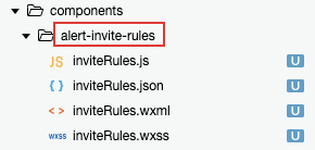
inviteRules.wxml文件:
<block wx:if="{{isShowInvite}}">
  <cover-view class="alert_bg" bindtap="_alertClose"></cover-view>
  <cover-view class="alert_invite_wrap">
    <cover-view class="alert_invite">
      <cover-view class="alert_invite_tit">{{title}}</cover-view>
      <cover-view class="alert_invite_txt">{{rules}}</cover-view>
      <button class="invite_btn" hover-class="none" open-type="share">{{buttonTxt}}</button>
    </cover-view>
    <cover-image src="{{iconClose}}" class="icon_close" bindtap="_alertClose"></cover-image>
  </cover-view>
</block>
inviteRules.js文件:
Component({
  data: {
    rules: '规则规则规则规则规则规则规则规则规则规则规则规则规则规则规则规则规则规则规则规则规则规则规则规则下载。',
    iconClose: 'http://xxxxx:8080/test/source1.png' //需要后端将icon_close_white放在服务器上,这个暂时用播放的
  },
  properties: {
    title: {
      type: String,
      value: '邀请获下载券'
    },
    buttonTxt: {
      type: String,
      value: '立即邀请'
    },
    isShowInvite: {
      type: Boolean,
      value: false
    }
  },
  methods: {
    _alertClose() {
      this.setData({
        isShowInvite: false
      })
    }
  }
})
inviteRules.json文件:
{
  "component": true
}
inviteRules.wxss文件:
.alert_bg{
  position: fixed;
  left: 0;
  right: 0;
  top: 0;
  bottom: 0;
  background: rgba(0,0,0,.8);
  z-index: 99999;
}
.alert_invite_wrap{
  width: 80%;
  position: absolute;
  left: 50%;
  top: 50%;
  transform: translate(-50%,-50%);
  z-index: 999999;
}
.alert_invite{
  width: 100%;
  background-color: #fff;
  border-radius: 20rpx;
  padding:50rpx;
  box-sizing: border-box;
  overflow: initial;
}
.alert_invite_txt{
  width: 100%;
  font-size: 26rpx;
  color: #444444;
  line-height: 25px;
  white-space: pre-wrap;
  margin-bottom: 75rpx;
}
.alert_invite_tit{
  font-weight: bold;
  font-size: 40rpx;
  color: #333333;
  margin-bottom: 55rpx;
}
.invite_btn{
  width: 100%!important;
  height: 80rpx;
  box-sizing: border-box;
  line-height: 80rpx;
  background: #ffcc21;
  border-radius: 50rpx;
  font-size: 30rpx;
  color: #444444;
}
.icon_close{
  width: 80rpx;
  height: 80rpx;
  margin:0 auto;
  margin-top: 80rpx;
}
--------------以上是组件文件,下面是使用组件。------------

组件的使用
组件的使用:
【.wxml文件】
<alert-invite-rules id="inviteRules" title="标题tit" buttonTxt="按钮文字" isShowInvite="{{isShowInvite}}" />
参数说明:
@params title 默认文案: 邀请获下载券 非必传
@params buttonTxt 默认文案: 立即邀请 非必传
@params isShowInvite 默认false 必传 父页面,控制isShowInvite 的true false即可。
【.json文件】
"usingComponents": {
"alert-invite-rules":"/components/alert-invite-rules/inviteRules"
},
【.js文件】
onReady:function(){
// 获得该引入的组件
var inviteRules = this.selectComponent('#inviteRules')
},
index.wxml文件:
<alert-invite-rules id="inviteRules" isShowInvite="{{isShowInvite}}"/>
<button bindtap="toInviteFn">点击展示弹框</button>
index.js文件
  onReady:function(){
    // 获得invite-rules组件
    var inviteRules  = this.selectComponent('#inviteRules')
  },
  // 邀好友的下载券
  toInviteFn(e){
    console.log('被点击了',e)
    this.setData({
      isShowInvite:true
    })
  },
index.json文件
{
  "usingComponents": {
   "alert-invite-rules":"/components/alert-invite-rules/inviteRules"
  },
  "navigationStyle": "custom"
}