<!DOCTYPE html>
<html lang="en">
<head>
<meta charset="UTF-8">
<meta http-equiv="X-UA-Compatible" content="IE=edge">
<meta name="viewport" content="width=device-width, initial-scale=1.0">
<title>盒子阴影</title>
<style>
div{
width: 200px;
height: 200px;
background-color: darkseagreen;
margin: 100px auto;
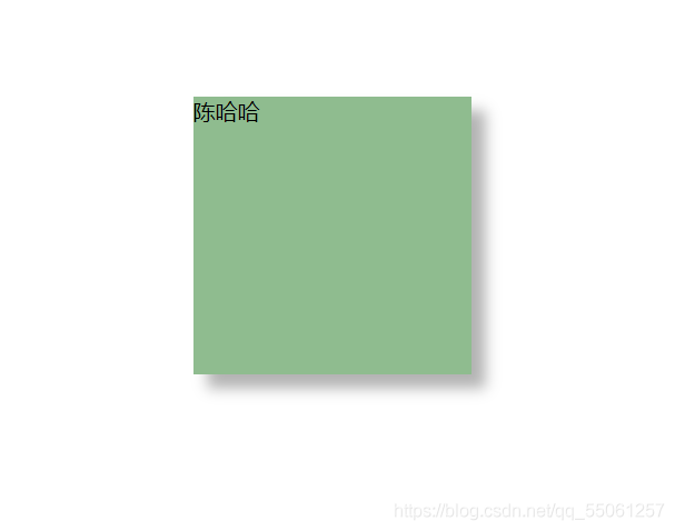
/* 盒子阴影 */
/* box-shadow: 10px 10px 10px rgba(0,0,0,0.3); */
}
/* 鼠标经过盒子变阴影 */
div:hover{
box-shadow: 10px 10px 10px rgba(0,0,0,0.3);
}
</style>
</head>
<body>
<div>陈哈哈</div>
</body>
</html>