盒子和文字阴影
代码如下:
<head>
<meta charset="UTF-8">
<title>Title</title>
<style>
/*
盒子阴影:box-shadow
水平阴影的尺寸 h-shadow
垂直阴影的尺寸 v-shadow
阴影的模糊聚类 spread
阴影尺寸 px
颜色 rgba()
内外阴影 外(outset)默认 inset(内阴影)
文字阴影 :text-shadow
水平阴阴影的尺寸 h-shadow
垂直阴阴影的尺寸 v-shadow
阴影的模糊距离 spread
颜色 rgba()
*/
.box{
width: 300px;
height: 200px;
margin: 0 auto;
background-color: white;
/* 第一个参数是左右阴影,第二个参数是上下阴影,第三个参数是模糊距离,第四个参数是灌云距离*/
font-size: 50px;
line-height: 200px;
text-align: center;
text-shadow: 20px 20px 30px red;
}
.box:hover{
box-shadow: 0px 0px 10px 0px rgba(0,0,0,0.2) inset;
}
</style>
</head>
<body>
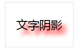
<div class="box">
文字阴影
</div>
</body>
文字的凹凸

代码如下:
<head>
    <meta charset="UTF-8">
    <title>Title</title>
    <style>
        body{

            background-color: #808080;
        }
        div{
            width: 600px;
            height: 300px;
            text-align: center;
            line-height: 300px;
            font-size: 80px;
            font-weight: 900;
            color: #808080;  /*文字要和背景同色才有凹凸感*/
        }
        .tu{
            /*text-shadow: 右下,左上;
            1px,1px,1px,#000,右下黑色
            -1px,-1px,1px,#ffffff ,左上白色
            */
            text-shadow: 1px 1px 1px #000, -1px -1px 1px #ffffff;
        }
        .ao{
            text-shadow: 1px 1px 1px #fff,-1px -1px 1px #000;
        }
    </style>
</head>
<body>
<div class="tu">凸起的文字</div>
<div class="ao">凹下的文字</div>
</body>
动画之过渡
<head>
    <meta charset="UTF-8">
    <title>Title</title>
    <style>
        .box{
            width: 200px;
            height: 200px;
            background-color: red;
           /* border-radius: 50%;*/
            /*脱标 left top*/
            position: absolute;
            /*left:0;
            top: 0px;
            !*方向 运动时间 线性运动 鼠标移动1s后移动*!
            transition: left 3s linear 1s ;*/

            transition: 3s linear 1s ;

        }
        .box:hover{
            /*left: 1000px;*/
            width: 30px;
            border-radius: 50% 50%;
            opacity: 0;
        }
    </style>

</head>
<body>
<!--
c3动画

过渡:从一个状态到另一状态(时间)
transtion:

动画:多个状态的切换
先定义后部使用
-->
<div class="box"></div>

</body>
盒子缩小放大旋转
<head>
    <meta charset="UTF-8">
    <title></title>
    <style>
        /*c3 变形  transform  2D  元素参考点在中心
        1:平移  translate
        2:缩放  scale
        3:倾斜  skew
        4:旋转 rotate


        */
        .box {
            width: 200px;
            height: 200px;

        }
        .box1 {
            background-color: orangered;
            /*平移*/
            transition: transform  2s linear 0s;
        }
        .box1:hover {
            transform: translate(400px,500px);
        }
        .box2 {
            background-color:skyblue;
            /*平移*/
            transition: transform  2s linear 0s;
        }
        .box2:hover {
             transform: scale(0.5);  /*>1 放大  <1 缩小*/
        }
        .box3 {
            background-color:red;
            /*平移*/
            transition: transform  2s linear 0s;
        }
        .box3:hover {
            transform: skew(-360deg);  /*45deg 逆时针  -45deg 顺时针 */
        }
        .box4 {
            background-color:yellow;
            /*平移*/
            transition: transform  2s linear 0s;
        }
        .box4:hover {
            transform: rotateY(90deg);  /*45deg 逆时针  -45deg 顺时针 */
        }
    </style>
</head>
<body>
<div class="box box1"></div>
<div class="box box2"></div>
<div class="box box3"></div>
<div class="box box4"></div>

</body>
动画
<head>
    <meta charset="UTF-8">
    <title>Title</title>
    <style>
        /*
animation 	所有动画属性的简写属性,除了 animation-play-state 属性。 	3
animation-name 	规定 @keyframes 动画的名称。 	3
animation-duration 	规定动画完成一个周期所花费的秒或毫秒。默认是 0。 	3
animation-timing-function 	规定动画的速度曲线。默认是 "ease"。 	3
animation-delay 	规定动画何时开始。默认是 0。 	3
animation-iteration-count 	规定动画被播放的次数。默认是 1。 	  3次  infinite 无限
animation-direction 	规定动画是否在下一周期逆向地播放。默认是 "normal"。alternate  反向播放
animation-play-state 	规定动画是否正在运行或暂停。默认是 "running"。 	3
animation-fill-mode 规定对象动画时间之外的状态。*/


        .box{
            width: 200px;
            height: 200px;
            background-color: skyblue;
            /*
            动画先定义后使用
            动画属性  animation:动画名字  动画持续时间s 延时时间s  运动曲线  往返运动
            infinite 无限制次数

            */
            animation: ani 5s 1s linear infinite alternate;
        }

        @keyframes ani {
            /*0%最初状态
            20%  1/5状态
            30%---100% 30%到完全状态
            */
            0%{
                background-color: red;
            }
            20%{
                border-radius: 30px;
                border: 2px solid black;
            }
            50%{
                transform: translateX(400px);
                border-radius: 50%;
            }
            100%{
                opacity: 0.3;
            }
        }

    </style>

</head>
<body>

<div class="box"></div>
</body>