文章来源
《Machine learning predictive models for mineral prospectivity: An evaluation of neural networks, random forest, regression trees and support vector machines.》——《矿产前景的机器学习预测模型:神经网络、随机森林、回归树和支持向量机的评估》
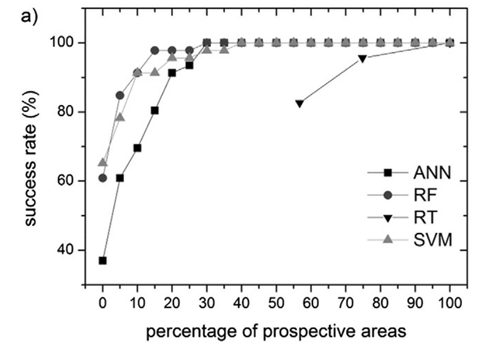
该文章中对于成功率曲线图的介绍如下
翻译:
图 5a 显示了按远景区域的不同百分比估算已知金矿床的成功率。与其他 MLA 模型相比,RF 地图中定义为高度前瞻性的区域要小得多。因此,为了达到类似于 RF 的成功率,其他 MLA 方法需要划定更大的预期区域。可以观察到 RF 和 SVM 如何从相似的成功率开始,尽管在 RF 的情况下成功率曲线的斜率更陡峭(解释:不同的斜率代表不同的成矿潜力。斜率越大,在较小的区域内捕获的矿藏就越多)。对于超过 10% 的预期区域百分比阈值,RF 和 SVM 的成功率超过 90%,而 ANN 仅等于 70%。然而,当 15% 的研究区域被认为是前瞻性时,RF 成功率收敛于 98% 的成功率值。 SVM 需要划定 35% 的区域才能达到这个成功率值。 RT 经历了最差的成功率,仅在超过 75% 的区域达到了超过 95% 的值。
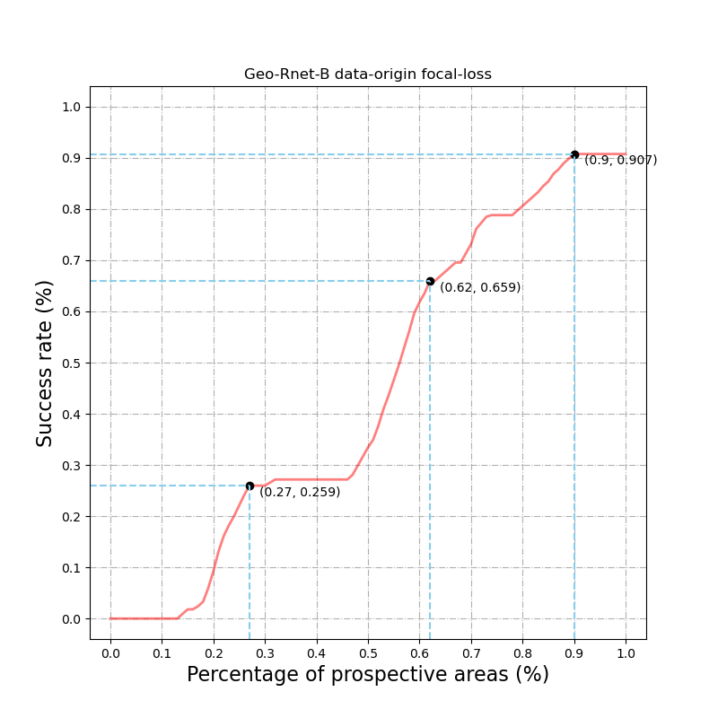
成功率曲线的算法
成功率的计算是根据潜在区面积百分比的不同阈值对黄金潜力图进行重新分类,并计算这些潜在区与已知金矿的成功率(真阳性率;TPR)(Agterberg和Bonham-Carter,2005)。成功率是指在前景区正确划定的训练矿床的百分比。在本研究中,鉴于开采成本与远景区的范围直接相关,在尽可能小的远景区达到高的成功率是至关重要的。
上述中 TPR = (预测为正,真实为正) / (所有已知正例)
Code
# 将整个研究区划分为有矿/无矿二分类
data_sum =  	# 此处为神经网络模型对整个研究区域的矿区单元的成矿概率预测值,区间值为[0,1]
high = data_sum.shape[0]
width = data_sum.shape[1]
total_area = width * high	# 整个研究区域面积

total = []
TPR = []

# 用坐标表示每个矿区单元,比如 (0,0)就是左上角的小区域
for i in range(high):
    for j in range(width):
        total.append((i,j))

def calculate_TPR():
    start = time.time()
    for i in np.linspace(0, 1.0, 101):
        TP = 0
        end_index = round(total_area * i)
        temp = total[0:end_index+1]		# 对面积进行百分阈值划分
        new_list = [item for item in temp if item in positive_location]		# positive_location是已知正样本坐标
        for (n,p) in new_list:			# 计算出在该阈值下面积中被正确预测的正样本
            if data_sum[n][p] >= 0.5:
                TP += 1
        TPR.append(TP/TP_plus_FN)
    end = time.time()
    print('耗时{:.2f}秒'.format(end-start))
    np.save('./numpyData/SuccessRate/'+fileName+'.npy',TPR)		# 保存计算结果

calculate_TPR()
# TPR = np.load('./numpyData/SuccessRate/'+fileName+'.npy')

# 设置画布大小 8*8
fig, ax1 = plt.subplots(figsize=(8, 8), dpi=100)

# 设置网格线
ax1.grid(axis='both', linestyle='-.')

# 标记3个点的坐标
first_index = (0.27,0.259)
second_index = (0.62,0.659)
third_index = (0.90,0.907)

# 绘图
ax1.plot(np.linspace(0, 1.0, 101), TPR, color="red", alpha=0.5, linewidth= 2)

# 绘制3个折点
ax1.plot(first_index[0], first_index[1], 'ko')
plt.hlines(first_index[1], -0.04, first_index[0], color="skyblue", linestyle='--')       # 画出横线到坐标
plt.vlines(first_index[0], -0.04, first_index[1], color="skyblue", linestyle='--')        # 画出竖线到坐标

ax1.plot(second_index[0], second_index[1], 'ko')
plt.hlines(second_index[1], -0.04, second_index[0], color="skyblue", linestyle='--')       # 画出横线到坐标
plt.vlines(second_index[0], -0.04, second_index[1], color="skyblue", linestyle='--')        # 画出竖线到坐标

ax1.plot(third_index[0], third_index[1], 'ko')
plt.hlines(third_index[1], -0.04, third_index[0], color="skyblue", linestyle='--')       # 画出横线到坐标
plt.vlines(third_index[0], -0.04, third_index[1], color="skyblue", linestyle='--')        # 画出竖线到坐标

show_first = str(first_index)
show_second = str(second_index)
show_third = str(third_index)

# 3个点标注信息
plt.annotate(show_first,xy=(first_index[0], first_index[1]),xytext=(first_index[0]+0.02, first_index[1]-0.02))
plt.annotate(show_second,xy=(second_index[0], second_index[1]),xytext=(second_index[0]+0.02, second_index[1]-0.02))
plt.annotate(show_third,xy=(third_index[0], third_index[1]),xytext=(third_index[0]+0.02, third_index[1]-0.02))


# ax1.set_yticks(np.linspace(0, 100, 11), custom_y_left)     # 自定义 y轴刻度
ax1.set_yticks(np.linspace(0, 1.0, 11))     # 设置 y轴刻度
plt.ylim((-0.04,1.04))                      # 设置 y轴显示范围
ax1.set_xticks(np.linspace(0, 1.0, 11))     # 设置 x轴刻度
plt.xlim((-0.04,1.04))                      # 设置 x轴显示范围

# 设置 x、y轴坐标信息
ax1.set_xlabel('Percentage of prospective areas (%)', fontdict={

    'size': 16})
ax1.set_ylabel('Success rate (%)', fontdict={

    'size': 16})

plt.title(fileName)
plt.show(block=True)
效果图